AI Platform - Dashboard UX - Data Visualisation
DFKI — Designing for
the Amazon Rainforest.
A full UX redesign of DFKI's AI-based ecological monitoring platform - used by scientists to analyse audio recordings of Amazon rainforest wildlife. From stakeholder interviews and competitor research through to persona, user flows, wireframes, and a production-ready hi-fi prototype.
Client:
DFKI
Role:
UX/UI Designer -
UX Researcher
Duration:
4 weeks
Platform:
In-house data dashboard

01 - Introduction
An AI platform monitoring the health of the Amazon
DFKI's AI-based platform monitors the ecological health of the Amazon rainforest by analysing audio recordings of wildlife - giving researchers valuable insights into long-term patterns of rainforest sounds and biodiversity.
The platform was technically powerful but difficult to use. Scientists - the primary users - faced significant friction navigating the interface and extracting meaningful insights from the data. Complex acoustic terminology, dense data visualisations, and an unintuitive workflow were getting in the way of the research itself.
My role was to redesign the platform from the ground up - making it more intuitive, more accessible, and more effective for the researchers who depend on it every day.

The original platform - powerful, but inaccessible to scientists without deep technical knowledge
0+
0+
Weeks total sprint
0D
0D
User flow - hardest deliverable
User flow - hardest deliverable
0+
0+
Competitor initiatives studied
Competitor initiatives studied
0
0
Major design iterations
Major design iterations
02 - The Challenge
Designing for a niche domain - with no direct competitors
This project came with a unique set of constraints that shaped every design decision. The platform sat at the intersection of acoustic science, AI data analysis, and conservation research - a combination with no direct UX precedent to draw from.
Highly specialised domain knowledge
Terms like acoustic indices, ACI, and bioacoustic clustering aren't in any standard UX pattern library. Understanding the domain deeply enough to design for it required significant research before a single wireframe could be sketched.
Hard-to-reach primary users
The target users - field researchers and domain experts working on acoustic indices in the Amazon - are an extremely niche group. Direct access for user interviews was not possible, requiring a creative approach to gather meaningful insights.
Data-heavy interface with strict visual requirements
Stakeholders required that graphs and data visualisations reflect domain-standard visual conventions used in academic research - not standard UI chart patterns. Aligning DFKI's brand with scientific norms required an additional design step.
No comparable platforms to benchmark against
Unlike most UX projects, there were no direct competitors to analyse. The platform's combination of AI audio analysis and ecological monitoring was unique - requiring us to draw insights from adjacent initiatives rather than direct comparisons.

03 - Research
No direct competitors - so we looked sideways
With no comparable platforms to benchmark against, the research phase required looking at adjacent initiatives in ecological monitoring and conservation technology. Each gave us useful signal even without being a direct match.
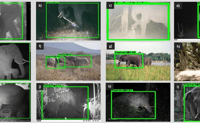
WILDLIFE AI
Wildlife monitoring using camera traps and AI classification. Provided insights into how to communicate AI-generated classifications to researchers in a trusted, legible way.
High detection accuracy
Good species recognition
Automated image tagging
Complex user interface
Limited real-time alerts
Expensive for small teams
AI CLASSIFICATION UX

HOTSPOTTER
Real-time audio detection of illegal logging. Useful for understanding how to present alert-based data and time-sensitive insights on a dashboard interface.
Powerful heatmaps
Advanced data filtering
Strong reporting tools
Steep learning curve
Not mobile friendly
Slow data processing
REALTIME DATA
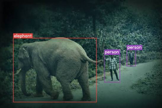
TRAILGUARD AI
Automated biodiversity monitoring using acoustic sensors. Gave us strong reference points for how to structure large-volume audio data for non-technical stakeholders.
End-to-end solution
Reliable hardware
Offline data collection
High initial cost
Bulky hardware
Third-party integrations
AI CLASSIFICATION UX

eBIRD / CORNELL LAB
Scientific-grade bird sound analysis platform. Showed us how domain experts expect to interact with spectrograms and acoustic data visualisations.
Large open dataset
Great for trend analysis
Trusted scientific source
Not real-time
Not predictive
Difficult for non-experts
SCIENTIFIC UX
04 - Users
Gabriel Santos - our primary persona
With direct access to field researchers unavailable, we interviewed professionals from adjacent fields - computational linguists, data scientists, product owners, and UX designers unfamiliar with our product. While this had limitations, it gave us enough signal to construct a grounded primary persona and validate our core assumptions about usability needs.
The primary users are scientists and conservationists who depend on the platform to analyse audio data and understand the health and biodiversity of the Amazon rainforest - not to learn a complex interface.


Gabriel Santos - primary persona representing field researchers and conservationists using the platform
05 - Process
From user flow to hi-fi - in four weeks
The project followed a full UX process - with the user flow as the most demanding single deliverable. Designing how a scientist moves through uploading, analysing, and interpreting audio data in a technically complex domain required two full days of focused work before a single screen was sketched.

Task flow - the most complex deliverable, requiring 2 days of iteration to resolve the full user journey
01
Domain research and terminology mapping
Before any UX work, the team mapped acoustic science terminology - ACI, acoustic indices, bioacoustic clustering - to build a shared vocabulary. You cannot design for a domain you don't understand.
02
Competitor and adjacent platform analysis
Analysed 4 adjacent ecological monitoring platforms to extract UX patterns relevant to scientific data dashboards, even without direct competitors to benchmark against.
03
User interviews and persona development
Conducted interviews with adjacent professionals - data scientists, computational linguists, product owners - to build a grounded persona and validate core usability assumptions.
04
User flow and task flow design
Mapped the complete user journey through the platform - upload, analyse, visualise, interpret. The most demanding deliverable, requiring two full days of focused iteration.
05
Lo-fi to mid-fi wireframes
Designed and iterated wireframes for the three core dashboard panels - dataset actualisation, time series, and clustering. Each moved from rough lo-fi sketches to detailed mid-fi screens.
06
Style tile, brand alignment, hi-fi
Developed a visual direction aligned with DFKI's brand and scientific conventions. Graphs were redesigned to reflect domain-standard visual norms while maintaining brand consistency.
06 - Design evolution
Lo-fi to mid-fi - three core dashboard panels
The wireframe phase focused on the three most complex and critical areas of the platform. Each was designed, tested with proxy users, and iterated before moving to high fidelity.

Lo-fi wireframes - establishing layout structure before committing to visual design decisions
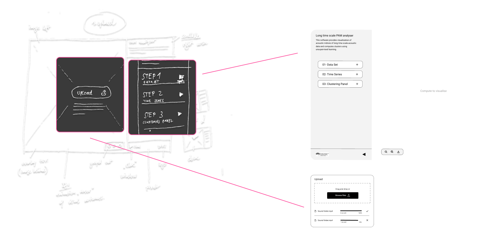
Panel 01
Dataset actualisation
Redesigned data upload and management flow - reducing cognitive load for scientists managing multiple audio datasets.
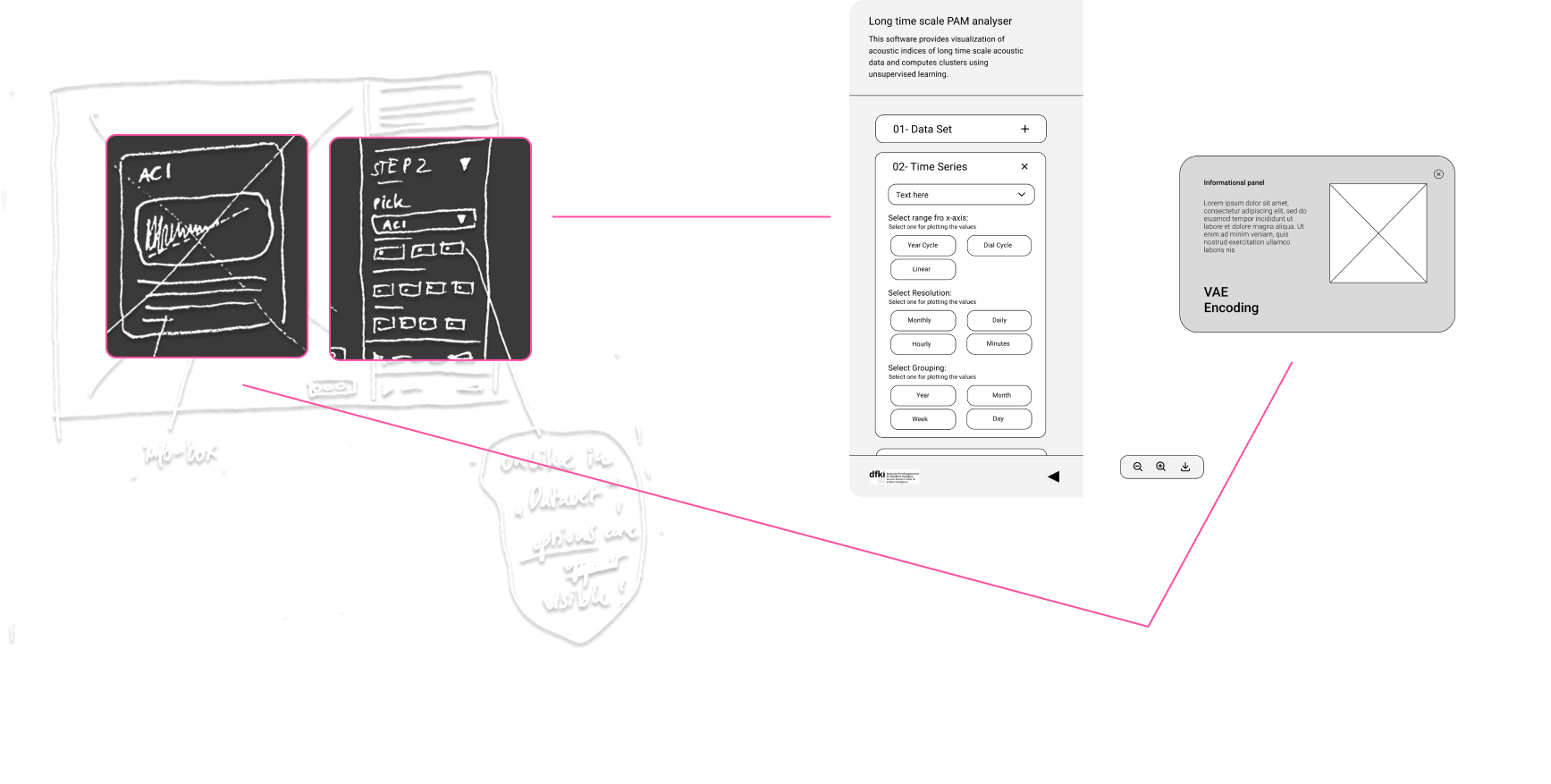
Panel 02
Time series visualisation
Restructured the time series view to surface long-term patterns at a glance, with drill-down capability for detailed analysis.
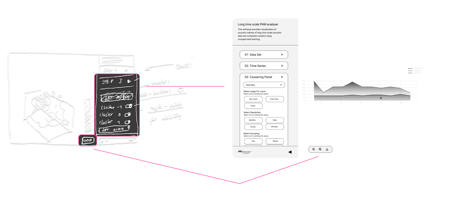
Panel 03
Clustering panel
Redesigned the bioacoustic clustering interface to make AI-generated groupings legible and interpretable for non-ML researchers.
07 - Visual Direction
Brand alignment meets scientific convention
The visual direction was a negotiation between two requirements: DFKI's brand identity and the domain-standard visual conventions that scientific users expect and trust. Standard UI chart styles were rejected by stakeholders - researchers expected their familiar representations.
The solution was an additional design step - combining and redesigning the graph styles to incorporate DFKI's brand colours while maintaining the structural integrity of research-standard visualisations.

Style tile - clean, data-forward, minimal distraction
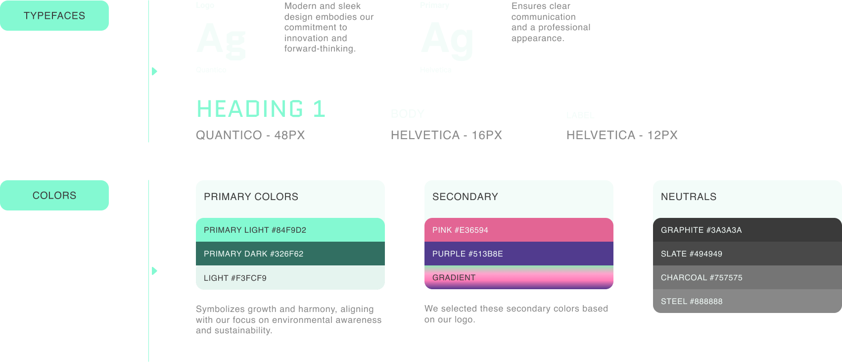
Style guide - typography, colour system, and component specs
Style tile - clean, data-forward, minimal distraction
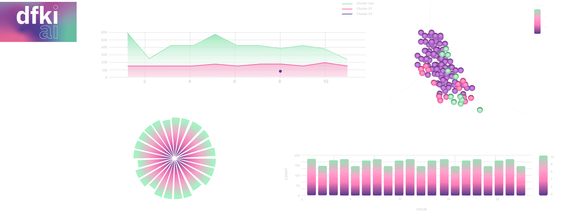
Graph redesign - DFKI brand colours applied to domain-standard scientific visualisation formats
08 - Design iterations
Testing and refining the core interactions
Despite limitations in accessing primary users directly, feedback from proxy interviews informed several meaningful iterations. The Cluster Audio feature and the information architecture of the info screen both underwent significant changes based on what we observed.

Style tile - clean, data-forward, minimal distraction
Designing for scientists means respecting their expertise - not simplifying away the complexity they depend on, but removing the friction that gets in the way of it.
09 - Outcomes
A dashboard scientists can actually use

Final product - the redesigned platform in action, showing the complete audio analysis workflow
Full user flow mapped and validated
A complete task flow covering every step from data upload through audio analysis and visualisation - the most complex deliverable on the project, requiring two full days of iteration to get right.
Graph system aligned with scientific standards
A hybrid visual system that satisfies both DFKI's brand requirements and the domain-standard chart conventions that scientific users trust and expect - resolving a key stakeholder conflict.
Complete hi-fi prototype with style guide
Production-ready screens for all three core dashboard panels, plus a full style guide covering typography, colour system, and component specifications for developer handoff.
Iterated designs based on proxy user feedback
Multiple rounds of design iteration on the Cluster Audio feature and info screen architecture - driven by structured feedback from proxy interviews despite limited direct user access.
10 - Key Takeaways
What this project reinforced
01
Domain knowledge is a design tool
You cannot design well for a specialised domain without understanding it. The time invested in learning acoustic indices and bioacoustic science paid back in every design decision made - from information architecture to graph conventions.
02
Proxy users are better than no users
When primary users are inaccessible, structured interviews with adjacent professionals still yield actionable signal. The insights weren't perfect - but they were enough to drive meaningful iterations and catch real usability issues before the final handoff.
03
Stakeholder constraints can improve the design
The requirement to align graphs with scientific visual conventions - initially a constraint - forced a more considered approach to data visualisation that ultimately served users better than a standard UI chart library would have.
More Projects

Design System - WCAG - Figma
Ecclesia - a design system built in 53 hours.
Germany's leading insurance group had no design system. No component library. No shared UI language.
Read More
AI Platform - Dashboard UX
DFKI — Designing for
the Amazon Rainforest.
Full UX redesign of DFKI's AI-based ecological monitoring platform used by scientists.
Read More

UX/UI · Accessibility · WCAG 2.1 AA
Esche Schümann - designing
for who question everything.
UX/UI redesign of Esche Schümann Commichau's digital presence delivered in 22 hours.
Read More
AI Platform - Dashboard UX - Data Visualisation
DFKI — Designing for
the Amazon Rainforest.
A full UX redesign of DFKI's AI-based ecological monitoring platform - used by scientists to analyse audio recordings of Amazon rainforest wildlife. From stakeholder interviews and competitor research through to persona, user flows, wireframes, and a production-ready hi-fi prototype.
Client:
DFKI
Role:
UX/UI Designer -
UX Researcher
Duration:
4 weeks
Platform:
In-house data dashboard
01 - Introduction
An AI platform monitoring the health of the Amazon
DFKI's AI-based platform monitors the ecological health of the Amazon rainforest by analysing audio recordings of wildlife - giving researchers valuable insights into long-term patterns of rainforest sounds and biodiversity.
The platform was technically powerful but difficult to use. Scientists - the primary users - faced significant friction navigating the interface and extracting meaningful insights from the data. Complex acoustic terminology, dense data visualisations, and an unintuitive workflow were getting in the way of the research itself.
My role was to redesign the platform from the ground up - making it more intuitive, more accessible, and more effective for the researchers who depend on it every day.
The original platform - powerful, but inaccessible to scientists without deep technical knowledge
0+
0+
Weeks total sprint
0D
0D
User flow - hardest deliverable
User flow - hardest deliverable
0+
0+
Competitor initiatives studied
Competitor initiatives studied
0
0
Major design iterations
Major design iterations
02 - The Challenge
Designing for a niche domain - with no direct competitors
This project came with a unique set of constraints that shaped every design decision. The platform sat at the intersection of acoustic science, AI data analysis, and conservation research - a combination with no direct UX precedent to draw from.
Highly specialised domain knowledge
Terms like acoustic indices, ACI, and bioacoustic clustering aren't in any standard UX pattern library. Understanding the domain deeply enough to design for it required significant research before a single wireframe could be sketched.
Hard-to-reach primary users
The target users - field researchers and domain experts working on acoustic indices in the Amazon - are an extremely niche group. Direct access for user interviews was not possible, requiring a creative approach to gather meaningful insights.
Data-heavy interface with strict visual requirements
Stakeholders required that graphs and data visualisations reflect domain-standard visual conventions used in academic research - not standard UI chart patterns. Aligning DFKI's brand with scientific norms required an additional design step.
No comparable platforms to benchmark against
Unlike most UX projects, there were no direct competitors to analyse. The platform's combination of AI audio analysis and ecological monitoring was unique - requiring us to draw insights from adjacent initiatives rather than direct comparisons.
03 - Research
No direct competitors - so we looked sideways
With no comparable platforms to benchmark against, the research phase required looking at adjacent initiatives in ecological monitoring and conservation technology. Each gave us useful signal even without being a direct match.
WILDLIFE AI
Wildlife monitoring using camera traps and AI classification. Provided insights into how to communicate AI-generated classifications to researchers in a trusted, legible way.
High detection accuracy
Good species recognition
Automated image tagging
Complex user interface
Limited real-time alerts
Expensive for small teams
AI CLASSIFICATION UX
HOTSPOTTER
Real-time audio detection of illegal logging. Useful for understanding how to present alert-based data and time-sensitive insights on a dashboard interface.
Powerful heatmaps
Advanced data filtering
Strong reporting tools
Steep learning curve
Not mobile friendly
Slow data processing
REALTIME DATA
TRAILGUARD AI
Automated biodiversity monitoring using acoustic sensors. Gave us strong reference points for how to structure large-volume audio data for non-technical stakeholders.
End-to-end solution
Reliable hardware
Offline data collection
High initial cost
Bulky hardware
Third-party integrations
AI CLASSIFICATION UX
eBIRD / CORNELL LAB
Scientific-grade bird sound analysis platform. Showed us how domain experts expect to interact with spectrograms and acoustic data visualisations.
Large open dataset
Great for trend analysis
Trusted scientific source
Not real-time
Not predictive
Difficult for non-experts
SCIENTIFIC UX
04 - Users
Gabriel Santos - our primary persona
With direct access to field researchers unavailable, we interviewed professionals from adjacent fields - computational linguists, data scientists, product owners, and UX designers unfamiliar with our product. While this had limitations, it gave us enough signal to construct a grounded primary persona and validate our core assumptions about usability needs.
The primary users are scientists and conservationists who depend on the platform to analyse audio data and understand the health and biodiversity of the Amazon rainforest - not to learn a complex interface.
Gabriel Santos - primary persona representing field researchers and conservationists using the platform
05 - Process
From user flow to hi-fi - in four weeks
The project followed a full UX process - with the user flow as the most demanding single deliverable. Designing how a scientist moves through uploading, analysing, and interpreting audio data in a technically complex domain required two full days of focused work before a single screen was sketched.
Task flow - the most complex deliverable, requiring 2 days of iteration to resolve the full user journey
01
Domain research and terminology mapping
Before any UX work, the team mapped acoustic science terminology - ACI, acoustic indices, bioacoustic clustering - to build a shared vocabulary. You cannot design for a domain you don't understand.
02
Competitor and adjacent platform analysis
Analysed 4 adjacent ecological monitoring platforms to extract UX patterns relevant to scientific data dashboards, even without direct competitors to benchmark against.
03
User interviews and persona development
Conducted interviews with adjacent professionals - data scientists, computational linguists, product owners - to build a grounded persona and validate core usability assumptions.
04
User flow and task flow design
Mapped the complete user journey through the platform - upload, analyse, visualise, interpret. The most demanding deliverable, requiring two full days of focused iteration.
05
Lo-fi to mid-fi wireframes
Designed and iterated wireframes for the three core dashboard panels - dataset actualisation, time series, and clustering. Each moved from rough lo-fi sketches to detailed mid-fi screens.
06
Style tile, brand alignment, hi-fi
Developed a visual direction aligned with DFKI's brand and scientific conventions. Graphs were redesigned to reflect domain-standard visual norms while maintaining brand consistency.
06 - Design evolution
Lo-fi to mid-fi - three core dashboard panels
The wireframe phase focused on the three most complex and critical areas of the platform. Each was designed, tested with proxy users, and iterated before moving to high fidelity.
Lo-fi wireframes - establishing layout structure before committing to visual design decisions
Panel 01
Dataset actualisation
Redesigned data upload and management flow - reducing cognitive load for scientists managing multiple audio datasets.
Panel 02
Time series visualisation
Restructured the time series view to surface long-term patterns at a glance, with drill-down capability for detailed analysis.
Panel 03
Clustering panel
Redesigned the bioacoustic clustering interface to make AI-generated groupings legible and interpretable for non-ML researchers.
07 - Visual Direction
Brand alignment meets scientific convention
The visual direction was a negotiation between two requirements: DFKI's brand identity and the domain-standard visual conventions that scientific users expect and trust. Standard UI chart styles were rejected by stakeholders - researchers expected their familiar representations.
The solution was an additional design step - combining and redesigning the graph styles to incorporate DFKI's brand colours while maintaining the structural integrity of research-standard visualisations.
Style tile - clean, data-forward, minimal distraction
Style guide - typography, colour system, and component specs
Style tile - clean, data-forward, minimal distraction
Graph redesign - DFKI brand colours applied to domain-standard scientific visualisation formats
08 - Design iterations
Testing and refining the core interactions
Despite limitations in accessing primary users directly, feedback from proxy interviews informed several meaningful iterations. The Cluster Audio feature and the information architecture of the info screen both underwent significant changes based on what we observed.
Style tile - clean, data-forward, minimal distraction
Designing for scientists means respecting their expertise - not simplifying away the complexity they depend on, but removing the friction that gets in the way of it.
09 - Outcomes
A dashboard scientists can actually use
Final product - the redesigned platform in action, showing the complete audio analysis workflow
Full user flow mapped and validated
A complete task flow covering every step from data upload through audio analysis and visualisation - the most complex deliverable on the project, requiring two full days of iteration to get right.
Graph system aligned with scientific standards
A hybrid visual system that satisfies both DFKI's brand requirements and the domain-standard chart conventions that scientific users trust and expect - resolving a key stakeholder conflict.
Complete hi-fi prototype with style guide
Production-ready screens for all three core dashboard panels, plus a full style guide covering typography, colour system, and component specifications for developer handoff.
Iterated designs based on proxy user feedback
Multiple rounds of design iteration on the Cluster Audio feature and info screen architecture - driven by structured feedback from proxy interviews despite limited direct user access.
10 - Key Takeaways
What this project reinforced
01
Domain knowledge is a design tool
You cannot design well for a specialised domain without understanding it. The time invested in learning acoustic indices and bioacoustic science paid back in every design decision made - from information architecture to graph conventions.
02
Proxy users are better than no users
When primary users are inaccessible, structured interviews with adjacent professionals still yield actionable signal. The insights weren't perfect - but they were enough to drive meaningful iterations and catch real usability issues before the final handoff.
03
Stakeholder constraints can improve the design
The requirement to align graphs with scientific visual conventions - initially a constraint - forced a more considered approach to data visualisation that ultimately served users better than a standard UI chart library would have.
More Projects
Design System - WCAG - Figma
Ecclesia - a design system built in 53 hours.
Germany's leading insurance group had no design system. No component library. No shared UI language.
Read More
AI Platform - Dashboard UX
DFKI — Designing for
the Amazon Rainforest.
Full UX redesign of DFKI's AI-based ecological monitoring platform used by scientists.
Read More
UX/UI · Accessibility · WCAG 2.1 AA
Esche Schümann - designing
for who question everything.
UX/UI redesign of Esche Schümann Commichau's digital presence delivered in 22 hours.
Read More
AI Platform - Dashboard UX - Data Visualisation
DFKI — Designing for
the Amazon Rainforest.
A full UX redesign of DFKI's AI-based ecological monitoring platform - used by scientists to analyse audio recordings of Amazon rainforest wildlife. From stakeholder interviews and competitor research through to persona, user flows, wireframes, and a production-ready hi-fi prototype.
Client:
DFKI
Role:
UX/UI Designer -
UX Researcher
Duration:
4 weeks
Platform:
In-house data dashboard
01 - Introduction
An AI platform monitoring the health of the Amazon
DFKI's AI-based platform monitors the ecological health of the Amazon rainforest by analysing audio recordings of wildlife - giving researchers valuable insights into long-term patterns of rainforest sounds and biodiversity.
The platform was technically powerful but difficult to use. Scientists - the primary users - faced significant friction navigating the interface and extracting meaningful insights from the data. Complex acoustic terminology, dense data visualisations, and an unintuitive workflow were getting in the way of the research itself.
My role was to redesign the platform from the ground up - making it more intuitive, more accessible, and more effective for the researchers who depend on it every day.
The original platform - powerful, but inaccessible to scientists without deep technical knowledge
0+
0+
Weeks total sprint
0D
0D
User flow - hardest deliverable
User flow - hardest deliverable
0+
0+
Competitor initiatives studied
Competitor initiatives studied
0
0
Major design iterations
Major design iterations
02 - The Challenge
Designing for a niche domain - with no direct competitors
This project came with a unique set of constraints that shaped every design decision. The platform sat at the intersection of acoustic science, AI data analysis, and conservation research - a combination with no direct UX precedent to draw from.
Highly specialised domain knowledge
Terms like acoustic indices, ACI, and bioacoustic clustering aren't in any standard UX pattern library. Understanding the domain deeply enough to design for it required significant research before a single wireframe could be sketched.
Hard-to-reach primary users
The target users - field researchers and domain experts working on acoustic indices in the Amazon - are an extremely niche group. Direct access for user interviews was not possible, requiring a creative approach to gather meaningful insights.
Data-heavy interface with strict visual requirements
Stakeholders required that graphs and data visualisations reflect domain-standard visual conventions used in academic research - not standard UI chart patterns. Aligning DFKI's brand with scientific norms required an additional design step.
No comparable platforms to benchmark against
Unlike most UX projects, there were no direct competitors to analyse. The platform's combination of AI audio analysis and ecological monitoring was unique - requiring us to draw insights from adjacent initiatives rather than direct comparisons.
03 - Research
No direct competitors - so we looked sideways
With no comparable platforms to benchmark against, the research phase required looking at adjacent initiatives in ecological monitoring and conservation technology. Each gave us useful signal even without being a direct match.
WILDLIFE AI
Wildlife monitoring using camera traps and AI classification. Provided insights into how to communicate AI-generated classifications to researchers in a trusted, legible way.
High detection accuracy
Good species recognition
Automated image tagging
Complex user interface
Limited real-time alerts
Expensive for small teams
AI CLASSIFICATION UX
HOTSPOTTER
Real-time audio detection of illegal logging. Useful for understanding how to present alert-based data and time-sensitive insights on a dashboard interface.
Powerful heatmaps
Advanced data filtering
Strong reporting tools
Steep learning curve
Not mobile friendly
Slow data processing
REALTIME DATA
TRAILGUARD AI
Automated biodiversity monitoring using acoustic sensors. Gave us strong reference points for how to structure large-volume audio data for non-technical stakeholders.
End-to-end solution
Reliable hardware
Offline data collection
High initial cost
Bulky hardware
Third-party integrations
AI CLASSIFICATION UX
eBIRD / CORNELL LAB
Scientific-grade bird sound analysis platform. Showed us how domain experts expect to interact with spectrograms and acoustic data visualisations.
Large open dataset
Great for trend analysis
Trusted scientific source
Not real-time
Not predictive
Difficult for non-experts
SCIENTIFIC UX
04 - Users
Gabriel Santos - our primary persona
With direct access to field researchers unavailable, we interviewed professionals from adjacent fields - computational linguists, data scientists, product owners, and UX designers unfamiliar with our product. While this had limitations, it gave us enough signal to construct a grounded primary persona and validate our core assumptions about usability needs.
The primary users are scientists and conservationists who depend on the platform to analyse audio data and understand the health and biodiversity of the Amazon rainforest - not to learn a complex interface.
Gabriel Santos - primary persona representing field researchers and conservationists using the platform
05 - Process
From user flow to hi-fi - in four weeks
The project followed a full UX process - with the user flow as the most demanding single deliverable. Designing how a scientist moves through uploading, analysing, and interpreting audio data in a technically complex domain required two full days of focused work before a single screen was sketched.
Task flow - the most complex deliverable, requiring 2 days of iteration to resolve the full user journey
01
Domain research and terminology mapping
Before any UX work, the team mapped acoustic science terminology - ACI, acoustic indices, bioacoustic clustering - to build a shared vocabulary. You cannot design for a domain you don't understand.
02
Competitor and adjacent platform analysis
Analysed 4 adjacent ecological monitoring platforms to extract UX patterns relevant to scientific data dashboards, even without direct competitors to benchmark against.
03
User interviews and persona development
Conducted interviews with adjacent professionals - data scientists, computational linguists, product owners - to build a grounded persona and validate core usability assumptions.
04
User flow and task flow design
Mapped the complete user journey through the platform - upload, analyse, visualise, interpret. The most demanding deliverable, requiring two full days of focused iteration.
05
Lo-fi to mid-fi wireframes
Designed and iterated wireframes for the three core dashboard panels - dataset actualisation, time series, and clustering. Each moved from rough lo-fi sketches to detailed mid-fi screens.
06
Style tile, brand alignment, hi-fi
Developed a visual direction aligned with DFKI's brand and scientific conventions. Graphs were redesigned to reflect domain-standard visual norms while maintaining brand consistency.
06 - Design evolution
Lo-fi to mid-fi - three core dashboard panels
The wireframe phase focused on the three most complex and critical areas of the platform. Each was designed, tested with proxy users, and iterated before moving to high fidelity.
Lo-fi wireframes - establishing layout structure before committing to visual design decisions
Panel 01
Dataset actualisation
Redesigned data upload and management flow - reducing cognitive load for scientists managing multiple audio datasets.
Panel 02
Time series visualisation
Restructured the time series view to surface long-term patterns at a glance, with drill-down capability for detailed analysis.
Panel 03
Clustering panel
Redesigned the bioacoustic clustering interface to make AI-generated groupings legible and interpretable for non-ML researchers.
07 - Visual Direction
Brand alignment meets scientific convention
The visual direction was a negotiation between two requirements: DFKI's brand identity and the domain-standard visual conventions that scientific users expect and trust. Standard UI chart styles were rejected by stakeholders - researchers expected their familiar representations.
The solution was an additional design step - combining and redesigning the graph styles to incorporate DFKI's brand colours while maintaining the structural integrity of research-standard visualisations.
Style tile - clean, data-forward, minimal distraction
Style guide - typography, colour system, and component specs
Style tile - clean, data-forward, minimal distraction
Graph redesign - DFKI brand colours applied to domain-standard scientific visualisation formats
08 - Design iterations
Testing and refining the core interactions
Despite limitations in accessing primary users directly, feedback from proxy interviews informed several meaningful iterations. The Cluster Audio feature and the information architecture of the info screen both underwent significant changes based on what we observed.
Style tile - clean, data-forward, minimal distraction
Designing for scientists means respecting their expertise - not simplifying away the complexity they depend on, but removing the friction that gets in the way of it.
09 - Outcomes
A dashboard scientists can actually use
Final product - the redesigned platform in action, showing the complete audio analysis workflow
Full user flow mapped and validated
A complete task flow covering every step from data upload through audio analysis and visualisation - the most complex deliverable on the project, requiring two full days of iteration to get right.
Graph system aligned with scientific standards
A hybrid visual system that satisfies both DFKI's brand requirements and the domain-standard chart conventions that scientific users trust and expect - resolving a key stakeholder conflict.
Complete hi-fi prototype with style guide
Production-ready screens for all three core dashboard panels, plus a full style guide covering typography, colour system, and component specifications for developer handoff.
Iterated designs based on proxy user feedback
Multiple rounds of design iteration on the Cluster Audio feature and info screen architecture - driven by structured feedback from proxy interviews despite limited direct user access.
10 - Key Takeaways
What this project reinforced
01
Domain knowledge is a design tool
You cannot design well for a specialised domain without understanding it. The time invested in learning acoustic indices and bioacoustic science paid back in every design decision made - from information architecture to graph conventions.
02
Proxy users are better than no users
When primary users are inaccessible, structured interviews with adjacent professionals still yield actionable signal. The insights weren't perfect - but they were enough to drive meaningful iterations and catch real usability issues before the final handoff.
03
Stakeholder constraints can improve the design
The requirement to align graphs with scientific visual conventions - initially a constraint - forced a more considered approach to data visualisation that ultimately served users better than a standard UI chart library would have.
More Projects
Design System - WCAG - Figma
Ecclesia - a design system built in 53 hours.
Germany's leading insurance group had no design system. No component library. No shared UI language.
Read More
AI Platform - Dashboard UX
DFKI — Designing for
the Amazon Rainforest.
Full UX redesign of DFKI's AI-based ecological monitoring platform used by scientists.
Read More
UX/UI · Accessibility · WCAG 2.1 AA
Esche Schümann - designing
for who question everything.
UX/UI redesign of Esche Schümann Commichau's digital presence delivered in 22 hours.