AI Platform - Dashboard UX - Data Visualisation
Esche Schümann - designing
for those who question everything.
A full UX/UI redesign of Esche Schümann Commichau's digital presence - one of Hamburg's most established law firms - delivered in 22 hours. The design challenge was straightforward. The client challenge was not: every arrow, every alignment, every pixel of white space needed a rationale. This is how I turned that into a strength.
Client:
Esche Schümann Commichau
Role:
UX/UI Designer -
UX Researcher
Duration:
2-week sprint - 22 hours
Platform:
Research, Lo/Mid/Hi-fi, Component Library, Accessibility

01 - Context
Hamburg's leading law firm - with a digital presence that didn't match its reputation
Esche Schümann Commichau is one of Hamburg's most established multidisciplinary law firms, with over 200 years of heritage and 106 experts across law, tax, and auditing. Their client base spans national and international mid-market companies, corporations, and private clients.
The existing website lacked responsiveness, visual hierarchy, and the modern credibility expected of a firm of this stature. But the real design challenge wasn't technical - it was human. The client brought a lawyer's mindset to every design decision. Every element needed justification. Every choice was subject to questioning. Every round of feedback was exhaustive and precise.
Translating UX reasoning into language that felt natural to a legal audience - structured, logical, risk-aware - became as important as the design work itself.
0
0
Hours total sprint
0+
0+
Years of firm heritage
Years of firm heritage
0
0
Experts across law, tax, audit
Experts across law, tax, audit
0
0
Core user flows redesigned
Core user flows redesigned
02 - The Problem
Two problems in one project - technical and human
The website had clear UX failures: no responsive layout, poor visual hierarchy, an attorney directory that was hard to navigate, and a news system that felt disconnected from the firm's actual expertise. These were solvable.
The harder problem was the client dynamic. Lawyers are trained to question everything, to seek justification, to identify risk in every statement. Applied to a design process, this meant that every visual decision - an arrow direction, a card colour, the amount of white space between two elements - required a documented rationale before it could move forward.
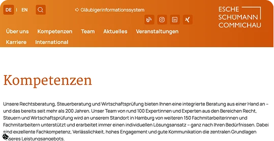
No responsive design
The existing site was desktop-only - a significant failure for a firm whose clients access information across devices, often on the move. Mobile usability was non-existent.
Attorney directory was hard to navigate
With 106+ professionals across multiple practice areas and seniority levels, finding the right contact was a friction-heavy experience. The directory lacked useful filtering and scannable layout.
A lawyer-like approach to every design element
The client was detail-focused and occasionally resistant to design decisions that felt subjective to them. Functionality, layout, and white space all sparked extended feedback rounds requiring documented justification.
News and publications lacked structure
he firm's thought leadership content - a genuine differentiator for a law firm - was buried and poorly structured. It wasn't surfacing the expertise that would build trust with prospective clients.
03 - User Flows
Three flows that define why someone visits a law firm website
Before any wireframe was sketched, I identified the three primary reasons a user visits a law firm's website. Every design decision was then evaluated against these flows - does this help or hinder the user reaching their goal?
Flow 01
Finding a specific lawyer or legal team
Redesigned data upload and management flow - reducing cognitive load for scientists managing multiple audio datasets.
Flow 02
Navigating services by area of law
A potential client with a specific legal need - M&A, employment law, tax - trying to understand whether the firm has relevant expertise and who they'd work with. Clarity and credibility are the primary needs.
Flow 03
Reading current legal news and publications
An existing or prospective client keeping up with legal developments relevant to their industry. Content discoverability and readability are the primary needs - this flow builds long-term trust.
04 - My Approach
Designing with a rationale for every decision
The moment I understood the client's feedback style, I adapted my working method. Instead of presenting designs and waiting for reactions, I built a rationale layer into every deliverable from the start.
Every annotated Figma screen included not just design specs, but a short written explanation of why each decision was made - framed in language a lawyer would find compelling: consistency, structure, risk reduction, precedent.
Why this arrow? - "It directs attention to the primary call-to-action, reducing ambiguity and decision fatigue for the user - consistent with established patterns in professional services digital design."
Why is this centred? - "Centring the headline creates visual hierarchy that signals importance - the same principle used in formal legal documents to distinguish section headers from body text."
Why is this card white and not grey? - "White creates contrast against the page background, making the card immediately scannable - reducing the cognitive load required to parse the directory."
01
User flow mapping
Mapped the three core user journeys before touching a single screen. This grounded every subsequent design decision in a documented user need - giving every choice a defensible rationale beyond personal preference.
02
Lo-fi wireframes with structural annotation
Wireframes were presented with structural annotations explaining information hierarchy choices - not just what was placed where, but why that placement served the user's goal for each specific flow.
03
Annotated Figma files with decision logic
Every hi-fi screen included a decision log - a short note per component explaining the design choice in terms the client would find compelling: consistency, clarity, structure, risk reduction. No decision was presented without its rationale.
04
Micro-presentations for complex decisions
For decisions that needed more context - the navigation structure, the attorney card design, the news layout - I prepared short slide decks showing alternatives considered and why the chosen approach best served the firm's users and brand.
05
Component library and dev handoff via Figma Dev Mode
All components were documented in Figma with full states, responsive behaviour, and WCAG accessibility annotations. Handoff via Dev Mode ensured the development team could implement without needing further design interpretation.
Terminology adapted for a legal audience
The main challenge was creating a fully accessible, modern website while maintaining visual elegance for a brand with decades of heritage. This wasn't a project with room to iterate slowly - every decision had to be right from the start.
Design question
Design language
Legal framing
Why use white space?
Creates breathing room, improves scanability, reduces cognitive load
"Structure and clarity - the same principles that make a well-drafted contract readable"
Why this typography?
Hierarchy signals importance, guides the eye to key information
"Precedent-based - follows established professional services conventions"
Why modular components?
Consistency across pages, easier to maintain, scalable
Risk reduction - consistent UI prevents errors and reduces ambiguity"
05 - Solution
A responsive, trustworthy digital presence - built to last
Despite the intensive feedback loop, the final design delivered a modern, credible website that genuinely reflects the firm's standing. The solution balanced visual clarity with the conservative, authoritative tone expected of a firm with Esche Schümann's heritage.

Final design - responsive across desktop, tablet, and mobile with consistent component system throughout
01
Responsive structure
Fully responsive layouts across desktop, tablet, and mobile - designed mobile-first for the first time in the firm's digital history.
02
Attorney directory
Intuitive, filterable attorney directory with scannable cards - making it fast to find the right contact by name, practice area, seniority, or language.
03
Modular news system
Restructured news and publications section with category filtering and clear authorship - surfacing the firm's thought leadership more effectively.
04
Component library
Full Figma component library with all interactive states, responsive variants, and WCAG accessibility annotations - ready for immediate implementation.
05
Figma Dev Mode handoff
Complete dev handoff via Figma Dev Mode - spacing, behaviour specs, responsive rules, and ARIA guidance fully documented to reduce implementation ambiguity.
06
WCAG accessibility
AA compliance baked in from the start - contrast ratios, focus states, label associations, and semantic structure all verified before handoff.
The hardest design skill isn't drawing screens - it's knowing how to speak the language of the person sitting across from you. With lawyers, that means structure, logic, and evidence. Once I learned to frame every design decision that way, the feedback loops shortened dramatically.
06 - Outcomes
A design approved - and a method that generalises
Design approved without further major revisions
Despite the client's intensive scrutiny of every element, the final design was approved without a further round of major revisions - the rationale-driven approach eliminated the ambiguity that typically fuels revision cycles.
First fully responsive version of the site
The redesign introduced genuine mobile responsiveness for the first time - bringing the firm's digital presence in line with the expectations of a modern professional services audience.
Development in progress - design complete
The design phase is complete and currently in implementation with the development team. The fully annotated Figma Dev Mode handoff has reduced back-and-forth between design and development significantly.
A reusable approach to demanding stakeholders
The rationale-driven design method - annotated Figma files, micro-presentations, legally-framed decision logic - is now a repeatable approach for any project where stakeholders come from high-scrutiny professional backgrounds.
07 - Key Takeaways
What this project reinforced
01
Design rationale is a deliverable
On projects with demanding or resistant stakeholders, the written justification for each decision is as important as the decision itself. Building this layer into the workflow from day one - not as a response to feedback, but as a proactive part of every file - changes how feedback lands.
02
Speak the client's professional language
Translating UX principles into terms a lawyer finds credible - structure, consistency, risk reduction, precedent - isn't a compromise. It's communication. The design didn't change; the framing did. And that framing made the difference between resistance and approval.
03
Scrutiny improves outcomes
The client's questioning of every element was exhausting in the moment - but it forced a level of rigour that produced a more considered, better-justified design. The outcome was stronger because every decision had been challenged and survived. Demanding clients make better work.
More Projects

Design System - WCAG - Figma
Ecclesia - a design system built in 53 hours.
Germany's leading insurance group had no design system. No component library. No shared UI language.
Read More

AI Platform - Dashboard UX
DFKI — Designing for
the Amazon Rainforest.
Full UX redesign of DFKI's AI-based ecological monitoring platform used by scientists.
Read More

UX/UI · Accessibility · WCAG 2.1 AA
Making Turkish Airlines
accessible for everyone.
A comprehensive WCAG 2.1 AA audit and redesign of the Turkish Airlines digital booking experience
Read More
AI Platform - Dashboard UX - Data Visualisation
Esche Schümann - designing
for those who question everything.
A full UX/UI redesign of Esche Schümann Commichau's digital presence - one of Hamburg's most established law firms - delivered in 22 hours. The design challenge was straightforward. The client challenge was not: every arrow, every alignment, every pixel of white space needed a rationale. This is how I turned that into a strength.
Client:
Esche Schümann Commichau
Role:
UX/UI Designer -
UX Researcher
Duration:
2-week sprint - 22 hours
Platform:
Research, Lo/Mid/Hi-fi, Component Library, Accessibility
01 - Context
Hamburg's leading law firm - with a digital presence that didn't match its reputation
Esche Schümann Commichau is one of Hamburg's most established multidisciplinary law firms, with over 200 years of heritage and 106 experts across law, tax, and auditing. Their client base spans national and international mid-market companies, corporations, and private clients.
The existing website lacked responsiveness, visual hierarchy, and the modern credibility expected of a firm of this stature. But the real design challenge wasn't technical - it was human. The client brought a lawyer's mindset to every design decision. Every element needed justification. Every choice was subject to questioning. Every round of feedback was exhaustive and precise.
Translating UX reasoning into language that felt natural to a legal audience - structured, logical, risk-aware - became as important as the design work itself.
0
0
Hours total sprint
0+
0+
Years of firm heritage
Years of firm heritage
0
0
Experts across law, tax, audit
Experts across law, tax, audit
0
0
Core user flows redesigned
Core user flows redesigned
02 - The Problem
Two problems in one project - technical and human
The website had clear UX failures: no responsive layout, poor visual hierarchy, an attorney directory that was hard to navigate, and a news system that felt disconnected from the firm's actual expertise. These were solvable.
The harder problem was the client dynamic. Lawyers are trained to question everything, to seek justification, to identify risk in every statement. Applied to a design process, this meant that every visual decision - an arrow direction, a card colour, the amount of white space between two elements - required a documented rationale before it could move forward.
No responsive design
The existing site was desktop-only - a significant failure for a firm whose clients access information across devices, often on the move. Mobile usability was non-existent.
Attorney directory was hard to navigate
With 106+ professionals across multiple practice areas and seniority levels, finding the right contact was a friction-heavy experience. The directory lacked useful filtering and scannable layout.
A lawyer-like approach to every design element
The client was detail-focused and occasionally resistant to design decisions that felt subjective to them. Functionality, layout, and white space all sparked extended feedback rounds requiring documented justification.
News and publications lacked structure
he firm's thought leadership content - a genuine differentiator for a law firm - was buried and poorly structured. It wasn't surfacing the expertise that would build trust with prospective clients.
03 - User Flows
Three flows that define why someone visits a law firm website
Before any wireframe was sketched, I identified the three primary reasons a user visits a law firm's website. Every design decision was then evaluated against these flows - does this help or hinder the user reaching their goal?
Flow 01
Finding a specific lawyer or legal team
Redesigned data upload and management flow - reducing cognitive load for scientists managing multiple audio datasets.
Flow 02
Navigating services by area of law
A potential client with a specific legal need - M&A, employment law, tax - trying to understand whether the firm has relevant expertise and who they'd work with. Clarity and credibility are the primary needs.
Flow 03
Reading current legal news and publications
An existing or prospective client keeping up with legal developments relevant to their industry. Content discoverability and readability are the primary needs - this flow builds long-term trust.
04 - My Approach
Designing with a rationale for every decision
The moment I understood the client's feedback style, I adapted my working method. Instead of presenting designs and waiting for reactions, I built a rationale layer into every deliverable from the start.
Every annotated Figma screen included not just design specs, but a short written explanation of why each decision was made - framed in language a lawyer would find compelling: consistency, structure, risk reduction, precedent.
Why this arrow? - "It directs attention to the primary call-to-action, reducing ambiguity and decision fatigue for the user - consistent with established patterns in professional services digital design."
Why is this centred? - "Centring the headline creates visual hierarchy that signals importance - the same principle used in formal legal documents to distinguish section headers from body text."
Why is this card white and not grey? - "White creates contrast against the page background, making the card immediately scannable - reducing the cognitive load required to parse the directory."
01
User flow mapping
Mapped the three core user journeys before touching a single screen. This grounded every subsequent design decision in a documented user need - giving every choice a defensible rationale beyond personal preference.
02
Lo-fi wireframes with structural annotation
Wireframes were presented with structural annotations explaining information hierarchy choices - not just what was placed where, but why that placement served the user's goal for each specific flow.
03
Annotated Figma files with decision logic
Every hi-fi screen included a decision log - a short note per component explaining the design choice in terms the client would find compelling: consistency, clarity, structure, risk reduction. No decision was presented without its rationale.
04
Micro-presentations for complex decisions
For decisions that needed more context - the navigation structure, the attorney card design, the news layout - I prepared short slide decks showing alternatives considered and why the chosen approach best served the firm's users and brand.
05
Component library and dev handoff via Figma Dev Mode
All components were documented in Figma with full states, responsive behaviour, and WCAG accessibility annotations. Handoff via Dev Mode ensured the development team could implement without needing further design interpretation.
Terminology adapted for a legal audience
The main challenge was creating a fully accessible, modern website while maintaining visual elegance for a brand with decades of heritage. This wasn't a project with room to iterate slowly - every decision had to be right from the start.
Design question
Design language
Legal framing
Why use white space?
Creates breathing room, improves scanability, reduces cognitive load
"Structure and clarity - the same principles that make a well-drafted contract readable"
Why this typography?
Hierarchy signals importance, guides the eye to key information
"Precedent-based - follows established professional services conventions"
Why modular components?
Consistency across pages, easier to maintain, scalable
Risk reduction - consistent UI prevents errors and reduces ambiguity"
05 - Solution
A responsive, trustworthy digital presence - built to last
Despite the intensive feedback loop, the final design delivered a modern, credible website that genuinely reflects the firm's standing. The solution balanced visual clarity with the conservative, authoritative tone expected of a firm with Esche Schümann's heritage.
Final design - responsive across desktop, tablet, and mobile with consistent component system throughout
01
Responsive structure
Fully responsive layouts across desktop, tablet, and mobile - designed mobile-first for the first time in the firm's digital history.
02
Attorney directory
Intuitive, filterable attorney directory with scannable cards - making it fast to find the right contact by name, practice area, seniority, or language.
03
Modular news system
Restructured news and publications section with category filtering and clear authorship - surfacing the firm's thought leadership more effectively.
04
Component library
Full Figma component library with all interactive states, responsive variants, and WCAG accessibility annotations - ready for immediate implementation.
05
Figma Dev Mode handoff
Complete dev handoff via Figma Dev Mode - spacing, behaviour specs, responsive rules, and ARIA guidance fully documented to reduce implementation ambiguity.
06
WCAG accessibility
AA compliance baked in from the start - contrast ratios, focus states, label associations, and semantic structure all verified before handoff.
The hardest design skill isn't drawing screens - it's knowing how to speak the language of the person sitting across from you. With lawyers, that means structure, logic, and evidence. Once I learned to frame every design decision that way, the feedback loops shortened dramatically.
06 - Outcomes
A design approved - and a method that generalises
Design approved without further major revisions
Despite the client's intensive scrutiny of every element, the final design was approved without a further round of major revisions - the rationale-driven approach eliminated the ambiguity that typically fuels revision cycles.
First fully responsive version of the site
The redesign introduced genuine mobile responsiveness for the first time - bringing the firm's digital presence in line with the expectations of a modern professional services audience.
Development in progress - design complete
The design phase is complete and currently in implementation with the development team. The fully annotated Figma Dev Mode handoff has reduced back-and-forth between design and development significantly.
A reusable approach to demanding stakeholders
The rationale-driven design method - annotated Figma files, micro-presentations, legally-framed decision logic - is now a repeatable approach for any project where stakeholders come from high-scrutiny professional backgrounds.
07 - Key Takeaways
What this project reinforced
01
Design rationale is a deliverable
On projects with demanding or resistant stakeholders, the written justification for each decision is as important as the decision itself. Building this layer into the workflow from day one - not as a response to feedback, but as a proactive part of every file - changes how feedback lands.
02
Speak the client's professional language
Translating UX principles into terms a lawyer finds credible - structure, consistency, risk reduction, precedent - isn't a compromise. It's communication. The design didn't change; the framing did. And that framing made the difference between resistance and approval.
03
Scrutiny improves outcomes
The client's questioning of every element was exhausting in the moment - but it forced a level of rigour that produced a more considered, better-justified design. The outcome was stronger because every decision had been challenged and survived. Demanding clients make better work.
More Projects
Design System - WCAG - Figma
Ecclesia - a design system built in 53 hours.
Germany's leading insurance group had no design system. No component library. No shared UI language.
Read More
AI Platform - Dashboard UX
DFKI — Designing for
the Amazon Rainforest.
Full UX redesign of DFKI's AI-based ecological monitoring platform used by scientists.
Read More
UX/UI · Accessibility · WCAG 2.1 AA
Making Turkish Airlines
accessible for everyone.
A comprehensive WCAG 2.1 AA audit and redesign of the Turkish Airlines digital booking experience
Read More
AI Platform - Dashboard UX - Data Visualisation
Esche Schümann - designing
for those who question everything.
A full UX/UI redesign of Esche Schümann Commichau's digital presence - one of Hamburg's most established law firms - delivered in 22 hours. The design challenge was straightforward. The client challenge was not: every arrow, every alignment, every pixel of white space needed a rationale. This is how I turned that into a strength.
Client:
Esche Schümann Commichau
Role:
UX/UI Designer -
UX Researcher
Duration:
2-week sprint - 22 hours
Platform:
Research, Lo/Mid/Hi-fi, Component Library, Accessibility
01 - Context
Hamburg's leading law firm - with a digital presence that didn't match its reputation
Esche Schümann Commichau is one of Hamburg's most established multidisciplinary law firms, with over 200 years of heritage and 106 experts across law, tax, and auditing. Their client base spans national and international mid-market companies, corporations, and private clients.
The existing website lacked responsiveness, visual hierarchy, and the modern credibility expected of a firm of this stature. But the real design challenge wasn't technical - it was human. The client brought a lawyer's mindset to every design decision. Every element needed justification. Every choice was subject to questioning. Every round of feedback was exhaustive and precise.
Translating UX reasoning into language that felt natural to a legal audience - structured, logical, risk-aware - became as important as the design work itself.
0
0
Hours total sprint
0+
0+
Years of firm heritage
Years of firm heritage
0
0
Experts across law, tax, audit
Experts across law, tax, audit
0
0
Core user flows redesigned
Core user flows redesigned
02 - The Problem
Two problems in one project - technical and human
The website had clear UX failures: no responsive layout, poor visual hierarchy, an attorney directory that was hard to navigate, and a news system that felt disconnected from the firm's actual expertise. These were solvable.
The harder problem was the client dynamic. Lawyers are trained to question everything, to seek justification, to identify risk in every statement. Applied to a design process, this meant that every visual decision - an arrow direction, a card colour, the amount of white space between two elements - required a documented rationale before it could move forward.
No responsive design
The existing site was desktop-only - a significant failure for a firm whose clients access information across devices, often on the move. Mobile usability was non-existent.
Attorney directory was hard to navigate
With 106+ professionals across multiple practice areas and seniority levels, finding the right contact was a friction-heavy experience. The directory lacked useful filtering and scannable layout.
A lawyer-like approach to every design element
The client was detail-focused and occasionally resistant to design decisions that felt subjective to them. Functionality, layout, and white space all sparked extended feedback rounds requiring documented justification.
News and publications lacked structure
he firm's thought leadership content - a genuine differentiator for a law firm - was buried and poorly structured. It wasn't surfacing the expertise that would build trust with prospective clients.
03 - User Flows
Three flows that define why someone visits a law firm website
Before any wireframe was sketched, I identified the three primary reasons a user visits a law firm's website. Every design decision was then evaluated against these flows - does this help or hinder the user reaching their goal?
Flow 01
Finding a specific lawyer or legal team
Redesigned data upload and management flow - reducing cognitive load for scientists managing multiple audio datasets.
Flow 02
Navigating services by area of law
A potential client with a specific legal need - M&A, employment law, tax - trying to understand whether the firm has relevant expertise and who they'd work with. Clarity and credibility are the primary needs.
Flow 03
Reading current legal news and publications
An existing or prospective client keeping up with legal developments relevant to their industry. Content discoverability and readability are the primary needs - this flow builds long-term trust.
04 - My Approach
Designing with a rationale for every decision
The moment I understood the client's feedback style, I adapted my working method. Instead of presenting designs and waiting for reactions, I built a rationale layer into every deliverable from the start.
Every annotated Figma screen included not just design specs, but a short written explanation of why each decision was made - framed in language a lawyer would find compelling: consistency, structure, risk reduction, precedent.
Why this arrow? - "It directs attention to the primary call-to-action, reducing ambiguity and decision fatigue for the user - consistent with established patterns in professional services digital design."
Why is this centred? - "Centring the headline creates visual hierarchy that signals importance - the same principle used in formal legal documents to distinguish section headers from body text."
Why is this card white and not grey? - "White creates contrast against the page background, making the card immediately scannable - reducing the cognitive load required to parse the directory."
01
User flow mapping
Mapped the three core user journeys before touching a single screen. This grounded every subsequent design decision in a documented user need - giving every choice a defensible rationale beyond personal preference.
02
Lo-fi wireframes with structural annotation
Wireframes were presented with structural annotations explaining information hierarchy choices - not just what was placed where, but why that placement served the user's goal for each specific flow.
03
Annotated Figma files with decision logic
Every hi-fi screen included a decision log - a short note per component explaining the design choice in terms the client would find compelling: consistency, clarity, structure, risk reduction. No decision was presented without its rationale.
04
Micro-presentations for complex decisions
For decisions that needed more context - the navigation structure, the attorney card design, the news layout - I prepared short slide decks showing alternatives considered and why the chosen approach best served the firm's users and brand.
05
Component library and dev handoff via Figma Dev Mode
All components were documented in Figma with full states, responsive behaviour, and WCAG accessibility annotations. Handoff via Dev Mode ensured the development team could implement without needing further design interpretation.
Terminology adapted for a legal audience
The main challenge was creating a fully accessible, modern website while maintaining visual elegance for a brand with decades of heritage. This wasn't a project with room to iterate slowly - every decision had to be right from the start.
Design question
Design language
Legal framing
Why use white space?
Creates breathing room, improves scanability, reduces cognitive load
"Structure and clarity - the same principles that make a well-drafted contract readable"
Why this typography?
Hierarchy signals importance, guides the eye to key information
"Precedent-based - follows established professional services conventions"
Why modular components?
Consistency across pages, easier to maintain, scalable
Risk reduction - consistent UI prevents errors and reduces ambiguity"
05 - Solution
A responsive, trustworthy digital presence - built to last
Despite the intensive feedback loop, the final design delivered a modern, credible website that genuinely reflects the firm's standing. The solution balanced visual clarity with the conservative, authoritative tone expected of a firm with Esche Schümann's heritage.
Final design - responsive across desktop, tablet, and mobile with consistent component system throughout
01
Responsive structure
Fully responsive layouts across desktop, tablet, and mobile - designed mobile-first for the first time in the firm's digital history.
02
Attorney directory
Intuitive, filterable attorney directory with scannable cards - making it fast to find the right contact by name, practice area, seniority, or language.
03
Modular news system
Restructured news and publications section with category filtering and clear authorship - surfacing the firm's thought leadership more effectively.
04
Component library
Full Figma component library with all interactive states, responsive variants, and WCAG accessibility annotations - ready for immediate implementation.
05
Figma Dev Mode handoff
Complete dev handoff via Figma Dev Mode - spacing, behaviour specs, responsive rules, and ARIA guidance fully documented to reduce implementation ambiguity.
06
WCAG accessibility
AA compliance baked in from the start - contrast ratios, focus states, label associations, and semantic structure all verified before handoff.
The hardest design skill isn't drawing screens - it's knowing how to speak the language of the person sitting across from you. With lawyers, that means structure, logic, and evidence. Once I learned to frame every design decision that way, the feedback loops shortened dramatically.
06 - Outcomes
A design approved - and a method that generalises
Design approved without further major revisions
Despite the client's intensive scrutiny of every element, the final design was approved without a further round of major revisions - the rationale-driven approach eliminated the ambiguity that typically fuels revision cycles.
First fully responsive version of the site
The redesign introduced genuine mobile responsiveness for the first time - bringing the firm's digital presence in line with the expectations of a modern professional services audience.
Development in progress - design complete
The design phase is complete and currently in implementation with the development team. The fully annotated Figma Dev Mode handoff has reduced back-and-forth between design and development significantly.
A reusable approach to demanding stakeholders
The rationale-driven design method - annotated Figma files, micro-presentations, legally-framed decision logic - is now a repeatable approach for any project where stakeholders come from high-scrutiny professional backgrounds.
07 - Key Takeaways
What this project reinforced
01
Design rationale is a deliverable
On projects with demanding or resistant stakeholders, the written justification for each decision is as important as the decision itself. Building this layer into the workflow from day one - not as a response to feedback, but as a proactive part of every file - changes how feedback lands.
02
Speak the client's professional language
Translating UX principles into terms a lawyer finds credible - structure, consistency, risk reduction, precedent - isn't a compromise. It's communication. The design didn't change; the framing did. And that framing made the difference between resistance and approval.
03
Scrutiny improves outcomes
The client's questioning of every element was exhausting in the moment - but it forced a level of rigour that produced a more considered, better-justified design. The outcome was stronger because every decision had been challenged and survived. Demanding clients make better work.
More Projects
Design System - WCAG - Figma
Ecclesia - a design system built in 53 hours.
Germany's leading insurance group had no design system. No component library. No shared UI language.
Read More
AI Platform - Dashboard UX
DFKI — Designing for
the Amazon Rainforest.
Full UX redesign of DFKI's AI-based ecological monitoring platform used by scientists.
Read More
UX/UI · Accessibility · WCAG 2.1 AA
Making Turkish Airlines
accessible for everyone.
A comprehensive WCAG 2.1 AA audit and redesign of the Turkish Airlines digital booking experience