UX/UI · Accessibility · WCAG 2.1 AA
Ecclesia - a design system
built in 53 hours.
Germany's leading insurance group had no design system. No component library. No shared UI language between design and development. I built one from scratch - atoms to templates, WCAG compliant, dev-ready - under a tight deadline and with a client who had seen everything and liked nothing.
Client:
Ecclesia Group
Role:
Sr. UX/UI Designer
Duration:
2-week sprint
Platform:
Research, Lo/Mid/Hi-fi, Component Library, Accessibility

01 - Context
Germany's leading insurance group - with no design language
Ecclesia Group is one of Germany's most established insurance companies, with decades of brand history and a client base spanning corporate and private sectors. When Sunzinet was brought in to redesign their digital presence, the brief was clear: modern, trustworthy, and accessible.
What wasn't clear was the foundation. Ecclesia had no existing design system - no component library, no defined UI patterns, no documented tokens. Every past design decision lived in the heads of individual team members or scattered across disconnected files.
Building a credible, scalable website for an organisation of this size without a system underneath it isn't just slow - it's risky. Inconsistency at this scale erodes trust. And for an insurance company, trust is the entire product.
"Everyone in our company usually has something to criticize. But this time, no one had anything negative to say - everyone loved it."
0+
0+
Total hours
0
0
Design system from scratch
Design system from scratch
0+
0+
Component built
AA
WCAG Compliance level
WCAG Compliance level
02 - Key Challenges
Four constraints that shaped every decision
The main challenge was creating a fully accessible, modern website while maintaining visual elegance for a brand with decades of heritage. This wasn't a project with room to iterate slowly - every decision had to be right from the start.
53 hours. No extensions.
The total timeline from kickoff to dev-ready handoff was fixed. Research, system architecture, component build, screen design, and accessibility audit all had to fit inside that window - no buffer, no phased delivery.
A client with high standards and low trust
Ecclesia had worked with agencies before and been disappointed. They were detail-oriented, brand-protective, and experienced enough to spot shortcuts. The system had to be genuinely good - not just visually polished but structurally sound.
WCAG compliance was non-negotiable
As a major financial institution, Ecclesia needed to meet EU accessibility requirements. The client was occasionally resistant to accessibility standards - translating WCAG into design value, not design compromise, was central to the project's success.
Developer handoff had to be immediate
There was no design-to-development buffer. The moment design was approved, development would begin - meaning every component needed complete annotations, states, and responsive rules in Figma Dev Mode, ready to ship.
03 - My Approach
System first. Screens second. On purpose.
The main challenge was creating a fully accessible, modern website while maintaining visual elegance for a brand with decades of heritage. This wasn't a project with room to iterate slowly - every decision had to be right from the start.
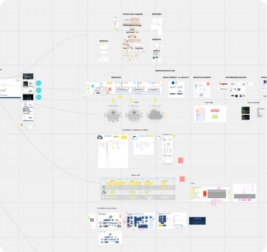
Key page templates designed:
01
Mega Menu
Complex multi-level navigation with full keyboard accessibility and focus management built in from the start.
02
Start page
Hero, feature blocks, trust signals - all assembled from system components with no one-off design decisions.
03
Industry page (Branchenseite)
Sector-specific content pages requiring flexible layout patterns that scale across multiple insurance categories.
04
Services, Newsroom, Job list
Content-heavy pages with filtering, pagination, and dynamic content - all handled through modular components.
04 - Solution
Component Library + Figma Dev Mode Handoff
All pages were built from modular, reusable components structured using atomic design principles - atoms to templates, every interactive state documented. No screen was built with a local style or one-off component.
Handoff was completed via Figma Dev Mode with full annotations for spacing, behaviour, and responsive rules. I also participated in a QA session post-implementation to ensure design quality was preserved through development.
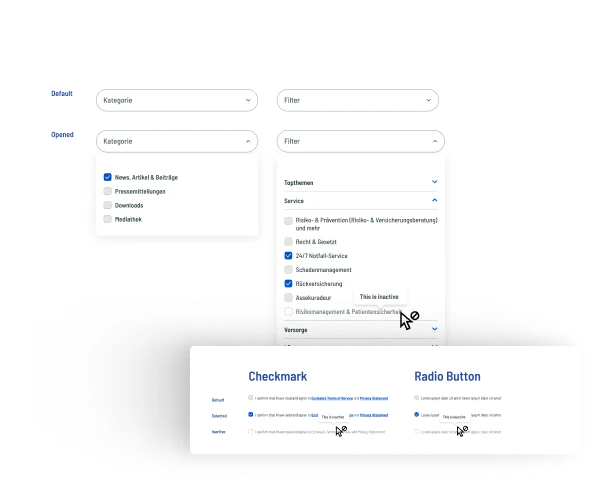
Component library in Figma - atoms to templates, 80+ components, all states documented
01
Design Tokens
Colour, typography, spacing, radius - all defined as semantic tokens mapped directly to CSS variables for development.
02
Component Library
80+ components built atomically - every variant, every interactive state (default, hover, focus, active, disabled, error).
03
Page Templates
6 full page templates assembled from system components - desktop, tablet, and mobile breakpoints for each.
04
Design Tokens
Colour, typography, spacing, radius - all defined as semantic tokens mapped directly to CSS variables for development.
05
Component Library
80+ components built atomically - every variant, every interactive state (default, hover, focus, active, disabled, error).
06
Page Templates
6 full page templates assembled from system components - desktop, tablet, and mobile breakpoints for each.
05 - Accessibility
WCAG 2.1 AA built in -
not bolted on
Accessibility was defined at the token level - meaning it couldn't accidentally be overridden during component build or screen design. Every colour pairing was checked before it was defined as a token. Every interactive component was built with its focus state as a first-class element, not an afterthought.
1.4.3 - Contrast
All text passes 4.5:1 minimum
Primary text achieves 16.4:1. Secondary text achieves 5.1:1. All token combinations pre-validated before being added to the system.
BUILT INTO TOKENS
2.4.7 - Focus Visible
Focus ring on every interactive element
3px solid focus ring defined in the base button atom and inherited by all interactive components - never removed or overridden.
BUILT INTO ATOMS
1.3.1 - Info and Relationships
All form labels programmatically associated
Every input has a defined label association in the component spec, with ARIA guidance included in Dev Mode handoff notes.
ANNOTATED FOR DEV
3.3.1 - Error Identification
Errors use icon + text, not colour alone
Error states use a warning icon, descriptive message, and border change - never just colour. Works for colour-blind users without adaptation.
BUILT INTO MOLECULES
1.4.11 - Non-text Contrast
UI components pass 3:1 against backgrounds
Input borders, button outlines, and icon colours all checked against the surfaces they appear on. No UI component relies on a contrast ratio below 3:1.
BUILT INTO TOKENS
4.1.2 - Name, Role, Value
ARIA roles defined for all custom components
Dropdowns, accordions, and modals include full ARIA annotations - expected roles, accessible names, and state communication included in handoff.
ANNOTATED FOR DEV
06 — Outcomes
What was delivered - and what it enabled

07 - Key takeaways
What this project taught me
01
Accessibility sells as business value
Stakeholder resistance to WCAG dissolved once it was framed as brand trust and legal risk reduction - not technical overhead. The language you use around accessibility matters as much as the implementation.
02
System before screens - always
Building the component library first, even under time pressure, eliminated inconsistency and saved significant time in both design iteration and developer handoff. Constraints sharpen decisions.
03
A solid foundation creates compounding value
The component library is now being reused across partner microsites - a single 53-hour investment that continues to deliver value long after the original project closed.
More Projects

AI Platform - Dashboard UX
DFKI — Designing for
the Amazon Rainforest.
Full UX redesign of DFKI's AI-based ecological monitoring platform used by scientists.
Read More

UX/UI · Accessibility · WCAG 2.1 AA
Esche Schümann - designing
for who question everything.
UX/UI redesign of Esche Schümann Commichau's digital presence delivered in 22 hours.
Read More

UX/UI · Accessibility · WCAG 2.1 AA
Making Turkish Airlines
accessible for everyone.
A comprehensive WCAG 2.1 AA audit and redesign of the Turkish Airlines digital booking experience
Read More
UX/UI · Accessibility · WCAG 2.1 AA
Ecclesia - a design system
built in 53 hours.
Germany's leading insurance group had no design system. No component library. No shared UI language between design and development. I built one from scratch - atoms to templates, WCAG compliant, dev-ready - under a tight deadline and with a client who had seen everything and liked nothing.
Client:
Ecclesia Group
Role:
Sr. UX/UI Designer
Duration:
2-week sprint
Platform:
Research, Lo/Mid/Hi-fi, Component Library, Accessibility
01 - Context
Germany's leading insurance group - with no design language
Ecclesia Group is one of Germany's most established insurance companies, with decades of brand history and a client base spanning corporate and private sectors. When Sunzinet was brought in to redesign their digital presence, the brief was clear: modern, trustworthy, and accessible.
What wasn't clear was the foundation. Ecclesia had no existing design system - no component library, no defined UI patterns, no documented tokens. Every past design decision lived in the heads of individual team members or scattered across disconnected files.
Building a credible, scalable website for an organisation of this size without a system underneath it isn't just slow - it's risky. Inconsistency at this scale erodes trust. And for an insurance company, trust is the entire product.
"Everyone in our company usually has something to criticize. But this time, no one had anything negative to say - everyone loved it."
0+
0+
Total hours
0
0
Design system from scratch
Design system from scratch
0+
0+
Component built
AA
WCAG Compliance level
WCAG Compliance level
02 - Key Challenges
Four constraints that shaped every decision
The main challenge was creating a fully accessible, modern website while maintaining visual elegance for a brand with decades of heritage. This wasn't a project with room to iterate slowly - every decision had to be right from the start.
53 hours. No extensions.
The total timeline from kickoff to dev-ready handoff was fixed. Research, system architecture, component build, screen design, and accessibility audit all had to fit inside that window - no buffer, no phased delivery.
A client with high standards and low trust
Ecclesia had worked with agencies before and been disappointed. They were detail-oriented, brand-protective, and experienced enough to spot shortcuts. The system had to be genuinely good - not just visually polished but structurally sound.
WCAG compliance was non-negotiable
As a major financial institution, Ecclesia needed to meet EU accessibility requirements. The client was occasionally resistant to accessibility standards - translating WCAG into design value, not design compromise, was central to the project's success.
Developer handoff had to be immediate
There was no design-to-development buffer. The moment design was approved, development would begin - meaning every component needed complete annotations, states, and responsive rules in Figma Dev Mode, ready to ship.
03 - My Approach
System first. Screens second. On purpose.
The main challenge was creating a fully accessible, modern website while maintaining visual elegance for a brand with decades of heritage. This wasn't a project with room to iterate slowly - every decision had to be right from the start.
Key page templates designed:
01
Mega Menu
Complex multi-level navigation with full keyboard accessibility and focus management built in from the start.
02
Start page
Hero, feature blocks, trust signals - all assembled from system components with no one-off design decisions.
03
Industry page (Branchenseite)
Sector-specific content pages requiring flexible layout patterns that scale across multiple insurance categories.
04
Services, Newsroom, Job list
Content-heavy pages with filtering, pagination, and dynamic content - all handled through modular components.
04 - Solution
Component Library + Figma Dev Mode Handoff
All pages were built from modular, reusable components structured using atomic design principles - atoms to templates, every interactive state documented. No screen was built with a local style or one-off component.
Handoff was completed via Figma Dev Mode with full annotations for spacing, behaviour, and responsive rules. I also participated in a QA session post-implementation to ensure design quality was preserved through development.
Component library in Figma - atoms to templates, 80+ components, all states documented
01
Design Tokens
Colour, typography, spacing, radius - all defined as semantic tokens mapped directly to CSS variables for development.
02
Component Library
80+ components built atomically - every variant, every interactive state (default, hover, focus, active, disabled, error).
03
Page Templates
6 full page templates assembled from system components - desktop, tablet, and mobile breakpoints for each.
04
Design Tokens
Colour, typography, spacing, radius - all defined as semantic tokens mapped directly to CSS variables for development.
05
Component Library
80+ components built atomically - every variant, every interactive state (default, hover, focus, active, disabled, error).
06
Page Templates
6 full page templates assembled from system components - desktop, tablet, and mobile breakpoints for each.
05 - Accessibility
WCAG 2.1 AA built in -
not bolted on
Accessibility was defined at the token level - meaning it couldn't accidentally be overridden during component build or screen design. Every colour pairing was checked before it was defined as a token. Every interactive component was built with its focus state as a first-class element, not an afterthought.
1.4.3 - Contrast
All text passes 4.5:1 minimum
Primary text achieves 16.4:1. Secondary text achieves 5.1:1. All token combinations pre-validated before being added to the system.
BUILT INTO TOKENS
2.4.7 - Focus Visible
Focus ring on every interactive element
3px solid focus ring defined in the base button atom and inherited by all interactive components - never removed or overridden.
BUILT INTO ATOMS
1.3.1 - Info and Relationships
All form labels programmatically associated
Every input has a defined label association in the component spec, with ARIA guidance included in Dev Mode handoff notes.
ANNOTATED FOR DEV
3.3.1 - Error Identification
Errors use icon + text, not colour alone
Error states use a warning icon, descriptive message, and border change - never just colour. Works for colour-blind users without adaptation.
BUILT INTO MOLECULES
1.4.11 - Non-text Contrast
UI components pass 3:1 against backgrounds
Input borders, button outlines, and icon colours all checked against the surfaces they appear on. No UI component relies on a contrast ratio below 3:1.
BUILT INTO TOKENS
4.1.2 - Name, Role, Value
ARIA roles defined for all custom components
Dropdowns, accordions, and modals include full ARIA annotations - expected roles, accessible names, and state communication included in handoff.
ANNOTATED FOR DEV
06 — Outcomes
What was delivered - and what it enabled
07 - Key takeaways
What this project taught me
01
Accessibility sells as business value
Stakeholder resistance to WCAG dissolved once it was framed as brand trust and legal risk reduction - not technical overhead. The language you use around accessibility matters as much as the implementation.
02
System before screens - always
Building the component library first, even under time pressure, eliminated inconsistency and saved significant time in both design iteration and developer handoff. Constraints sharpen decisions.
03
A solid foundation creates compounding value
The component library is now being reused across partner microsites - a single 53-hour investment that continues to deliver value long after the original project closed.
More Projects
AI Platform - Dashboard UX
DFKI — Designing for
the Amazon Rainforest.
Full UX redesign of DFKI's AI-based ecological monitoring platform used by scientists.
Read More
UX/UI · Accessibility · WCAG 2.1 AA
Esche Schümann - designing
for who question everything.
UX/UI redesign of Esche Schümann Commichau's digital presence delivered in 22 hours.
Read More
UX/UI · Accessibility · WCAG 2.1 AA
Making Turkish Airlines
accessible for everyone.
A comprehensive WCAG 2.1 AA audit and redesign of the Turkish Airlines digital booking experience
Read More
UX/UI · Accessibility · WCAG 2.1 AA
Ecclesia - a design system
built in 53 hours.
Germany's leading insurance group had no design system. No component library. No shared UI language between design and development. I built one from scratch - atoms to templates, WCAG compliant, dev-ready - under a tight deadline and with a client who had seen everything and liked nothing.
Client:
Ecclesia Group
Role:
Sr. UX/UI Designer
Duration:
2-week sprint
Platform:
Research, Lo/Mid/Hi-fi, Component Library, Accessibility
01 - Context
Germany's leading insurance group - with no design language
Ecclesia Group is one of Germany's most established insurance companies, with decades of brand history and a client base spanning corporate and private sectors. When Sunzinet was brought in to redesign their digital presence, the brief was clear: modern, trustworthy, and accessible.
What wasn't clear was the foundation. Ecclesia had no existing design system - no component library, no defined UI patterns, no documented tokens. Every past design decision lived in the heads of individual team members or scattered across disconnected files.
Building a credible, scalable website for an organisation of this size without a system underneath it isn't just slow - it's risky. Inconsistency at this scale erodes trust. And for an insurance company, trust is the entire product.
"Everyone in our company usually has something to criticize. But this time, no one had anything negative to say - everyone loved it."
0+
0+
Total hours
0
0
Design system from scratch
Design system from scratch
0+
0+
Component built
AA
WCAG Compliance level
WCAG Compliance level
02 - Key Challenges
Four constraints that shaped every decision
The main challenge was creating a fully accessible, modern website while maintaining visual elegance for a brand with decades of heritage. This wasn't a project with room to iterate slowly - every decision had to be right from the start.
53 hours. No extensions.
The total timeline from kickoff to dev-ready handoff was fixed. Research, system architecture, component build, screen design, and accessibility audit all had to fit inside that window - no buffer, no phased delivery.
A client with high standards and low trust
Ecclesia had worked with agencies before and been disappointed. They were detail-oriented, brand-protective, and experienced enough to spot shortcuts. The system had to be genuinely good - not just visually polished but structurally sound.
WCAG compliance was non-negotiable
As a major financial institution, Ecclesia needed to meet EU accessibility requirements. The client was occasionally resistant to accessibility standards - translating WCAG into design value, not design compromise, was central to the project's success.
Developer handoff had to be immediate
There was no design-to-development buffer. The moment design was approved, development would begin - meaning every component needed complete annotations, states, and responsive rules in Figma Dev Mode, ready to ship.
03 - My Approach
System first. Screens second. On purpose.
The main challenge was creating a fully accessible, modern website while maintaining visual elegance for a brand with decades of heritage. This wasn't a project with room to iterate slowly - every decision had to be right from the start.
Key page templates designed:
01
Mega Menu
Complex multi-level navigation with full keyboard accessibility and focus management built in from the start.
02
Start page
Hero, feature blocks, trust signals - all assembled from system components with no one-off design decisions.
03
Industry page (Branchenseite)
Sector-specific content pages requiring flexible layout patterns that scale across multiple insurance categories.
04
Services, Newsroom, Job list
Content-heavy pages with filtering, pagination, and dynamic content - all handled through modular components.
04 - Solution
Component Library + Figma Dev Mode Handoff
All pages were built from modular, reusable components structured using atomic design principles - atoms to templates, every interactive state documented. No screen was built with a local style or one-off component.
Handoff was completed via Figma Dev Mode with full annotations for spacing, behaviour, and responsive rules. I also participated in a QA session post-implementation to ensure design quality was preserved through development.
Component library in Figma - atoms to templates, 80+ components, all states documented
01
Design Tokens
Colour, typography, spacing, radius - all defined as semantic tokens mapped directly to CSS variables for development.
02
Component Library
80+ components built atomically - every variant, every interactive state (default, hover, focus, active, disabled, error).
03
Page Templates
6 full page templates assembled from system components - desktop, tablet, and mobile breakpoints for each.
04
Design Tokens
Colour, typography, spacing, radius - all defined as semantic tokens mapped directly to CSS variables for development.
05
Component Library
80+ components built atomically - every variant, every interactive state (default, hover, focus, active, disabled, error).
06
Page Templates
6 full page templates assembled from system components - desktop, tablet, and mobile breakpoints for each.
05 - Accessibility
WCAG 2.1 AA built in -
not bolted on
Accessibility was defined at the token level - meaning it couldn't accidentally be overridden during component build or screen design. Every colour pairing was checked before it was defined as a token. Every interactive component was built with its focus state as a first-class element, not an afterthought.
1.4.3 - Contrast
All text passes 4.5:1 minimum
Primary text achieves 16.4:1. Secondary text achieves 5.1:1. All token combinations pre-validated before being added to the system.
BUILT INTO TOKENS
2.4.7 - Focus Visible
Focus ring on every interactive element
3px solid focus ring defined in the base button atom and inherited by all interactive components - never removed or overridden.
BUILT INTO ATOMS
1.3.1 - Info and Relationships
All form labels programmatically associated
Every input has a defined label association in the component spec, with ARIA guidance included in Dev Mode handoff notes.
ANNOTATED FOR DEV
3.3.1 - Error Identification
Errors use icon + text, not colour alone
Error states use a warning icon, descriptive message, and border change - never just colour. Works for colour-blind users without adaptation.
BUILT INTO MOLECULES
1.4.11 - Non-text Contrast
UI components pass 3:1 against backgrounds
Input borders, button outlines, and icon colours all checked against the surfaces they appear on. No UI component relies on a contrast ratio below 3:1.
BUILT INTO TOKENS
4.1.2 - Name, Role, Value
ARIA roles defined for all custom components
Dropdowns, accordions, and modals include full ARIA annotations - expected roles, accessible names, and state communication included in handoff.
ANNOTATED FOR DEV
06 — Outcomes
What was delivered - and what it enabled
07 - Key takeaways
What this project taught me
01
Accessibility sells as business value
Stakeholder resistance to WCAG dissolved once it was framed as brand trust and legal risk reduction - not technical overhead. The language you use around accessibility matters as much as the implementation.
02
System before screens - always
Building the component library first, even under time pressure, eliminated inconsistency and saved significant time in both design iteration and developer handoff. Constraints sharpen decisions.
03
A solid foundation creates compounding value
The component library is now being reused across partner microsites - a single 53-hour investment that continues to deliver value long after the original project closed.
More Projects
AI Platform - Dashboard UX
DFKI — Designing for
the Amazon Rainforest.
Full UX redesign of DFKI's AI-based ecological monitoring platform used by scientists.
Read More
UX/UI · Accessibility · WCAG 2.1 AA
Esche Schümann - designing
for who question everything.
UX/UI redesign of Esche Schümann Commichau's digital presence delivered in 22 hours.
Read More
UX/UI · Accessibility · WCAG 2.1 AA
Making Turkish Airlines
accessible for everyone.
A comprehensive WCAG 2.1 AA audit and redesign of the Turkish Airlines digital booking experience