Mobile UX - Wellness App - Research - Usability Testing
Wellcam - designing a companion for mental well-being.
A full UX process for a mental wellness companion app - from user interviews and surveys through competitor analysis, persona development, MoSCoW prioritisation, user flows, and three rounds of design iteration driven by real usability testing. Built to feel warm, not clinical.
Client:
Mental Wellness App
Role:
UX/UI Designer -
UX Researcher
Duration:
2-week sprint
Deliverables:
Research, Lo/Mid/Hi-fi, Prototype, Usability Testing

01 - Context
A wellness app built around people - not features
Wellcam was designed to serve as a reliable companion for users on their mental wellness journey - offering practical tools, personalised guidance, and a supportive experience that feels human rather than transactional.
The mental wellness app market is crowded and competitive. Most existing solutions feel either overly clinical, aggressively gamified, or built for habit tracking rather than genuine emotional support. The design goal was to create something that felt like a warm embrace - a digital space where users could find support whenever they needed it, without friction or judgement.
This project followed a complete UX process - starting with research to genuinely understand user needs, not assume them - and iterated based on what real users told us in usability testing.
0
0
Weeks full sprint
0+
0+
Rounds of iteration
Rounds of iteration
0+
0+
Competitors analysed
Competitors analysed
0
0
Core features: Mood Mentor + Planner
Core features: Mood Mentor + Planner
02 - Research
We didn't guess - we listened
The research phase combined user interviews and surveys to understand what people actually struggle with in their mental wellness journey - and what they expect from an app designed to support them. The goal was to ground every feature decision in real user insight, not designer assumption.
Survey results surfaced several clear priorities: users wanted personalised guidance tailored to their situation, a sense of progression that felt meaningful rather than gamified, and an experience that didn't feel like another task on their to-do list.


Survey results - identifying the specific areas users expect a wellness app to prioritise

Key research insights - understanding the emotional and practical needs behind the wellness journey
Users don't want another app that tracks their habits. They want something that understands their situation and responds to it - like a friend who checks in, not a coach who grades you.
03 - Competitor Analysis
What the market gets right - and where it falls short
Competitor analysis was driven by what users themselves recommended in survey responses - giving us a picture of what already resonates with the target audience, and where the gaps are. Five clear strategic opportunities emerged from the analysis.

Sense of progression
Most apps gamify progress in ways that feel hollow. The opportunity was to create progression that felt personally meaningful - tied to the user's own goals, not generic streaks.
KEY OPPORTUNITY
Personalised tips
Generic wellness advice is everywhere. Users wanted guidance that responded to their specific situation and mood - not a one-size content feed.
KEY OPPORTUNITY
Incentive design
Existing apps use streaks and badges to drive engagement - but these create anxiety when broken. A gentler incentive model was needed.
KEY OPPORTUNITY
Interactive design
The most-used wellness features are passive - reading, listening. Users wanted something more interactive and responsive to how they were feeling in the moment.
KEY OPPORTUNITY
04 - Users
Carla - our primary persona
The persona was built from interview and survey insights - representing users who are seeking support and understanding in their mental wellness journey, whether they are tech-savvy or simply looking for a helping hand. Carla is not an "ideal user" - she is a realistic composite of what we heard from real people.


Carla - primary persona representing users seeking accessible, personalised mental wellness support
05 - Ideation
Features built from user needs - prioritised with MoSCoW
Feature ideation was driven by research findings - not brainstorming in a vacuum. Every proposed feature was traced back to a specific user need identified in interviews or surveys. The MoSCoW method was then used to prioritise ruthlessly within a two-week timeline.


Feature mapping - connecting research insights to concrete design opportunities


MoSCoW method - prioritising features for the two-week design sprint
Mood Mentor
A personalised check-in tool that responds to how the user is feeling in the moment - offering tailored content, exercises, or simply acknowledgment.
MUST HAVE
The Planner
A personal planning tool that helps users structure their wellness intentions without creating the pressure of a rigid habit tracker.
MUST HAVE
Progress bar
A visual progression indicator that feels encouraging rather than punishing - showing movement without making the user feel they've failed when they miss a day.
SHOULD HAVE
06 - User Flow
Finding the happy path - after many wrong ones
The user flow phase was the most challenging part of the project. The initial attempt to map the task flow revealed a common trap: designing from the designer's perspective rather than the user's path. The first flow was complicated, branching, and confused rather than guided.
After stepping back and revisiting the research, a clearer, simpler flow emerged - one that followed how users actually think about their wellness journey, not how a designer thinks about app architecture.

First attempt - overly complex, designer-perspective flow that didn't reflect real user mental models

Final flow - a clean, user-centred happy path that follows real user intentions
07 - Design Iterations
From lo-fi sketches to usability-tested hi-fi
The design process moved from rapid lo-fi sketching - with team voting on the strongest ideas from each version - through to mid-fi actualization and finally hi-fi screens. Usability testing at each stage drove meaningful changes, not cosmetic ones.

Lo-fi wireframes - rapid sketching with team voting to identify the strongest layout approaches
streamlined the picture-taking process
In user interviews, we streamlined the picture taking process, allowing users to opt out a "Don't ask me again" feature, guided my usability heuristics
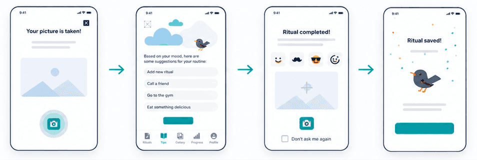

Improved the progress experience
We adjusted the progress bar for better effectiveness and simplified how rewards are presented
07 - Visual Direction
Calming, welcoming, human
The visual direction was built around one principle: the app should feel like a warm embrace, not a productivity tool. Colour, typography, and spacing were all chosen to reduce visual anxiety rather than add to it - soothing tones, generous white space, and a layout that never feels crowded or demanding.
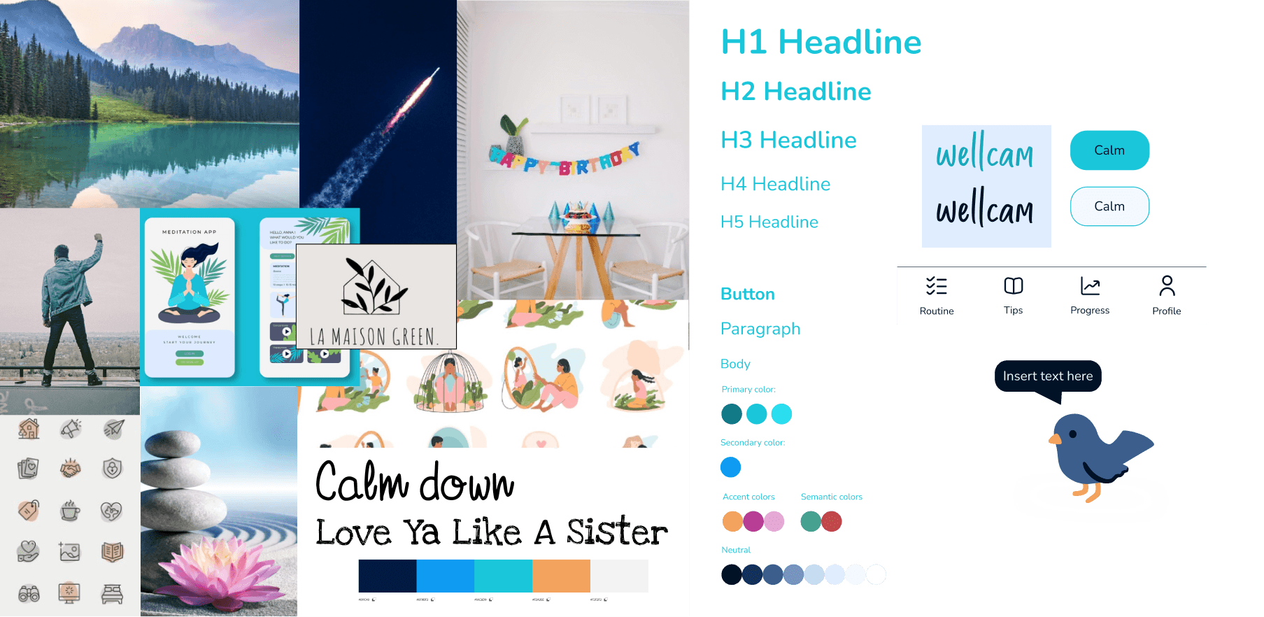
Style tile - clean, data-forward, minimal distraction
Style tile - a visual direction built around calm, warmth, and accessibility
The SOS camera feature was one of our favourite ideas. Removing it after testing was hard - but it was the most important design decision we made. The research always wins.
09 - Final product
A wellness companion that feels human
The final Wellcam prototype brought together all research, iteration, and user feedback into a cohesive, warm, and genuinely useful mental wellness experience. The Mood Mentor and The Planner are the two core features - built from what users said they actually needed, not what we assumed they wanted.
Final prototype - the complete Wellcam experience, from onboarding through Mood Mentor and The Planner

Mood Mentor - personalised support
A check-in tool that responds to how the user is feeling right now - offering tailored exercises, content, or simply a moment of acknowledgment. No generic advice, no one-size responses.
The Planner - structured without pressure
A wellness planning tool built around the user's own intentions - not a rigid habit tracker. Gentle progression without the anxiety of broken streaks.
Three rounds of usability-driven iteration
Real usability testing at each stage drove meaningful changes - not cosmetic tweaks. The opt-out photo flow, the redesigned progression bar, and the removal of the SOS camera feature all came directly from what users told us.
Published on Intranet
The full process was documented and published on intranet - reflecting a commitment to sharing design thinking transparently, not just polished final screens.
10 - Key Takeaways
What this project reinforced
01
The user flow is the hardest deliverable
It's the easiest thing to get wrong by designing from the wrong perspective. The first flow was for a designer; the final flow was for a user. Getting from one to the other required stepping entirely outside the tool and back into the research.
02
Kill your darlings - even the good ones
The SOS camera feature was creative, well-intentioned, and technically interesting. It was also wrong for the user. Removing it after testing was one of the most important decisions in the project - and it only happened because we did the testing.
03
Warmth is a design decision
In a domain as sensitive as mental wellness, tone and feel are not afterthoughts - they are the product. Every colour, spacing, and copywriting choice either adds to or reduces the user's sense of safety in the app. Design for emotion, not just function.
More Projects

Design System - WCAG - Figma
Ecclesia - a design system built in 53 hours.
Germany's leading insurance group had no design system. No component library. No shared UI language.
Read More

AI Platform - Dashboard UX
DFKI — Designing for
the Amazon Rainforest.
Full UX redesign of DFKI's AI-based ecological monitoring platform used by scientists.
Read More

UX/UI · Accessibility · WCAG 2.1 AA
Making Turkish Airlines
accessible for everyone.
A comprehensive WCAG 2.1 AA audit and redesign of the Turkish Airlines digital booking experience
Read More
Mobile UX - Wellness App - Research - Usability Testing
Wellcam - designing a companion for mental well-being.
A full UX process for a mental wellness companion app - from user interviews and surveys through competitor analysis, persona development, MoSCoW prioritisation, user flows, and three rounds of design iteration driven by real usability testing. Built to feel warm, not clinical.
Client:
Mental Wellness App
Role:
UX/UI Designer -
UX Researcher
Duration:
2-week sprint
Deliverables:
Research, Lo/Mid/Hi-fi, Prototype, Usability Testing
01 - Context
A wellness app built around people - not features
Wellcam was designed to serve as a reliable companion for users on their mental wellness journey - offering practical tools, personalised guidance, and a supportive experience that feels human rather than transactional.
The mental wellness app market is crowded and competitive. Most existing solutions feel either overly clinical, aggressively gamified, or built for habit tracking rather than genuine emotional support. The design goal was to create something that felt like a warm embrace - a digital space where users could find support whenever they needed it, without friction or judgement.
This project followed a complete UX process - starting with research to genuinely understand user needs, not assume them - and iterated based on what real users told us in usability testing.
0
0
Weeks full sprint
0+
0+
Rounds of iteration
Rounds of iteration
0+
0+
Competitors analysed
Competitors analysed
0
0
Core features: Mood Mentor + Planner
Core features: Mood Mentor + Planner
02 - Research
We didn't guess - we listened
The research phase combined user interviews and surveys to understand what people actually struggle with in their mental wellness journey - and what they expect from an app designed to support them. The goal was to ground every feature decision in real user insight, not designer assumption.
Survey results surfaced several clear priorities: users wanted personalised guidance tailored to their situation, a sense of progression that felt meaningful rather than gamified, and an experience that didn't feel like another task on their to-do list.
Survey results - identifying the specific areas users expect a wellness app to prioritise
Key research insights - understanding the emotional and practical needs behind the wellness journey
Users don't want another app that tracks their habits. They want something that understands their situation and responds to it - like a friend who checks in, not a coach who grades you.
03 - Competitor Analysis
What the market gets right - and where it falls short
Competitor analysis was driven by what users themselves recommended in survey responses - giving us a picture of what already resonates with the target audience, and where the gaps are. Five clear strategic opportunities emerged from the analysis.
Sense of progression
Most apps gamify progress in ways that feel hollow. The opportunity was to create progression that felt personally meaningful - tied to the user's own goals, not generic streaks.
KEY OPPORTUNITY
Personalised tips
Generic wellness advice is everywhere. Users wanted guidance that responded to their specific situation and mood - not a one-size content feed.
KEY OPPORTUNITY
Incentive design
Existing apps use streaks and badges to drive engagement - but these create anxiety when broken. A gentler incentive model was needed.
KEY OPPORTUNITY
Interactive design
The most-used wellness features are passive - reading, listening. Users wanted something more interactive and responsive to how they were feeling in the moment.
KEY OPPORTUNITY
04 - Users
Carla - our primary persona
The persona was built from interview and survey insights - representing users who are seeking support and understanding in their mental wellness journey, whether they are tech-savvy or simply looking for a helping hand. Carla is not an "ideal user" - she is a realistic composite of what we heard from real people.
Carla - primary persona representing users seeking accessible, personalised mental wellness support
05 - Ideation
Features built from user needs - prioritised with MoSCoW
Feature ideation was driven by research findings - not brainstorming in a vacuum. Every proposed feature was traced back to a specific user need identified in interviews or surveys. The MoSCoW method was then used to prioritise ruthlessly within a two-week timeline.
Feature mapping - connecting research insights to concrete design opportunities
MoSCoW method - prioritising features for the two-week design sprint
Mood Mentor
A personalised check-in tool that responds to how the user is feeling in the moment - offering tailored content, exercises, or simply acknowledgment.
MUST HAVE
The Planner
A personal planning tool that helps users structure their wellness intentions without creating the pressure of a rigid habit tracker.
MUST HAVE
Progress bar
A visual progression indicator that feels encouraging rather than punishing - showing movement without making the user feel they've failed when they miss a day.
SHOULD HAVE
06 - User Flow
Finding the happy path - after many wrong ones
The user flow phase was the most challenging part of the project. The initial attempt to map the task flow revealed a common trap: designing from the designer's perspective rather than the user's path. The first flow was complicated, branching, and confused rather than guided.
After stepping back and revisiting the research, a clearer, simpler flow emerged - one that followed how users actually think about their wellness journey, not how a designer thinks about app architecture.
First attempt - overly complex, designer-perspective flow that didn't reflect real user mental models
Final flow - a clean, user-centred happy path that follows real user intentions
07 - Design Iterations
From lo-fi sketches to usability-tested hi-fi
The design process moved from rapid lo-fi sketching - with team voting on the strongest ideas from each version - through to mid-fi actualization and finally hi-fi screens. Usability testing at each stage drove meaningful changes, not cosmetic ones.
Lo-fi wireframes - rapid sketching with team voting to identify the strongest layout approaches
streamlined the picture-taking process
In user interviews, we streamlined the picture taking process, allowing users to opt out a "Don't ask me again" feature, guided my usability heuristics
Improved the progress experience
We adjusted the progress bar for better effectiveness and simplified how rewards are presented
07 - Visual Direction
Calming, welcoming, human
The visual direction was built around one principle: the app should feel like a warm embrace, not a productivity tool. Colour, typography, and spacing were all chosen to reduce visual anxiety rather than add to it - soothing tones, generous white space, and a layout that never feels crowded or demanding.
Style tile - clean, data-forward, minimal distraction
Style tile - a visual direction built around calm, warmth, and accessibility
The SOS camera feature was one of our favourite ideas. Removing it after testing was hard - but it was the most important design decision we made. The research always wins.
09 - Final product
A wellness companion that feels human
The final Wellcam prototype brought together all research, iteration, and user feedback into a cohesive, warm, and genuinely useful mental wellness experience. The Mood Mentor and The Planner are the two core features - built from what users said they actually needed, not what we assumed they wanted.
Final prototype - the complete Wellcam experience, from onboarding through Mood Mentor and The Planner
Mood Mentor - personalised support
A check-in tool that responds to how the user is feeling right now - offering tailored exercises, content, or simply a moment of acknowledgment. No generic advice, no one-size responses.
The Planner - structured without pressure
A wellness planning tool built around the user's own intentions - not a rigid habit tracker. Gentle progression without the anxiety of broken streaks.
Three rounds of usability-driven iteration
Real usability testing at each stage drove meaningful changes - not cosmetic tweaks. The opt-out photo flow, the redesigned progression bar, and the removal of the SOS camera feature all came directly from what users told us.
Published on Intranet
The full process was documented and published on intranet - reflecting a commitment to sharing design thinking transparently, not just polished final screens.
10 - Key Takeaways
What this project reinforced
01
The user flow is the hardest deliverable
It's the easiest thing to get wrong by designing from the wrong perspective. The first flow was for a designer; the final flow was for a user. Getting from one to the other required stepping entirely outside the tool and back into the research.
02
Kill your darlings - even the good ones
The SOS camera feature was creative, well-intentioned, and technically interesting. It was also wrong for the user. Removing it after testing was one of the most important decisions in the project - and it only happened because we did the testing.
03
Warmth is a design decision
In a domain as sensitive as mental wellness, tone and feel are not afterthoughts - they are the product. Every colour, spacing, and copywriting choice either adds to or reduces the user's sense of safety in the app. Design for emotion, not just function.
More Projects
Design System - WCAG - Figma
Ecclesia - a design system built in 53 hours.
Germany's leading insurance group had no design system. No component library. No shared UI language.
Read More
AI Platform - Dashboard UX
DFKI — Designing for
the Amazon Rainforest.
Full UX redesign of DFKI's AI-based ecological monitoring platform used by scientists.
Read More
UX/UI · Accessibility · WCAG 2.1 AA
Making Turkish Airlines
accessible for everyone.
A comprehensive WCAG 2.1 AA audit and redesign of the Turkish Airlines digital booking experience
Read More
Mobile UX - Wellness App - Research - Usability Testing
Wellcam - designing a companion for mental well-being.
A full UX process for a mental wellness companion app - from user interviews and surveys through competitor analysis, persona development, MoSCoW prioritisation, user flows, and three rounds of design iteration driven by real usability testing. Built to feel warm, not clinical.
Client:
Mental Wellness App
Role:
UX/UI Designer -
UX Researcher
Duration:
2-week sprint
Deliverables:
Research, Lo/Mid/Hi-fi, Prototype, Usability Testing
01 - Context
A wellness app built around people - not features
Wellcam was designed to serve as a reliable companion for users on their mental wellness journey - offering practical tools, personalised guidance, and a supportive experience that feels human rather than transactional.
The mental wellness app market is crowded and competitive. Most existing solutions feel either overly clinical, aggressively gamified, or built for habit tracking rather than genuine emotional support. The design goal was to create something that felt like a warm embrace - a digital space where users could find support whenever they needed it, without friction or judgement.
This project followed a complete UX process - starting with research to genuinely understand user needs, not assume them - and iterated based on what real users told us in usability testing.
0
0
Weeks full sprint
0+
0+
Rounds of iteration
Rounds of iteration
0+
0+
Competitors analysed
Competitors analysed
0
0
Core features: Mood Mentor + Planner
Core features: Mood Mentor + Planner
02 - Research
We didn't guess - we listened
The research phase combined user interviews and surveys to understand what people actually struggle with in their mental wellness journey - and what they expect from an app designed to support them. The goal was to ground every feature decision in real user insight, not designer assumption.
Survey results surfaced several clear priorities: users wanted personalised guidance tailored to their situation, a sense of progression that felt meaningful rather than gamified, and an experience that didn't feel like another task on their to-do list.
Survey results - identifying the specific areas users expect a wellness app to prioritise
Key research insights - understanding the emotional and practical needs behind the wellness journey
Users don't want another app that tracks their habits. They want something that understands their situation and responds to it - like a friend who checks in, not a coach who grades you.
03 - Competitor Analysis
What the market gets right - and where it falls short
Competitor analysis was driven by what users themselves recommended in survey responses - giving us a picture of what already resonates with the target audience, and where the gaps are. Five clear strategic opportunities emerged from the analysis.
Sense of progression
Most apps gamify progress in ways that feel hollow. The opportunity was to create progression that felt personally meaningful - tied to the user's own goals, not generic streaks.
KEY OPPORTUNITY
Personalised tips
Generic wellness advice is everywhere. Users wanted guidance that responded to their specific situation and mood - not a one-size content feed.
KEY OPPORTUNITY
Incentive design
Existing apps use streaks and badges to drive engagement - but these create anxiety when broken. A gentler incentive model was needed.
KEY OPPORTUNITY
Interactive design
The most-used wellness features are passive - reading, listening. Users wanted something more interactive and responsive to how they were feeling in the moment.
KEY OPPORTUNITY
04 - Users
Carla - our primary persona
The persona was built from interview and survey insights - representing users who are seeking support and understanding in their mental wellness journey, whether they are tech-savvy or simply looking for a helping hand. Carla is not an "ideal user" - she is a realistic composite of what we heard from real people.
Carla - primary persona representing users seeking accessible, personalised mental wellness support
05 - Ideation
Features built from user needs - prioritised with MoSCoW
Feature ideation was driven by research findings - not brainstorming in a vacuum. Every proposed feature was traced back to a specific user need identified in interviews or surveys. The MoSCoW method was then used to prioritise ruthlessly within a two-week timeline.
Feature mapping - connecting research insights to concrete design opportunities
MoSCoW method - prioritising features for the two-week design sprint
Mood Mentor
A personalised check-in tool that responds to how the user is feeling in the moment - offering tailored content, exercises, or simply acknowledgment.
MUST HAVE
The Planner
A personal planning tool that helps users structure their wellness intentions without creating the pressure of a rigid habit tracker.
MUST HAVE
Progress bar
A visual progression indicator that feels encouraging rather than punishing - showing movement without making the user feel they've failed when they miss a day.
SHOULD HAVE
06 - User Flow
Finding the happy path - after many wrong ones
The user flow phase was the most challenging part of the project. The initial attempt to map the task flow revealed a common trap: designing from the designer's perspective rather than the user's path. The first flow was complicated, branching, and confused rather than guided.
After stepping back and revisiting the research, a clearer, simpler flow emerged - one that followed how users actually think about their wellness journey, not how a designer thinks about app architecture.
First attempt - overly complex, designer-perspective flow that didn't reflect real user mental models
Final flow - a clean, user-centred happy path that follows real user intentions
07 - Design Iterations
From lo-fi sketches to usability-tested hi-fi
The design process moved from rapid lo-fi sketching - with team voting on the strongest ideas from each version - through to mid-fi actualization and finally hi-fi screens. Usability testing at each stage drove meaningful changes, not cosmetic ones.
Lo-fi wireframes - rapid sketching with team voting to identify the strongest layout approaches
streamlined the picture-taking process
In user interviews, we streamlined the picture taking process, allowing users to opt out a "Don't ask me again" feature, guided my usability heuristics
Improved the progress experience
We adjusted the progress bar for better effectiveness and simplified how rewards are presented
07 - Visual Direction
Calming, welcoming, human
The visual direction was built around one principle: the app should feel like a warm embrace, not a productivity tool. Colour, typography, and spacing were all chosen to reduce visual anxiety rather than add to it - soothing tones, generous white space, and a layout that never feels crowded or demanding.
Style tile - clean, data-forward, minimal distraction
Style tile - a visual direction built around calm, warmth, and accessibility
The SOS camera feature was one of our favourite ideas. Removing it after testing was hard - but it was the most important design decision we made. The research always wins.
09 - Final product
A wellness companion that feels human
The final Wellcam prototype brought together all research, iteration, and user feedback into a cohesive, warm, and genuinely useful mental wellness experience. The Mood Mentor and The Planner are the two core features - built from what users said they actually needed, not what we assumed they wanted.
Final prototype - the complete Wellcam experience, from onboarding through Mood Mentor and The Planner
Mood Mentor - personalised support
A check-in tool that responds to how the user is feeling right now - offering tailored exercises, content, or simply a moment of acknowledgment. No generic advice, no one-size responses.
The Planner - structured without pressure
A wellness planning tool built around the user's own intentions - not a rigid habit tracker. Gentle progression without the anxiety of broken streaks.
Three rounds of usability-driven iteration
Real usability testing at each stage drove meaningful changes - not cosmetic tweaks. The opt-out photo flow, the redesigned progression bar, and the removal of the SOS camera feature all came directly from what users told us.
Published on Intranet
The full process was documented and published on intranet - reflecting a commitment to sharing design thinking transparently, not just polished final screens.
10 - Key Takeaways
What this project reinforced
01
The user flow is the hardest deliverable
It's the easiest thing to get wrong by designing from the wrong perspective. The first flow was for a designer; the final flow was for a user. Getting from one to the other required stepping entirely outside the tool and back into the research.
02
Kill your darlings - even the good ones
The SOS camera feature was creative, well-intentioned, and technically interesting. It was also wrong for the user. Removing it after testing was one of the most important decisions in the project - and it only happened because we did the testing.
03
Warmth is a design decision
In a domain as sensitive as mental wellness, tone and feel are not afterthoughts - they are the product. Every colour, spacing, and copywriting choice either adds to or reduces the user's sense of safety in the app. Design for emotion, not just function.
More Projects
Design System - WCAG - Figma
Ecclesia - a design system built in 53 hours.
Germany's leading insurance group had no design system. No component library. No shared UI language.
Read More
AI Platform - Dashboard UX
DFKI — Designing for
the Amazon Rainforest.
Full UX redesign of DFKI's AI-based ecological monitoring platform used by scientists.
Read More
UX/UI · Accessibility · WCAG 2.1 AA
Making Turkish Airlines
accessible for everyone.
A comprehensive WCAG 2.1 AA audit and redesign of the Turkish Airlines digital booking experience