UX Analysis - Good Design
A small UX win: how Hermes gets
parcel tracking right
I have been pretty vocal lately about UX problems I run into - looking at you, Deutsche Bahn. So it is only fair to call it out when an app actually gets the details right. This week that app is Hermes, and specifically its parcel tracking flow.


Clear from the first screen
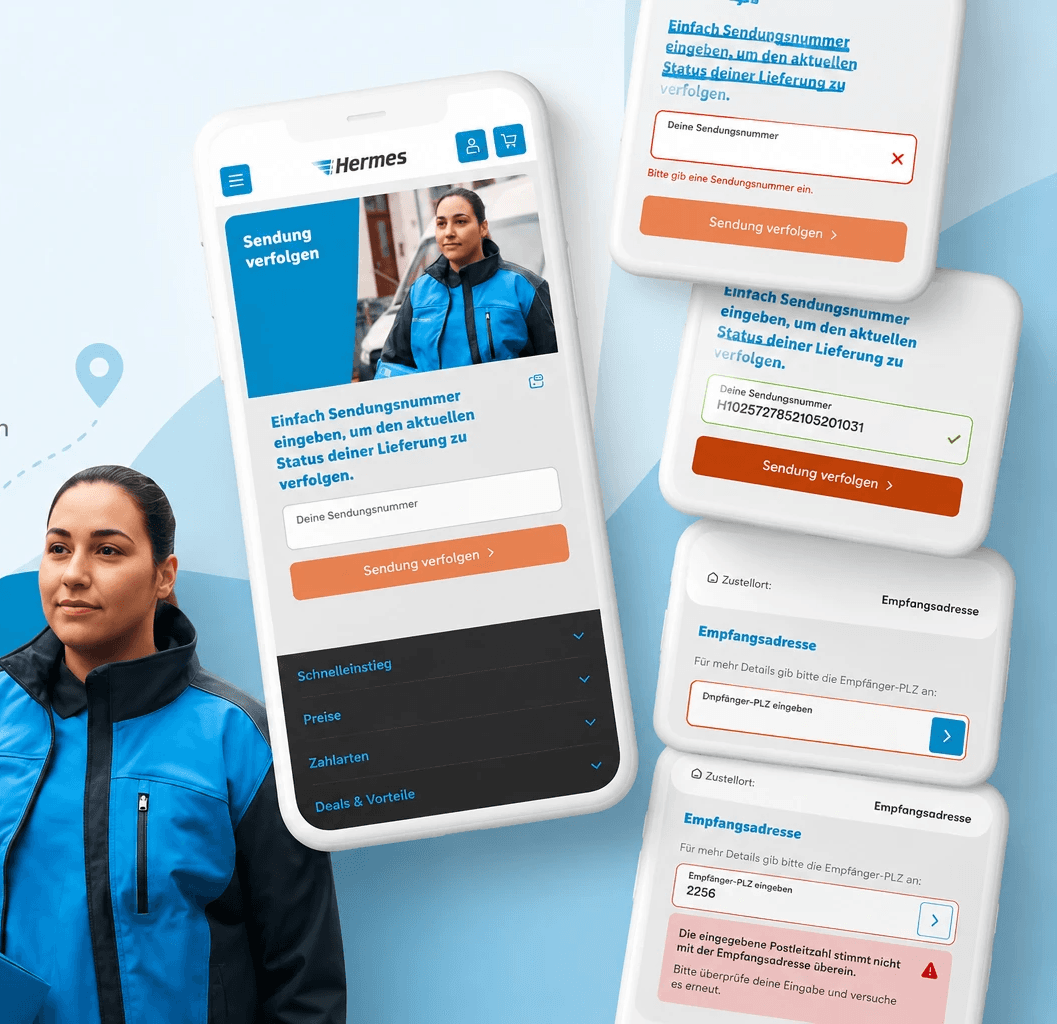
The tracking widget on the homepage does not make you guess what to do. One heading, one input field labeled "Deine Sendungsnummer," one orange button. No clutter, no competing calls to action. You know exactly what is expected of you within a second of landing on the page.
This sounds obvious. It is not. Most logistics apps bury the tracking flow under three tabs and a promotional banner. Hermes just... puts it there. Right in front of you. Radical.
Good error messages are not a nice-to-have. They are the difference between a user completing a task and a user giving up.


Privacy, built into the flow
This is the part that impressed me most. Once you track a shipment, Hermes does not just hand you the full delivery address. It asks you to confirm the recipient's postal code first. If you do not know the PLZ, you do not get the address.
That is a genuinely thoughtful privacy safeguard. A tracking number alone should not be enough for a stranger to find out where a package - and the person receiving it - actually lives. And when you get the postal code wrong, the app does not fail silently. It tells you clearly: "Die eingegebene Postleitzahl stimmt nicht mit der Empfangsadresse uberein," with a next step attached.
Privacy that feels like the app looking out for you, rather than friction standing in your way. That distinction matters more than most privacy UX ever achieves.
Why this matters
None of this is flashy. There is no animation to marvel at, no clever gimmick. It is just careful, unglamorous execution: instant validation, honest error messages, and a privacy check that does not feel like friction.
As a UX designer, this is the stuff I want to see more of. Good UX is rarely the thing you notice. It is the thing that quietly keeps you from making mistakes - and in this case, keeps someone else's address safe too.
The takeaway
The best UX writing is a plain sentence that tells you exactly what to do next. The best privacy UX feels like the product is on your side. Hermes managed both. That is worth saying out loud.
Well done, Hermes. Genuinely.
more to discover

Personal - Creative - Music
Playing in a band made me a better
UX designer. I am serious.
Nobody in a band ever said "I think we should add more here." The best musicians are the ones who know when to stop.
Read More
UX Analysis - Good Design
A small UX win: how Hermes gets parcel tracking right
So it is only fair to call it out when an app actually gets the details right. This week that app is Hermes.
Read More
UX Analysis - Good Design
A small UX win: how Hermes gets
parcel tracking right
I have been pretty vocal lately about UX problems I run into - looking at you, Deutsche Bahn. So it is only fair to call it out when an app actually gets the details right. This week that app is Hermes, and specifically its parcel tracking flow.
Clear from the first screen
The tracking widget on the homepage does not make you guess what to do. One heading, one input field labeled "Deine Sendungsnummer," one orange button. No clutter, no competing calls to action. You know exactly what is expected of you within a second of landing on the page.
This sounds obvious. It is not. Most logistics apps bury the tracking flow under three tabs and a promotional banner. Hermes just... puts it there. Right in front of you. Radical.
Good error messages are not a nice-to-have. They are the difference between a user completing a task and a user giving up.
Privacy, built into the flow
This is the part that impressed me most. Once you track a shipment, Hermes does not just hand you the full delivery address. It asks you to confirm the recipient's postal code first. If you do not know the PLZ, you do not get the address.
That is a genuinely thoughtful privacy safeguard. A tracking number alone should not be enough for a stranger to find out where a package - and the person receiving it - actually lives. And when you get the postal code wrong, the app does not fail silently. It tells you clearly: "Die eingegebene Postleitzahl stimmt nicht mit der Empfangsadresse uberein," with a next step attached.
Privacy that feels like the app looking out for you, rather than friction standing in your way. That distinction matters more than most privacy UX ever achieves.
Why this matters
None of this is flashy. There is no animation to marvel at, no clever gimmick. It is just careful, unglamorous execution: instant validation, honest error messages, and a privacy check that does not feel like friction.
As a UX designer, this is the stuff I want to see more of. Good UX is rarely the thing you notice. It is the thing that quietly keeps you from making mistakes - and in this case, keeps someone else's address safe too.
The takeaway
The best UX writing is a plain sentence that tells you exactly what to do next. The best privacy UX feels like the product is on your side. Hermes managed both. That is worth saying out loud.
Well done, Hermes. Genuinely.
more to discover
Personal - Creative - Music
Playing in a band made me a better
UX designer. I am serious.
Nobody in a band ever said "I think we should add more here." The best musicians are the ones who know when to stop.
Read More
UX Analysis - Good Design
A small UX win: how Hermes gets parcel tracking right
So it is only fair to call it out when an app actually gets the details right. This week that app is Hermes.
Read More
UX Analysis - Good Design
A small UX win: how Hermes gets
parcel tracking right
I have been pretty vocal lately about UX problems I run into - looking at you, Deutsche Bahn. So it is only fair to call it out when an app actually gets the details right. This week that app is Hermes, and specifically its parcel tracking flow.
Clear from the first screen
The tracking widget on the homepage does not make you guess what to do. One heading, one input field labeled "Deine Sendungsnummer," one orange button. No clutter, no competing calls to action. You know exactly what is expected of you within a second of landing on the page.
This sounds obvious. It is not. Most logistics apps bury the tracking flow under three tabs and a promotional banner. Hermes just... puts it there. Right in front of you. Radical.
Good error messages are not a nice-to-have. They are the difference between a user completing a task and a user giving up.
Privacy, built into the flow
This is the part that impressed me most. Once you track a shipment, Hermes does not just hand you the full delivery address. It asks you to confirm the recipient's postal code first. If you do not know the PLZ, you do not get the address.
That is a genuinely thoughtful privacy safeguard. A tracking number alone should not be enough for a stranger to find out where a package - and the person receiving it - actually lives. And when you get the postal code wrong, the app does not fail silently. It tells you clearly: "Die eingegebene Postleitzahl stimmt nicht mit der Empfangsadresse uberein," with a next step attached.
Privacy that feels like the app looking out for you, rather than friction standing in your way. That distinction matters more than most privacy UX ever achieves.
Why this matters
None of this is flashy. There is no animation to marvel at, no clever gimmick. It is just careful, unglamorous execution: instant validation, honest error messages, and a privacy check that does not feel like friction.
As a UX designer, this is the stuff I want to see more of. Good UX is rarely the thing you notice. It is the thing that quietly keeps you from making mistakes - and in this case, keeps someone else's address safe too.
The takeaway
The best UX writing is a plain sentence that tells you exactly what to do next. The best privacy UX feels like the product is on your side. Hermes managed both. That is worth saying out loud.
Well done, Hermes. Genuinely.
more to discover
Personal - Creative - Music
Playing in a band made me a better
UX designer. I am serious.
Nobody in a band ever said "I think we should add more here." The best musicians are the ones who know when to stop.
Read More
UX Analysis - Good Design
A small UX win: how Hermes gets parcel tracking right
So it is only fair to call it out when an app actually gets the details right. This week that app is Hermes.