UX Analysis - Heuristics
Revamping Slack for Better Team Communication
I love Slack. It's been my go-to tool for team communication for years. But let's face it - it has its quirks. Some of them are small. Some of them are the kind that make you stare at your screen wondering if you're missing something obvious.
I decided to put it through a proper heuristic evaluation using Jakob Nielsen's 10 Usability Heuristics - the same framework I apply on client projects. What I found was interesting enough to write about.
I'm not picking on Slack. I'm a fan. But the best tools deserve honest critique - that's how they get better.
The methodology
Nielsen's 10 heuristics are a set of general principles for interaction design. They're not strict rules - they're more like a lens. Applied systematically to a product, they help surface friction that users feel but can't always articulate. I went through Slack's core GIF and messaging flows and found 6 issues worth talking about - plus a bonus one I couldn't leave out.

The issues
#01
The "Fertig" keyboard disappears - and nothing happens
You type a GIF theme, hit "Done" (or "Fertig" in German), and the keyboard just disappears. No results appear. You have to manually tap the search button. This violates visibility of system status (clear feedback on what's happening) and flexibility and efficiency of use (why the extra step?). Hitting Done should show you the results - that's what every other keyboard interaction on iOS does.

#02
One GIF at a time - the shuffle problem
After searching for a GIF, you get one result. One. To see more you have to hit a shuffle button. It's like ordering pizza and being shown the toppings one by one. Users expect multiple results when they search for something. Showing one option violates recognition rather than recall and consistency with standards.

#03
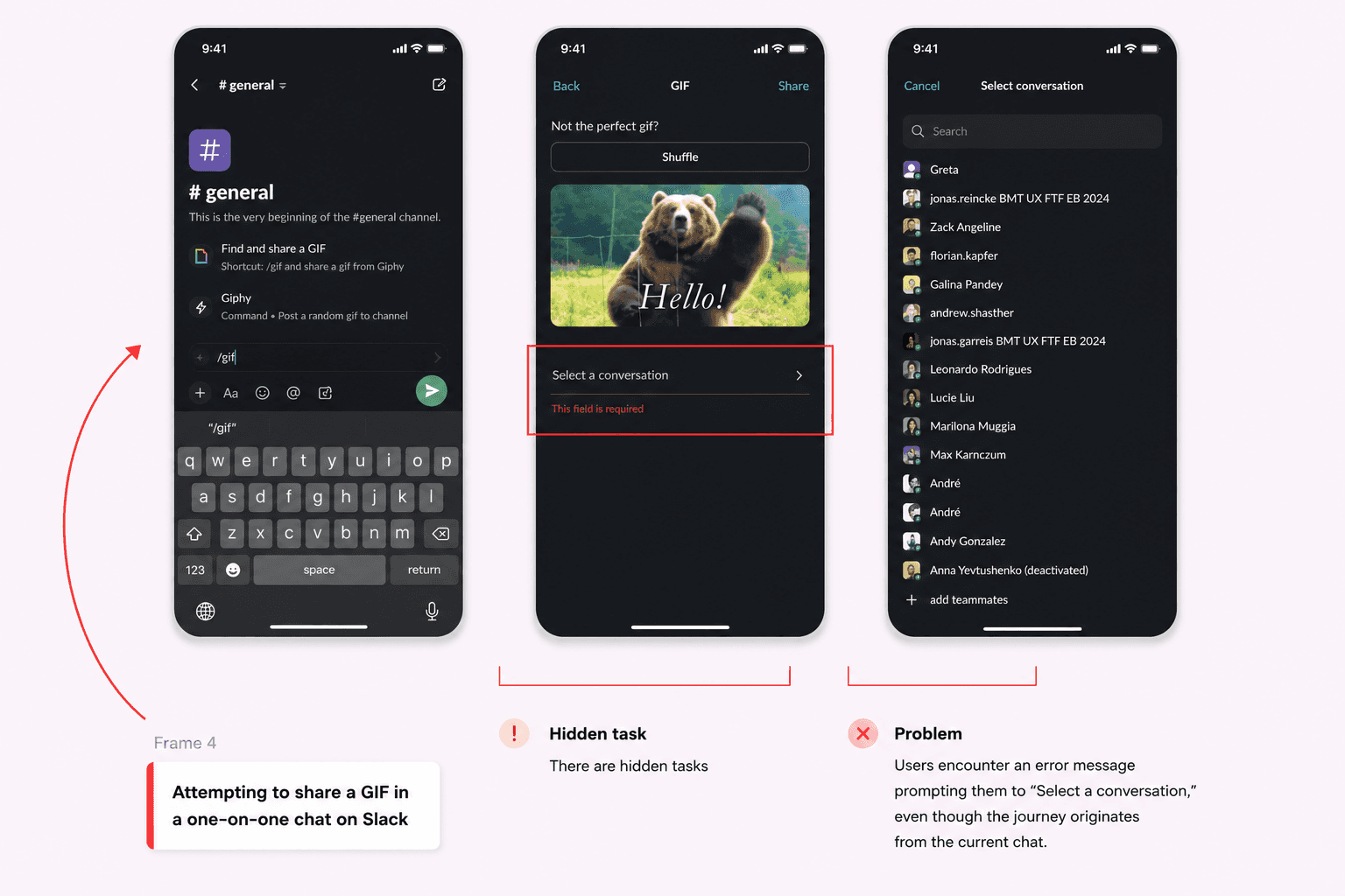
"Select a conversation" - but I'm already in one
You find a great GIF and hit share. Slack asks you to "select a conversation" - even though you're already inside a conversation. This is a jarring, unnecessary interruption. The system should automatically select the current conversation. This violates user control and freedom, consistency and standards, and honestly just common sense.
#04
Can't reply in a thread from a direct message
In some contexts, Slack doesn't give you the option to reply in a separate thread. If you want to give feedback on something without cluttering the main conversation - you're stuck. This limits flexibility and efficiency and reduces user control in ways that matter for real team workflows.
#05
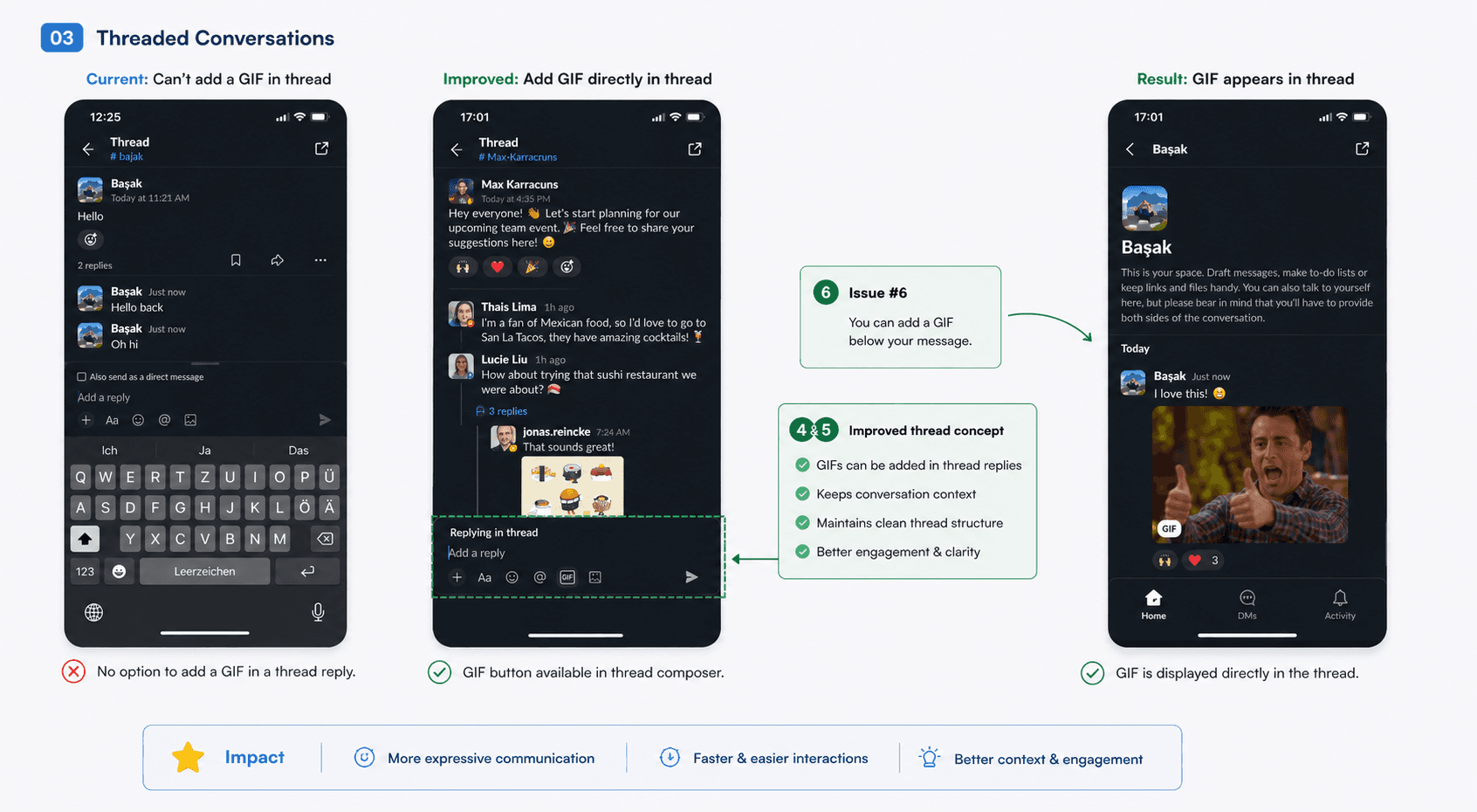
Can't send GIFs inside threads
The GIF sending option that's available in direct messages isn't available inside threads. It's a small inconsistency, but it breaks the expected behavior users build up over time. Violates consistency and standards.

#06
Can't position a GIF relative to text
When composing a message, you can't choose whether the GIF appears above or below your text. This limits creative control and sometimes creates awkwardly composed messages. A small thing - but it adds friction where there doesn't need to be any.
#star
bonus
Deactivated workspaces that you can no longer access still show up in your sidebar - with a warning icon. You can't remove them. You can't hide them. They just sit there. For anyone who has worked at multiple companies and cycled through Slack workspaces, this is genuinely psychologically annoying. The inability to clean up your own workspace sidebar violates user control and freedom in a very visible way.

What I redesigned
I didn't just list the problems - I designed solutions for each one. Hitting Done now triggers the GIF search automatically. Sharing a GIF defaults to the current conversation. Thread replies have access to the same feature set as direct messages. The GIF composer allows flexible text positioning. And deactivated workspaces can be removed from the sidebar.
None of these changes break Slack's architecture. They just make it feel more considered - like the product was designed by someone who actually uses it every day. Because that's exactly what a good heuristic evaluation looks like: you find the friction, you design the fix, you show the before and after.

takeaway
A heuristic evaluation is most valuable when it ends with redesigned solutions, not just a list of problems. Find the friction, apply the framework, show what better looks like. That's the whole point.
more to discover

Most Viewed
Dark UX - Ethics - Personal
My mum got scammed by a beautifully
designed app. That broke something in me.
Scammers used to rely on bad grammar and obvious lies. Now some of them are hiring designers. And that changes everything.
Read More
UX Analysis - Heuristics - Mobile
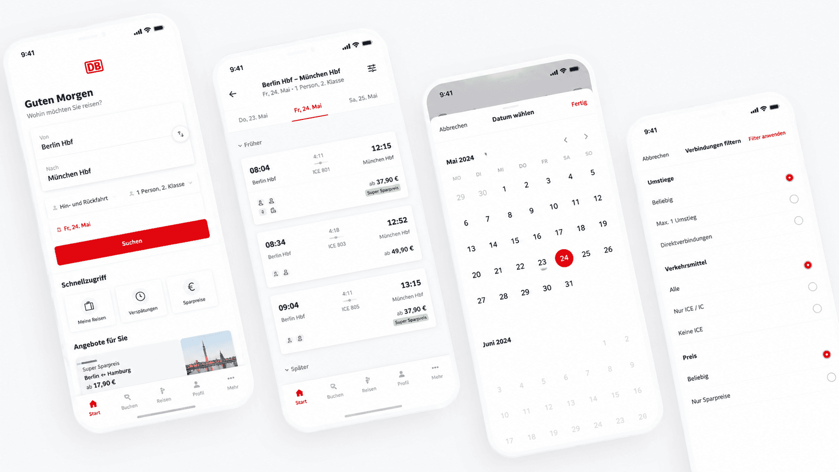
Dear DB Navigator: Two Date Issues That Cost Your Users Money
Good UX feedback isn't just "this is broken." It's "here's why it breaks, here's who it affects, and here's how to fix it."
Read More
UX Analysis - Heuristics
Revamping Slack for Better Team Communication
I love Slack. It's been my go-to tool for team communication for years. But let's face it - it has its quirks. Some of them are small. Some of them are the kind that make you stare at your screen wondering if you're missing something obvious.
I decided to put it through a proper heuristic evaluation using Jakob Nielsen's 10 Usability Heuristics - the same framework I apply on client projects. What I found was interesting enough to write about.
I'm not picking on Slack. I'm a fan. But the best tools deserve honest critique - that's how they get better.
The methodology
Nielsen's 10 heuristics are a set of general principles for interaction design. They're not strict rules - they're more like a lens. Applied systematically to a product, they help surface friction that users feel but can't always articulate. I went through Slack's core GIF and messaging flows and found 6 issues worth talking about - plus a bonus one I couldn't leave out.
The issues
#01
The "Fertig" keyboard disappears - and nothing happens
You type a GIF theme, hit "Done" (or "Fertig" in German), and the keyboard just disappears. No results appear. You have to manually tap the search button. This violates visibility of system status (clear feedback on what's happening) and flexibility and efficiency of use (why the extra step?). Hitting Done should show you the results - that's what every other keyboard interaction on iOS does.
#02
One GIF at a time - the shuffle problem
After searching for a GIF, you get one result. One. To see more you have to hit a shuffle button. It's like ordering pizza and being shown the toppings one by one. Users expect multiple results when they search for something. Showing one option violates recognition rather than recall and consistency with standards.
#03
"Select a conversation" - but I'm already in one
You find a great GIF and hit share. Slack asks you to "select a conversation" - even though you're already inside a conversation. This is a jarring, unnecessary interruption. The system should automatically select the current conversation. This violates user control and freedom, consistency and standards, and honestly just common sense.
#04
Can't reply in a thread from a direct message
In some contexts, Slack doesn't give you the option to reply in a separate thread. If you want to give feedback on something without cluttering the main conversation - you're stuck. This limits flexibility and efficiency and reduces user control in ways that matter for real team workflows.
#05
Can't send GIFs inside threads
The GIF sending option that's available in direct messages isn't available inside threads. It's a small inconsistency, but it breaks the expected behavior users build up over time. Violates consistency and standards.
#06
Can't position a GIF relative to text
When composing a message, you can't choose whether the GIF appears above or below your text. This limits creative control and sometimes creates awkwardly composed messages. A small thing - but it adds friction where there doesn't need to be any.
#star
bonus
Deactivated workspaces that you can no longer access still show up in your sidebar - with a warning icon. You can't remove them. You can't hide them. They just sit there. For anyone who has worked at multiple companies and cycled through Slack workspaces, this is genuinely psychologically annoying. The inability to clean up your own workspace sidebar violates user control and freedom in a very visible way.
What I redesigned
I didn't just list the problems - I designed solutions for each one. Hitting Done now triggers the GIF search automatically. Sharing a GIF defaults to the current conversation. Thread replies have access to the same feature set as direct messages. The GIF composer allows flexible text positioning. And deactivated workspaces can be removed from the sidebar.
None of these changes break Slack's architecture. They just make it feel more considered - like the product was designed by someone who actually uses it every day. Because that's exactly what a good heuristic evaluation looks like: you find the friction, you design the fix, you show the before and after.
takeaway
A heuristic evaluation is most valuable when it ends with redesigned solutions, not just a list of problems. Find the friction, apply the framework, show what better looks like. That's the whole point.
more to discover
Most Viewed
Dark UX - Ethics - Personal
My mum got scammed by a beautifully
designed app. That broke something in me.
Scammers used to rely on bad grammar and obvious lies. Now some of them are hiring designers. And that changes everything.
Read More
UX Analysis - Heuristics - Mobile
Dear DB Navigator: Two Date Issues That Cost Your Users Money
Good UX feedback isn't just "this is broken." It's "here's why it breaks, here's who it affects, and here's how to fix it."
Read More
UX Analysis - Heuristics
Revamping Slack for Better Team Communication
I love Slack. It's been my go-to tool for team communication for years. But let's face it - it has its quirks. Some of them are small. Some of them are the kind that make you stare at your screen wondering if you're missing something obvious.
I decided to put it through a proper heuristic evaluation using Jakob Nielsen's 10 Usability Heuristics - the same framework I apply on client projects. What I found was interesting enough to write about.
I'm not picking on Slack. I'm a fan. But the best tools deserve honest critique - that's how they get better.
The methodology
Nielsen's 10 heuristics are a set of general principles for interaction design. They're not strict rules - they're more like a lens. Applied systematically to a product, they help surface friction that users feel but can't always articulate. I went through Slack's core GIF and messaging flows and found 6 issues worth talking about - plus a bonus one I couldn't leave out.
The issues
#01
The "Fertig" keyboard disappears - and nothing happens
You type a GIF theme, hit "Done" (or "Fertig" in German), and the keyboard just disappears. No results appear. You have to manually tap the search button. This violates visibility of system status (clear feedback on what's happening) and flexibility and efficiency of use (why the extra step?). Hitting Done should show you the results - that's what every other keyboard interaction on iOS does.
#02
One GIF at a time - the shuffle problem
After searching for a GIF, you get one result. One. To see more you have to hit a shuffle button. It's like ordering pizza and being shown the toppings one by one. Users expect multiple results when they search for something. Showing one option violates recognition rather than recall and consistency with standards.
#03
"Select a conversation" - but I'm already in one
You find a great GIF and hit share. Slack asks you to "select a conversation" - even though you're already inside a conversation. This is a jarring, unnecessary interruption. The system should automatically select the current conversation. This violates user control and freedom, consistency and standards, and honestly just common sense.
#04
Can't reply in a thread from a direct message
In some contexts, Slack doesn't give you the option to reply in a separate thread. If you want to give feedback on something without cluttering the main conversation - you're stuck. This limits flexibility and efficiency and reduces user control in ways that matter for real team workflows.
#05
Can't send GIFs inside threads
The GIF sending option that's available in direct messages isn't available inside threads. It's a small inconsistency, but it breaks the expected behavior users build up over time. Violates consistency and standards.
#06
Can't position a GIF relative to text
When composing a message, you can't choose whether the GIF appears above or below your text. This limits creative control and sometimes creates awkwardly composed messages. A small thing - but it adds friction where there doesn't need to be any.
#star
bonus
Deactivated workspaces that you can no longer access still show up in your sidebar - with a warning icon. You can't remove them. You can't hide them. They just sit there. For anyone who has worked at multiple companies and cycled through Slack workspaces, this is genuinely psychologically annoying. The inability to clean up your own workspace sidebar violates user control and freedom in a very visible way.
What I redesigned
I didn't just list the problems - I designed solutions for each one. Hitting Done now triggers the GIF search automatically. Sharing a GIF defaults to the current conversation. Thread replies have access to the same feature set as direct messages. The GIF composer allows flexible text positioning. And deactivated workspaces can be removed from the sidebar.
None of these changes break Slack's architecture. They just make it feel more considered - like the product was designed by someone who actually uses it every day. Because that's exactly what a good heuristic evaluation looks like: you find the friction, you design the fix, you show the before and after.
takeaway
A heuristic evaluation is most valuable when it ends with redesigned solutions, not just a list of problems. Find the friction, apply the framework, show what better looks like. That's the whole point.
more to discover
Most Viewed
Dark UX - Ethics - Personal
My mum got scammed by a beautifully
designed app. That broke something in me.
Scammers used to rely on bad grammar and obvious lies. Now some of them are hiring designers. And that changes everything.
Read More
UX Analysis - Heuristics - Mobile
Dear DB Navigator: Two Date Issues That Cost Your Users Money
Good UX feedback isn't just "this is broken." It's "here's why it breaks, here's who it affects, and here's how to fix it."