UX Research - International Design
My mum got scammed by a beautifully
designed app. That broke something in me.
My mum is retired. She is smart, careful, and not naive. She got scammed anyway.
Someone called her. They said they were from an investment platform called N-Yatirim. They told her they would invest on her behalf, gave her an IBAN, and asked her to send money. She sent 250 dollars. Within a day it had grown to 270. It looked real. It felt real. And then she realised something was wrong and called them back.
That is when things got worse. They told her they were fixing it. They told her to open her banking app - "we are blacking out your screen, we cannot see anything." They guided her through screens while watching everything. She caught it. She closed her accounts, stopped all transactions, and called the bank. She did everything right once she realised.
But here is what I cannot stop thinking about. The app they built to deceive her was genuinely well designed.
Scammers used to rely on bad grammar and obvious lies. Now some of them are hiring designers. And that changes everything.

What the app actually looked like
I saw the screenshots. I want to be precise about this because I think precision matters here.
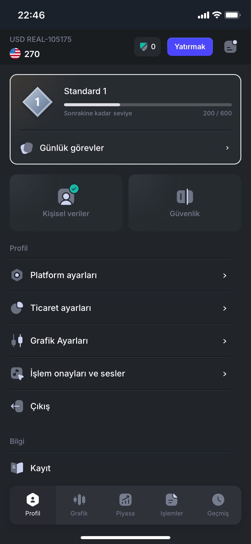
The app had a dark theme - the same premium aesthetic used by legitimate trading platforms like eToro or Binance. It showed real stock tickers: EUR/USD at 1.1412. 3M Company. Adobe Inc. AAVE. ADA. Real assets with real prices, updating in real time. It had a proper navigation bar - Profile, Chart, Market, Transactions, History. It had a gamification layer - a level system called "Standard 1" with a progress bar showing 200/600 points, daily tasks, achievement mechanics.
It had settings pages. Personal data sections. Security settings. An account ID: USD REAL-105175. A "Yatirim" (Invest) button in bright blue that looked exactly like a primary CTA on any well-designed fintech app.
Someone made deliberate design decisions here. They chose that dark theme. They chose to show real stock data rather than fake numbers. They built a level system to create a sense of progression and investment in the platform. They thought about information architecture. They thought about trust signals.
They used the same craft I use to help people - to hurt someone.
The UX of deception - what they got right
I have spent 16+ years thinking about how design builds trust. After looking at those screenshots, I can tell you exactly which trust-building techniques the scammers used - because they are the same ones I use legitimately.
Real data as social proof
They showed live EUR/USD exchange rates and real company stock prices. This is the same principle behind showing real user reviews, real product counts, real timestamps. Real data is an instant credibility signal. Your brain registers "this is connected to something real" before you consciously think about it. The fact that the data was accurate made the platform feel legitimate - even though displaying accurate stock prices costs almost nothing to implement via a free API.


Visual language borrowed from trusted brands
The dark theme, the accent blue, the icon style, the bottom navigation structure - all of it closely mirrors the visual language of legitimate trading apps that people recognise. This is a form of visual phishing. The same way a fake bank email copies the exact colours and typography of a real one, this app copied the aesthetic of a legitimate trading platform. Your brain pattern-matches to "I have seen this kind of app before and it was safe."
Gamification to create commitment
The level system - "Standard 1, 200/600 to next level" - and the daily tasks are not accidental. Gamification creates psychological investment. Once you have a level, a progress bar, points - you feel like you have something to lose by leaving. This is the same mechanic used by Duolingo, fitness apps, and loyalty programmes. Here it was used to make my mum feel she had already built something on the platform. Leaving would mean losing it.


A believable initial gain
250 dollars became 270 in one day. This is the classic setup of investment fraud. Show a small, believable gain first. Nothing suspicious - 8% in a day is high but not insane for a volatile asset in someone's mind. The purpose of this gain is not the money. It is proof. "See? It works. Now imagine what you could make with more."
The screen sharing trap
When my mum called them to ask for her money back, they shifted tactics. They told her to open her banking app. They said "we are blacking out your screen, we cannot see anything" - a deliberate lie designed to remove the one thing that might stop her: the fear of being watched.
This is psychological manipulation layered on top of the design. The app built the trust. The phone call exploited it. By the time she was on the call, she already believed in the platform because the interface had done its job. The scammers were now capitalising on weeks of design-built credibility.
She realised something was wrong. She stopped. She hung up. She closed her bank accounts.
But I keep thinking about the people who did not realise in time.
Why this matters for designers
We talk a lot in the UX community about dark patterns - manipulative design choices that trick users into doing things they did not intend. Subscribe instead of download. Unsubscribe hidden behind seven menus. Pre-ticked consent boxes. These are real problems and they deserve criticism.
But the scam app my mum used represents something further along that spectrum. It is not dark patterns in service of a legitimate business maximising revenue. It is UX expertise deployed in service of organised crime, targeting vulnerable people, with real financial consequences.
And here is the uncomfortable truth: the better designers get at building trust, the better criminal operations can use those same techniques to destroy it. The skills are the same. The intent is opposite.
Every trust signal we design teaches users to trust that signal. Including the ones that scammers copy.

How to recognise a scam app - the design red flags
I am not going to pretend there is a simple checklist that stops this. The whole point is that well-designed scam apps do not look like scam apps. But there are signals worth knowing:
01
It was not on the App Store or Google Play
Legitimate investment apps go through app store review. If someone asks you to download something via a link, a PDF, or a WhatsApp message rather than through the official store - that is a significant red flag. App stores are not perfect, but they are a layer of verification that scam apps typically cannot pass.
02
The contact was unsolicited
Nobody from a legitimate investment platform calls you out of nowhere to offer to invest on your behalf. The call coming to you, rather than you finding the platform, is the foundational red flag that everything else builds on.
03
They asked you to share your screen
"We cannot see your screen" is a lie. If someone asks you to share your screen in the context of your bank account or investments, hang up immediately. No legitimate financial institution needs this. Ever.
04
The gains felt too fast
8% in one day is possible in volatile markets. It is also the exact amount a scammer would choose - high enough to be exciting, low enough to be believable. If a platform shows you a fast gain immediately after your first deposit, treat it as a manipulation tactic rather than a result.
05
They created urgency around getting your money back
"We are handling it right now, but you need to do X immediately" - urgency is a manipulation tool. Scammers use it to prevent you from pausing, thinking, or calling someone you trust. Any legitimate institution will give you time to think.
What I want designers to take from this
Do not look away from the fact that your craft can be weaponised. Understanding how trust is built in interfaces is not just useful for making better products - it is increasingly important for protecting the people those products are supposed to serve.
If you work in fintech, in investment platforms, in anything that handles money - think about what distinguishes your legitimate interface from a well-designed fraudulent one. What signals are you relying on that a scammer could copy? How would a user know the difference?
And on a more personal level: talk to the older people in your life about this. Not in a condescending way. In an honest way. My mum is not naive. She was targeted by a professional operation with a well-designed product and a practised script. Anyone can be caught by this. The best protection is knowing what it looks like.
My mum caught it early. She is okay. The bank is investigating. But the 250 dollars is probably gone - and that is not the part that bothers me most.
What bothers me is that someone, somewhere, sat down and designed that app. Made it look right. Made it feel trustworthy. And then handed it to criminals.
I hope they read this.
If this has happened to you or someone you know
Contact your bank immediately - ask to stop all transactions and file a formal complaint. Report to the police (in Germany: Polizei Online-Wache, in Turkey: Siber Suçlarla Mucadele). Change all passwords for email, banking, and government accounts. If a TC kimlik numarasi or personal ID was shared, contact your mobile operator and ask them to flag your account against SIM swap fraud. You are not alone and you did nothing wrong.
more to discover
UX Analysis - Heuristics - Mobile
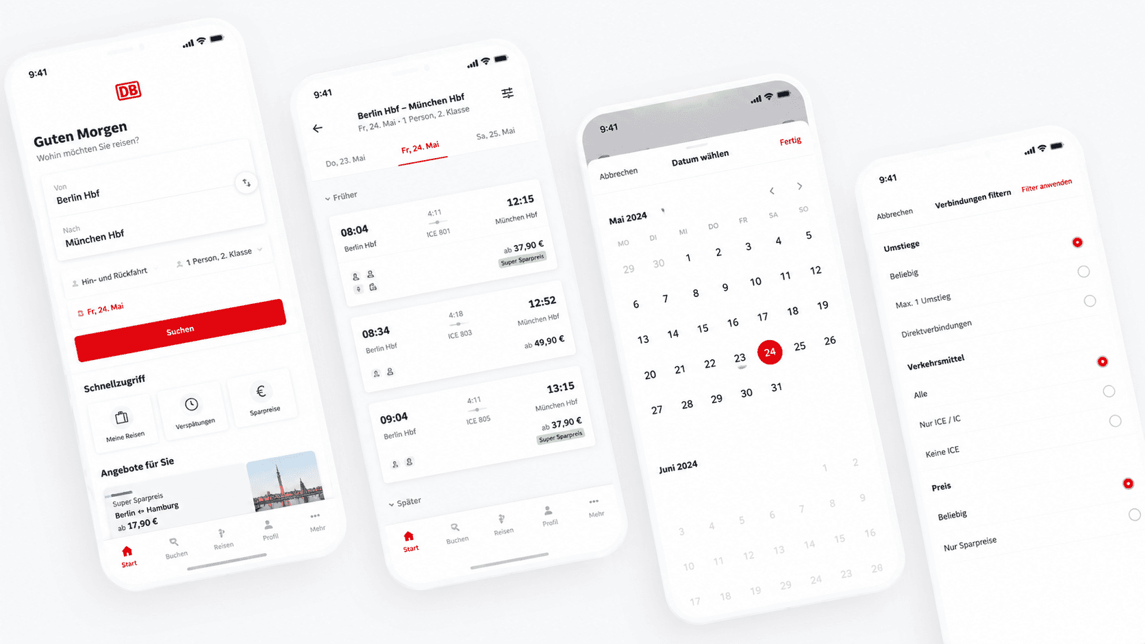
Dear DB Navigator: Two Date Issues That Cost Your Users Money
Good UX feedback isn't just "this is broken." It's "here's why it breaks, here's who it affects, and here's how to fix it."
Read More
UX Analysis - Good Design
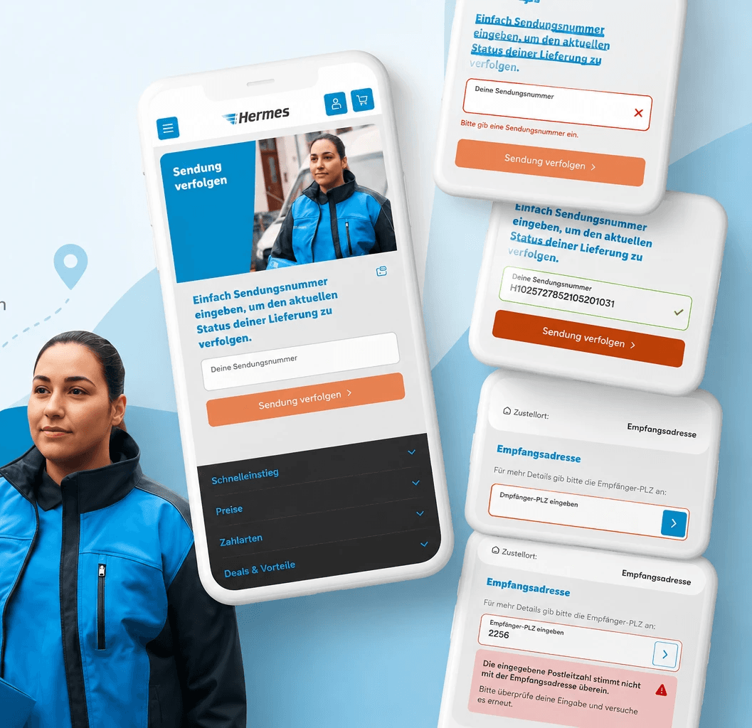
A small UX win: how Hermes gets parcel tracking right
So it is only fair to call it out when an app actually gets the details right. This week that app is Hermes.
Read More
UX Research - International Design
My mum got scammed by a beautifully
designed app. That broke something in me.
My mum is retired. She is smart, careful, and not naive. She got scammed anyway.
Someone called her. They said they were from an investment platform called N-Yatirim. They told her they would invest on her behalf, gave her an IBAN, and asked her to send money. She sent 250 dollars. Within a day it had grown to 270. It looked real. It felt real. And then she realised something was wrong and called them back.
That is when things got worse. They told her they were fixing it. They told her to open her banking app - "we are blacking out your screen, we cannot see anything." They guided her through screens while watching everything. She caught it. She closed her accounts, stopped all transactions, and called the bank. She did everything right once she realised.
But here is what I cannot stop thinking about. The app they built to deceive her was genuinely well designed.
Scammers used to rely on bad grammar and obvious lies. Now some of them are hiring designers. And that changes everything.
What the app actually looked like
I saw the screenshots. I want to be precise about this because I think precision matters here.
The app had a dark theme - the same premium aesthetic used by legitimate trading platforms like eToro or Binance. It showed real stock tickers: EUR/USD at 1.1412. 3M Company. Adobe Inc. AAVE. ADA. Real assets with real prices, updating in real time. It had a proper navigation bar - Profile, Chart, Market, Transactions, History. It had a gamification layer - a level system called "Standard 1" with a progress bar showing 200/600 points, daily tasks, achievement mechanics.
It had settings pages. Personal data sections. Security settings. An account ID: USD REAL-105175. A "Yatirim" (Invest) button in bright blue that looked exactly like a primary CTA on any well-designed fintech app.
Someone made deliberate design decisions here. They chose that dark theme. They chose to show real stock data rather than fake numbers. They built a level system to create a sense of progression and investment in the platform. They thought about information architecture. They thought about trust signals.
They used the same craft I use to help people - to hurt someone.
The UX of deception - what they got right
I have spent 16+ years thinking about how design builds trust. After looking at those screenshots, I can tell you exactly which trust-building techniques the scammers used - because they are the same ones I use legitimately.
Real data as social proof
They showed live EUR/USD exchange rates and real company stock prices. This is the same principle behind showing real user reviews, real product counts, real timestamps. Real data is an instant credibility signal. Your brain registers "this is connected to something real" before you consciously think about it. The fact that the data was accurate made the platform feel legitimate - even though displaying accurate stock prices costs almost nothing to implement via a free API.
Visual language borrowed from trusted brands
The dark theme, the accent blue, the icon style, the bottom navigation structure - all of it closely mirrors the visual language of legitimate trading apps that people recognise. This is a form of visual phishing. The same way a fake bank email copies the exact colours and typography of a real one, this app copied the aesthetic of a legitimate trading platform. Your brain pattern-matches to "I have seen this kind of app before and it was safe."
Gamification to create commitment
The level system - "Standard 1, 200/600 to next level" - and the daily tasks are not accidental. Gamification creates psychological investment. Once you have a level, a progress bar, points - you feel like you have something to lose by leaving. This is the same mechanic used by Duolingo, fitness apps, and loyalty programmes. Here it was used to make my mum feel she had already built something on the platform. Leaving would mean losing it.
A believable initial gain
250 dollars became 270 in one day. This is the classic setup of investment fraud. Show a small, believable gain first. Nothing suspicious - 8% in a day is high but not insane for a volatile asset in someone's mind. The purpose of this gain is not the money. It is proof. "See? It works. Now imagine what you could make with more."
The screen sharing trap
When my mum called them to ask for her money back, they shifted tactics. They told her to open her banking app. They said "we are blacking out your screen, we cannot see anything" - a deliberate lie designed to remove the one thing that might stop her: the fear of being watched.
This is psychological manipulation layered on top of the design. The app built the trust. The phone call exploited it. By the time she was on the call, she already believed in the platform because the interface had done its job. The scammers were now capitalising on weeks of design-built credibility.
She realised something was wrong. She stopped. She hung up. She closed her bank accounts.
But I keep thinking about the people who did not realise in time.
Why this matters for designers
We talk a lot in the UX community about dark patterns - manipulative design choices that trick users into doing things they did not intend. Subscribe instead of download. Unsubscribe hidden behind seven menus. Pre-ticked consent boxes. These are real problems and they deserve criticism.
But the scam app my mum used represents something further along that spectrum. It is not dark patterns in service of a legitimate business maximising revenue. It is UX expertise deployed in service of organised crime, targeting vulnerable people, with real financial consequences.
And here is the uncomfortable truth: the better designers get at building trust, the better criminal operations can use those same techniques to destroy it. The skills are the same. The intent is opposite.
Every trust signal we design teaches users to trust that signal. Including the ones that scammers copy.
How to recognise a scam app - the design red flags
I am not going to pretend there is a simple checklist that stops this. The whole point is that well-designed scam apps do not look like scam apps. But there are signals worth knowing:
01
It was not on the App Store or Google Play
Legitimate investment apps go through app store review. If someone asks you to download something via a link, a PDF, or a WhatsApp message rather than through the official store - that is a significant red flag. App stores are not perfect, but they are a layer of verification that scam apps typically cannot pass.
02
The contact was unsolicited
Nobody from a legitimate investment platform calls you out of nowhere to offer to invest on your behalf. The call coming to you, rather than you finding the platform, is the foundational red flag that everything else builds on.
03
They asked you to share your screen
"We cannot see your screen" is a lie. If someone asks you to share your screen in the context of your bank account or investments, hang up immediately. No legitimate financial institution needs this. Ever.
04
The gains felt too fast
8% in one day is possible in volatile markets. It is also the exact amount a scammer would choose - high enough to be exciting, low enough to be believable. If a platform shows you a fast gain immediately after your first deposit, treat it as a manipulation tactic rather than a result.
05
They created urgency around getting your money back
"We are handling it right now, but you need to do X immediately" - urgency is a manipulation tool. Scammers use it to prevent you from pausing, thinking, or calling someone you trust. Any legitimate institution will give you time to think.
What I want designers to take from this
Do not look away from the fact that your craft can be weaponised. Understanding how trust is built in interfaces is not just useful for making better products - it is increasingly important for protecting the people those products are supposed to serve.
If you work in fintech, in investment platforms, in anything that handles money - think about what distinguishes your legitimate interface from a well-designed fraudulent one. What signals are you relying on that a scammer could copy? How would a user know the difference?
And on a more personal level: talk to the older people in your life about this. Not in a condescending way. In an honest way. My mum is not naive. She was targeted by a professional operation with a well-designed product and a practised script. Anyone can be caught by this. The best protection is knowing what it looks like.
My mum caught it early. She is okay. The bank is investigating. But the 250 dollars is probably gone - and that is not the part that bothers me most.
What bothers me is that someone, somewhere, sat down and designed that app. Made it look right. Made it feel trustworthy. And then handed it to criminals.
I hope they read this.
If this has happened to you or someone you know
Contact your bank immediately - ask to stop all transactions and file a formal complaint. Report to the police (in Germany: Polizei Online-Wache, in Turkey: Siber Suçlarla Mucadele). Change all passwords for email, banking, and government accounts. If a TC kimlik numarasi or personal ID was shared, contact your mobile operator and ask them to flag your account against SIM swap fraud. You are not alone and you did nothing wrong.
more to discover
UX Analysis - Heuristics - Mobile
Dear DB Navigator: Two Date Issues That Cost Your Users Money
Good UX feedback isn't just "this is broken." It's "here's why it breaks, here's who it affects, and here's how to fix it."
Read More
UX Analysis - Good Design
A small UX win: how Hermes gets parcel tracking right
So it is only fair to call it out when an app actually gets the details right. This week that app is Hermes.
Read More
UX Research - International Design
My mum got scammed by a beautifully
designed app. That broke something in me.
My mum is retired. She is smart, careful, and not naive. She got scammed anyway.
Someone called her. They said they were from an investment platform called N-Yatirim. They told her they would invest on her behalf, gave her an IBAN, and asked her to send money. She sent 250 dollars. Within a day it had grown to 270. It looked real. It felt real. And then she realised something was wrong and called them back.
That is when things got worse. They told her they were fixing it. They told her to open her banking app - "we are blacking out your screen, we cannot see anything." They guided her through screens while watching everything. She caught it. She closed her accounts, stopped all transactions, and called the bank. She did everything right once she realised.
But here is what I cannot stop thinking about. The app they built to deceive her was genuinely well designed.
Scammers used to rely on bad grammar and obvious lies. Now some of them are hiring designers. And that changes everything.
What the app actually looked like
I saw the screenshots. I want to be precise about this because I think precision matters here.
The app had a dark theme - the same premium aesthetic used by legitimate trading platforms like eToro or Binance. It showed real stock tickers: EUR/USD at 1.1412. 3M Company. Adobe Inc. AAVE. ADA. Real assets with real prices, updating in real time. It had a proper navigation bar - Profile, Chart, Market, Transactions, History. It had a gamification layer - a level system called "Standard 1" with a progress bar showing 200/600 points, daily tasks, achievement mechanics.
It had settings pages. Personal data sections. Security settings. An account ID: USD REAL-105175. A "Yatirim" (Invest) button in bright blue that looked exactly like a primary CTA on any well-designed fintech app.
Someone made deliberate design decisions here. They chose that dark theme. They chose to show real stock data rather than fake numbers. They built a level system to create a sense of progression and investment in the platform. They thought about information architecture. They thought about trust signals.
They used the same craft I use to help people - to hurt someone.
The UX of deception - what they got right
I have spent 16+ years thinking about how design builds trust. After looking at those screenshots, I can tell you exactly which trust-building techniques the scammers used - because they are the same ones I use legitimately.
Real data as social proof
They showed live EUR/USD exchange rates and real company stock prices. This is the same principle behind showing real user reviews, real product counts, real timestamps. Real data is an instant credibility signal. Your brain registers "this is connected to something real" before you consciously think about it. The fact that the data was accurate made the platform feel legitimate - even though displaying accurate stock prices costs almost nothing to implement via a free API.
Visual language borrowed from trusted brands
The dark theme, the accent blue, the icon style, the bottom navigation structure - all of it closely mirrors the visual language of legitimate trading apps that people recognise. This is a form of visual phishing. The same way a fake bank email copies the exact colours and typography of a real one, this app copied the aesthetic of a legitimate trading platform. Your brain pattern-matches to "I have seen this kind of app before and it was safe."
Gamification to create commitment
The level system - "Standard 1, 200/600 to next level" - and the daily tasks are not accidental. Gamification creates psychological investment. Once you have a level, a progress bar, points - you feel like you have something to lose by leaving. This is the same mechanic used by Duolingo, fitness apps, and loyalty programmes. Here it was used to make my mum feel she had already built something on the platform. Leaving would mean losing it.
A believable initial gain
250 dollars became 270 in one day. This is the classic setup of investment fraud. Show a small, believable gain first. Nothing suspicious - 8% in a day is high but not insane for a volatile asset in someone's mind. The purpose of this gain is not the money. It is proof. "See? It works. Now imagine what you could make with more."
The screen sharing trap
When my mum called them to ask for her money back, they shifted tactics. They told her to open her banking app. They said "we are blacking out your screen, we cannot see anything" - a deliberate lie designed to remove the one thing that might stop her: the fear of being watched.
This is psychological manipulation layered on top of the design. The app built the trust. The phone call exploited it. By the time she was on the call, she already believed in the platform because the interface had done its job. The scammers were now capitalising on weeks of design-built credibility.
She realised something was wrong. She stopped. She hung up. She closed her bank accounts.
But I keep thinking about the people who did not realise in time.
Why this matters for designers
We talk a lot in the UX community about dark patterns - manipulative design choices that trick users into doing things they did not intend. Subscribe instead of download. Unsubscribe hidden behind seven menus. Pre-ticked consent boxes. These are real problems and they deserve criticism.
But the scam app my mum used represents something further along that spectrum. It is not dark patterns in service of a legitimate business maximising revenue. It is UX expertise deployed in service of organised crime, targeting vulnerable people, with real financial consequences.
And here is the uncomfortable truth: the better designers get at building trust, the better criminal operations can use those same techniques to destroy it. The skills are the same. The intent is opposite.
Every trust signal we design teaches users to trust that signal. Including the ones that scammers copy.
How to recognise a scam app - the design red flags
I am not going to pretend there is a simple checklist that stops this. The whole point is that well-designed scam apps do not look like scam apps. But there are signals worth knowing:
01
It was not on the App Store or Google Play
Legitimate investment apps go through app store review. If someone asks you to download something via a link, a PDF, or a WhatsApp message rather than through the official store - that is a significant red flag. App stores are not perfect, but they are a layer of verification that scam apps typically cannot pass.
02
The contact was unsolicited
Nobody from a legitimate investment platform calls you out of nowhere to offer to invest on your behalf. The call coming to you, rather than you finding the platform, is the foundational red flag that everything else builds on.
03
They asked you to share your screen
"We cannot see your screen" is a lie. If someone asks you to share your screen in the context of your bank account or investments, hang up immediately. No legitimate financial institution needs this. Ever.
04
The gains felt too fast
8% in one day is possible in volatile markets. It is also the exact amount a scammer would choose - high enough to be exciting, low enough to be believable. If a platform shows you a fast gain immediately after your first deposit, treat it as a manipulation tactic rather than a result.
05
They created urgency around getting your money back
"We are handling it right now, but you need to do X immediately" - urgency is a manipulation tool. Scammers use it to prevent you from pausing, thinking, or calling someone you trust. Any legitimate institution will give you time to think.
What I want designers to take from this
Do not look away from the fact that your craft can be weaponised. Understanding how trust is built in interfaces is not just useful for making better products - it is increasingly important for protecting the people those products are supposed to serve.
If you work in fintech, in investment platforms, in anything that handles money - think about what distinguishes your legitimate interface from a well-designed fraudulent one. What signals are you relying on that a scammer could copy? How would a user know the difference?
And on a more personal level: talk to the older people in your life about this. Not in a condescending way. In an honest way. My mum is not naive. She was targeted by a professional operation with a well-designed product and a practised script. Anyone can be caught by this. The best protection is knowing what it looks like.
My mum caught it early. She is okay. The bank is investigating. But the 250 dollars is probably gone - and that is not the part that bothers me most.
What bothers me is that someone, somewhere, sat down and designed that app. Made it look right. Made it feel trustworthy. And then handed it to criminals.
I hope they read this.
If this has happened to you or someone you know
Contact your bank immediately - ask to stop all transactions and file a formal complaint. Report to the police (in Germany: Polizei Online-Wache, in Turkey: Siber Suçlarla Mucadele). Change all passwords for email, banking, and government accounts. If a TC kimlik numarasi or personal ID was shared, contact your mobile operator and ask them to flag your account against SIM swap fraud. You are not alone and you did nothing wrong.
more to discover
UX Analysis - Heuristics - Mobile
Dear DB Navigator: Two Date Issues That Cost Your Users Money
Good UX feedback isn't just "this is broken." It's "here's why it breaks, here's who it affects, and here's how to fix it."
Read More
UX Analysis - Good Design
A small UX win: how Hermes gets parcel tracking right
So it is only fair to call it out when an app actually gets the details right. This week that app is Hermes.