Case Study - Healthcare UX - Germany
Redesigning the German doctor's office:
from ALBIS to a system that actually works
If you have ever been to a German doctor's office and noticed the receptionist squinting at a Windows XP-era interface with seventeen toolbars, you have seen ALBIS. Or one of its cousins. German Arztinformationssysteme - the software that manages patient records, prescriptions, diagnoses, and billing in medical practices - are famously functional and famously painful to use.
They work. Doctors use them every day. Millions of patient records live inside them. But the user experience is a product of a different era, designed around paper workflows that were never fully rethought when they moved to digital.
I worked on redesigning one specific but important workflow: creating an eRezept - an electronic prescription - for a patient who needs recurring medications renewed. It sounds simple. In the current system, it is not.
The best way to understand a legacy system is to watch an expert user struggle with it. Not because they are bad at their job - but because the system was never designed to make their job easy.

The problem with the old system
The scenario is straightforward: a patient comes in because two of their five regular medications have run out. The doctor needs to renew exactly those two, not all five. In the old system, this requires navigating between multiple sections - the medication history, a specialist list, a search database - because the medications originally prescribed by a specialist are not in the GP's own list and have to be hunted down manually.
The interface gives you everything at once: toolbars stacked on toolbars, tabs within tabs, dense text with no visual hierarchy. Everything is technically accessible. Nothing is clearly findable. The cognitive load on a GP who sees thirty patients a day is real, even if they never articulate it as a UX problem - because for them it is just how the system works.

The redesign: Healthy System
The redesign is called Healthy System. The name is a small joke and also a mission statement.
The core principle was to design around the actual workflow rather than around the data. A GP opening a patient record at the start of a consultation has a specific goal. The interface should support that goal, not present every possible action at equal weight simultaneously.
The patient overview was reorganised into clear sections: medical data with active diagnoses, insurance card information, vaccination status, the eMedikationsliste, and allergies. Each section is visually separated, scannable in seconds, and expandable when needed. The right sidebar contains quick actions relevant to the current consultation - not everything the system can do.

The redesigned patient overview - same data, completely different hierarchy. The consultation workflow is visible at a glance.
The eRezept workflow - step by step
Here is the specific flow I redesigned, following the scenario of Dr. Seelig renewing two medications for a patient with three chronic conditions.
#01
Empty eMP, clear next action
The eMedikationsliste section shows clearly that no eMedikationsplan exists yet. Instead of just showing an error or an empty state with no guidance, the system gives the doctor an immediate path forward: a plus icon with a plain explanation of what clicking it will do. The empty state is useful, not just honest.

When the doctor clicks the plus icon, the system offers to import existing medications from the patient's electronic medication list - a clear, helpful next step rather than a blank slate.
takeaway
A heuristic evaluation is most valuable when it ends with redesigned solutions, not just a list of problems. Find the friction, apply the framework, show what better looks like. That's the whole point.
more to discover

Most Viewed
Dark UX - Ethics - Personal
My mum got scammed by a beautifully
designed app. That broke something in me.
Scammers used to rely on bad grammar and obvious lies. Now some of them are hiring designers. And that changes everything.
Read More
UX Analysis - Heuristics - Mobile
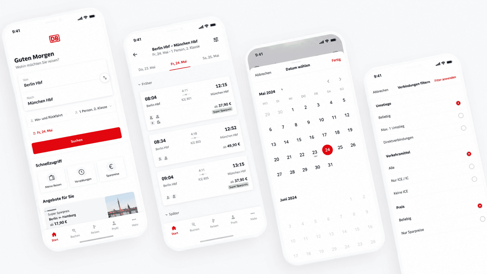
Dear DB Navigator: Two Date Issues That Cost Your Users Money
Good UX feedback isn't just "this is broken." It's "here's why it breaks, here's who it affects, and here's how to fix it."
Read More
Case Study - Healthcare UX - Germany
Redesigning the German doctor's office:
from ALBIS to a system that actually works
If you have ever been to a German doctor's office and noticed the receptionist squinting at a Windows XP-era interface with seventeen toolbars, you have seen ALBIS. Or one of its cousins. German Arztinformationssysteme - the software that manages patient records, prescriptions, diagnoses, and billing in medical practices - are famously functional and famously painful to use.
They work. Doctors use them every day. Millions of patient records live inside them. But the user experience is a product of a different era, designed around paper workflows that were never fully rethought when they moved to digital.
I worked on redesigning one specific but important workflow: creating an eRezept - an electronic prescription - for a patient who needs recurring medications renewed. It sounds simple. In the current system, it is not.
The best way to understand a legacy system is to watch an expert user struggle with it. Not because they are bad at their job - but because the system was never designed to make their job easy.
The problem with the old system
The scenario is straightforward: a patient comes in because two of their five regular medications have run out. The doctor needs to renew exactly those two, not all five. In the old system, this requires navigating between multiple sections - the medication history, a specialist list, a search database - because the medications originally prescribed by a specialist are not in the GP's own list and have to be hunted down manually.
The interface gives you everything at once: toolbars stacked on toolbars, tabs within tabs, dense text with no visual hierarchy. Everything is technically accessible. Nothing is clearly findable. The cognitive load on a GP who sees thirty patients a day is real, even if they never articulate it as a UX problem - because for them it is just how the system works.
The redesign: Healthy System
The redesign is called Healthy System. The name is a small joke and also a mission statement.
The core principle was to design around the actual workflow rather than around the data. A GP opening a patient record at the start of a consultation has a specific goal. The interface should support that goal, not present every possible action at equal weight simultaneously.
The patient overview was reorganised into clear sections: medical data with active diagnoses, insurance card information, vaccination status, the eMedikationsliste, and allergies. Each section is visually separated, scannable in seconds, and expandable when needed. The right sidebar contains quick actions relevant to the current consultation - not everything the system can do.
The redesigned patient overview - same data, completely different hierarchy. The consultation workflow is visible at a glance.
The eRezept workflow - step by step
Here is the specific flow I redesigned, following the scenario of Dr. Seelig renewing two medications for a patient with three chronic conditions.
#01
Empty eMP, clear next action
The eMedikationsliste section shows clearly that no eMedikationsplan exists yet. Instead of just showing an error or an empty state with no guidance, the system gives the doctor an immediate path forward: a plus icon with a plain explanation of what clicking it will do. The empty state is useful, not just honest.
When the doctor clicks the plus icon, the system offers to import existing medications from the patient's electronic medication list - a clear, helpful next step rather than a blank slate.
takeaway
A heuristic evaluation is most valuable when it ends with redesigned solutions, not just a list of problems. Find the friction, apply the framework, show what better looks like. That's the whole point.
more to discover
Most Viewed
Dark UX - Ethics - Personal
My mum got scammed by a beautifully
designed app. That broke something in me.
Scammers used to rely on bad grammar and obvious lies. Now some of them are hiring designers. And that changes everything.
Read More
UX Analysis - Heuristics - Mobile
Dear DB Navigator: Two Date Issues That Cost Your Users Money
Good UX feedback isn't just "this is broken." It's "here's why it breaks, here's who it affects, and here's how to fix it."
Read More
Case Study - Healthcare UX - Germany
Redesigning the German doctor's office:
from ALBIS to a system that actually works
If you have ever been to a German doctor's office and noticed the receptionist squinting at a Windows XP-era interface with seventeen toolbars, you have seen ALBIS. Or one of its cousins. German Arztinformationssysteme - the software that manages patient records, prescriptions, diagnoses, and billing in medical practices - are famously functional and famously painful to use.
They work. Doctors use them every day. Millions of patient records live inside them. But the user experience is a product of a different era, designed around paper workflows that were never fully rethought when they moved to digital.
I worked on redesigning one specific but important workflow: creating an eRezept - an electronic prescription - for a patient who needs recurring medications renewed. It sounds simple. In the current system, it is not.
The best way to understand a legacy system is to watch an expert user struggle with it. Not because they are bad at their job - but because the system was never designed to make their job easy.
The problem with the old system
The scenario is straightforward: a patient comes in because two of their five regular medications have run out. The doctor needs to renew exactly those two, not all five. In the old system, this requires navigating between multiple sections - the medication history, a specialist list, a search database - because the medications originally prescribed by a specialist are not in the GP's own list and have to be hunted down manually.
The interface gives you everything at once: toolbars stacked on toolbars, tabs within tabs, dense text with no visual hierarchy. Everything is technically accessible. Nothing is clearly findable. The cognitive load on a GP who sees thirty patients a day is real, even if they never articulate it as a UX problem - because for them it is just how the system works.
The redesign: Healthy System
The redesign is called Healthy System. The name is a small joke and also a mission statement.
The core principle was to design around the actual workflow rather than around the data. A GP opening a patient record at the start of a consultation has a specific goal. The interface should support that goal, not present every possible action at equal weight simultaneously.
The patient overview was reorganised into clear sections: medical data with active diagnoses, insurance card information, vaccination status, the eMedikationsliste, and allergies. Each section is visually separated, scannable in seconds, and expandable when needed. The right sidebar contains quick actions relevant to the current consultation - not everything the system can do.
The redesigned patient overview - same data, completely different hierarchy. The consultation workflow is visible at a glance.
The eRezept workflow - step by step
Here is the specific flow I redesigned, following the scenario of Dr. Seelig renewing two medications for a patient with three chronic conditions.
#01
Empty eMP, clear next action
The eMedikationsliste section shows clearly that no eMedikationsplan exists yet. Instead of just showing an error or an empty state with no guidance, the system gives the doctor an immediate path forward: a plus icon with a plain explanation of what clicking it will do. The empty state is useful, not just honest.
When the doctor clicks the plus icon, the system offers to import existing medications from the patient's electronic medication list - a clear, helpful next step rather than a blank slate.
takeaway
A heuristic evaluation is most valuable when it ends with redesigned solutions, not just a list of problems. Find the friction, apply the framework, show what better looks like. That's the whole point.
more to discover
Most Viewed
Dark UX - Ethics - Personal
My mum got scammed by a beautifully
designed app. That broke something in me.
Scammers used to rely on bad grammar and obvious lies. Now some of them are hiring designers. And that changes everything.
Read More
UX Analysis - Heuristics - Mobile
Dear DB Navigator: Two Date Issues That Cost Your Users Money
Good UX feedback isn't just "this is broken." It's "here's why it breaks, here's who it affects, and here's how to fix it."