Accessibility - WCAG
5 WCAG Mistakes I See on Almost Every Website
After years of running accessibility audits across insurance, aviation, fintech and enterprise platforms, I've noticed the same issues coming up again and again. Projects with big budgets, experienced teams, thorough QA processes - and still the same five problems.
These aren't obscure edge cases. They're common enough that you can find at least one of them on almost any website you open today. Here's what they are, why they happen, and how to fix them before you even open Axe DevTools.
01
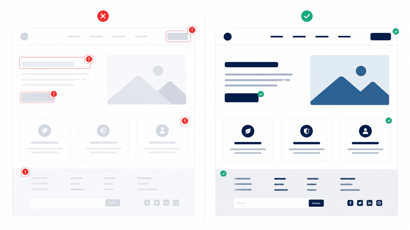
Missing focus indicators
This is the most common one by a significant margin. Somewhere in the CSS, there's an outline: none on the button or link element - added by a developer (or designer) who didn't like how the browser's default focus ring looked. The result: keyboard users have no visual indication of where they are on the page. This fails WCAG 2.4.7 (Focus Visible). The fix isn't complicated - design a visible, branded focus ring and make it part of every interactive component from the start. Three pixels of solid colour is all it takes.

02
Colour-only error states
Red border. Red text. Nothing else. This is how most form error states are designed - and it fails for anyone with colour blindness, which affects around 8% of men. WCAG 3.3.1 (Error Identification) requires that errors are communicated in a way that doesn't rely on colour alone. The fix: add a warning icon and a descriptive error message alongside the colour change. "Invalid date" in red tells you something went wrong. "Invalid date - please use DD/MM/YYYY format" with a ⚠ icon tells you what went wrong and how to fix it. Always the latter.

03
Form labels that aren't programmatically associated with inputs
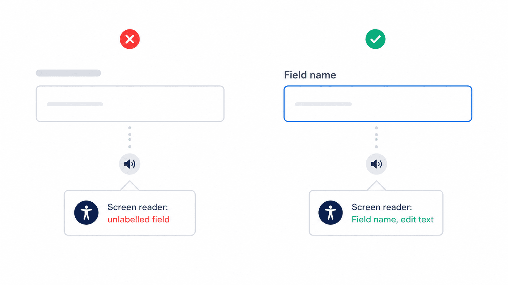
The label looks right visually - it's positioned above the input, the right size, the right colour. But if it's not using a proper <label for=""> relationship with the input's id, screen readers announce the field as unlabelled. WCAG 1.3.1 (Info and Relationships) requires this association. This one is almost always a development problem rather than a design problem - but designers can prevent it by annotating Figma handoff files with ARIA requirements.
04
Text contrast that looks fine on a good screen
Light grey text on white. Placeholder text that's barely there. Body copy that passes on a calibrated design monitor and fails on 40% of real-world screens. WCAG 1.4.3 (Contrast Minimum) requires 4.5:1 for normal text and 3:1 for large text. The reason this keeps happening: designers check contrast in Figma on a good display and it looks fine. Check it with an actual contrast checker. Build it into your design tokens so it can't be accidentally broken downstream.

05
Non-text elements with invisible borders
Input fields where the border is so light it disappears against a white background. Checkboxes that blend into the page. Buttons that rely entirely on their background colour to be identifiable as interactive. WCAG 1.4.11 (Non-text Contrast) requires UI components to have a 3:1 contrast ratio against adjacent colours. This is one of the newer criteria (added in WCAG 2.1) and still catches most teams by surprise. If you can barely see the input border on your screen, a low-vision user can't see it at all.

Why do these keep happening?
Almost always the same reasons. Accessibility isn't considered at the token level - it's audited at the end, when it's expensive to fix. Focus states are styled away for visual reasons without a designed replacement. Error states are designed by someone who doesn't have colour blindness and doesn't test with one. Form associations are assumed to be a developer concern rather than a design concern.
The fix is shifting accessibility earlier in the process - not as a checklist at the end, but as a design constraint from the first token definition. When your colour system is built with contrast ratios built in, and your component library includes accessible focus states as standard, these problems stop making it to production.
where to start
Run your current site through Axe DevTools (free browser extension) and WAVE. Most of these five issues will appear in the first 2 minutes. Then fix them at the component level so they don't come back.
more to discover

Most Viewed
Dark UX - Ethics - Personal
My mum got scammed by a beautifully
designed app. That broke something in me.
Scammers used to rely on bad grammar and obvious lies. Now some of them are hiring designers. And that changes everything.
Read More
UX Analysis - Heuristics - Mobile
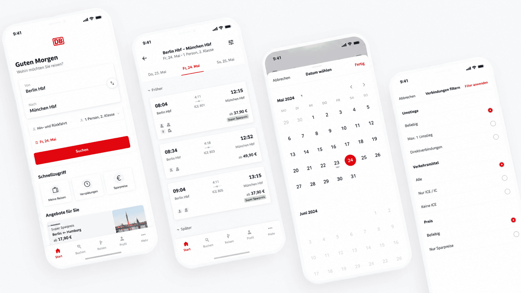
Dear DB Navigator: Two Date Issues That Cost Your Users Money
Good UX feedback isn't just "this is broken." It's "here's why it breaks, here's who it affects, and here's how to fix it."
Read More
Accessibility - WCAG
5 WCAG Mistakes I See on Almost Every Website
After years of running accessibility audits across insurance, aviation, fintech and enterprise platforms, I've noticed the same issues coming up again and again. Projects with big budgets, experienced teams, thorough QA processes - and still the same five problems.
These aren't obscure edge cases. They're common enough that you can find at least one of them on almost any website you open today. Here's what they are, why they happen, and how to fix them before you even open Axe DevTools.
01
Missing focus indicators
This is the most common one by a significant margin. Somewhere in the CSS, there's an outline: none on the button or link element - added by a developer (or designer) who didn't like how the browser's default focus ring looked. The result: keyboard users have no visual indication of where they are on the page. This fails WCAG 2.4.7 (Focus Visible). The fix isn't complicated - design a visible, branded focus ring and make it part of every interactive component from the start. Three pixels of solid colour is all it takes.
02
Colour-only error states
Red border. Red text. Nothing else. This is how most form error states are designed - and it fails for anyone with colour blindness, which affects around 8% of men. WCAG 3.3.1 (Error Identification) requires that errors are communicated in a way that doesn't rely on colour alone. The fix: add a warning icon and a descriptive error message alongside the colour change. "Invalid date" in red tells you something went wrong. "Invalid date - please use DD/MM/YYYY format" with a ⚠ icon tells you what went wrong and how to fix it. Always the latter.
03
Form labels that aren't programmatically associated with inputs
The label looks right visually - it's positioned above the input, the right size, the right colour. But if it's not using a proper <label for=""> relationship with the input's id, screen readers announce the field as unlabelled. WCAG 1.3.1 (Info and Relationships) requires this association. This one is almost always a development problem rather than a design problem - but designers can prevent it by annotating Figma handoff files with ARIA requirements.
04
Text contrast that looks fine on a good screen
Light grey text on white. Placeholder text that's barely there. Body copy that passes on a calibrated design monitor and fails on 40% of real-world screens. WCAG 1.4.3 (Contrast Minimum) requires 4.5:1 for normal text and 3:1 for large text. The reason this keeps happening: designers check contrast in Figma on a good display and it looks fine. Check it with an actual contrast checker. Build it into your design tokens so it can't be accidentally broken downstream.
05
Non-text elements with invisible borders
Input fields where the border is so light it disappears against a white background. Checkboxes that blend into the page. Buttons that rely entirely on their background colour to be identifiable as interactive. WCAG 1.4.11 (Non-text Contrast) requires UI components to have a 3:1 contrast ratio against adjacent colours. This is one of the newer criteria (added in WCAG 2.1) and still catches most teams by surprise. If you can barely see the input border on your screen, a low-vision user can't see it at all.
Why do these keep happening?
Almost always the same reasons. Accessibility isn't considered at the token level - it's audited at the end, when it's expensive to fix. Focus states are styled away for visual reasons without a designed replacement. Error states are designed by someone who doesn't have colour blindness and doesn't test with one. Form associations are assumed to be a developer concern rather than a design concern.
The fix is shifting accessibility earlier in the process - not as a checklist at the end, but as a design constraint from the first token definition. When your colour system is built with contrast ratios built in, and your component library includes accessible focus states as standard, these problems stop making it to production.
where to start
Run your current site through Axe DevTools (free browser extension) and WAVE. Most of these five issues will appear in the first 2 minutes. Then fix them at the component level so they don't come back.
more to discover
Most Viewed
Dark UX - Ethics - Personal
My mum got scammed by a beautifully
designed app. That broke something in me.
Scammers used to rely on bad grammar and obvious lies. Now some of them are hiring designers. And that changes everything.
Read More
UX Analysis - Heuristics - Mobile
Dear DB Navigator: Two Date Issues That Cost Your Users Money
Good UX feedback isn't just "this is broken." It's "here's why it breaks, here's who it affects, and here's how to fix it."
Read More
Accessibility - WCAG
5 WCAG Mistakes I See on Almost Every Website
After years of running accessibility audits across insurance, aviation, fintech and enterprise platforms, I've noticed the same issues coming up again and again. Projects with big budgets, experienced teams, thorough QA processes - and still the same five problems.
These aren't obscure edge cases. They're common enough that you can find at least one of them on almost any website you open today. Here's what they are, why they happen, and how to fix them before you even open Axe DevTools.
01
Missing focus indicators
This is the most common one by a significant margin. Somewhere in the CSS, there's an outline: none on the button or link element - added by a developer (or designer) who didn't like how the browser's default focus ring looked. The result: keyboard users have no visual indication of where they are on the page. This fails WCAG 2.4.7 (Focus Visible). The fix isn't complicated - design a visible, branded focus ring and make it part of every interactive component from the start. Three pixels of solid colour is all it takes.
02
Colour-only error states
Red border. Red text. Nothing else. This is how most form error states are designed - and it fails for anyone with colour blindness, which affects around 8% of men. WCAG 3.3.1 (Error Identification) requires that errors are communicated in a way that doesn't rely on colour alone. The fix: add a warning icon and a descriptive error message alongside the colour change. "Invalid date" in red tells you something went wrong. "Invalid date - please use DD/MM/YYYY format" with a ⚠ icon tells you what went wrong and how to fix it. Always the latter.
03
Form labels that aren't programmatically associated with inputs
The label looks right visually - it's positioned above the input, the right size, the right colour. But if it's not using a proper <label for=""> relationship with the input's id, screen readers announce the field as unlabelled. WCAG 1.3.1 (Info and Relationships) requires this association. This one is almost always a development problem rather than a design problem - but designers can prevent it by annotating Figma handoff files with ARIA requirements.
04
Text contrast that looks fine on a good screen
Light grey text on white. Placeholder text that's barely there. Body copy that passes on a calibrated design monitor and fails on 40% of real-world screens. WCAG 1.4.3 (Contrast Minimum) requires 4.5:1 for normal text and 3:1 for large text. The reason this keeps happening: designers check contrast in Figma on a good display and it looks fine. Check it with an actual contrast checker. Build it into your design tokens so it can't be accidentally broken downstream.
05
Non-text elements with invisible borders
Input fields where the border is so light it disappears against a white background. Checkboxes that blend into the page. Buttons that rely entirely on their background colour to be identifiable as interactive. WCAG 1.4.11 (Non-text Contrast) requires UI components to have a 3:1 contrast ratio against adjacent colours. This is one of the newer criteria (added in WCAG 2.1) and still catches most teams by surprise. If you can barely see the input border on your screen, a low-vision user can't see it at all.
Why do these keep happening?
Almost always the same reasons. Accessibility isn't considered at the token level - it's audited at the end, when it's expensive to fix. Focus states are styled away for visual reasons without a designed replacement. Error states are designed by someone who doesn't have colour blindness and doesn't test with one. Form associations are assumed to be a developer concern rather than a design concern.
The fix is shifting accessibility earlier in the process - not as a checklist at the end, but as a design constraint from the first token definition. When your colour system is built with contrast ratios built in, and your component library includes accessible focus states as standard, these problems stop making it to production.
where to start
Run your current site through Axe DevTools (free browser extension) and WAVE. Most of these five issues will appear in the first 2 minutes. Then fix them at the component level so they don't come back.
more to discover
Most Viewed
Dark UX - Ethics - Personal
My mum got scammed by a beautifully
designed app. That broke something in me.
Scammers used to rely on bad grammar and obvious lies. Now some of them are hiring designers. And that changes everything.
Read More
UX Analysis - Heuristics - Mobile
Dear DB Navigator: Two Date Issues That Cost Your Users Money
Good UX feedback isn't just "this is broken." It's "here's why it breaks, here's who it affects, and here's how to fix it."