Mobile UX - Wellness App - Research - Usability Testing
Medicrescent - designing forhealth tourism at scale.
A health tourism platform connecting patients with hospitals worldwide - and hospitals with their B2B partners. Logo, full accessible design system, and a dual-audience web platform built around one of UX's hardest problems: making users feel safe uploading sensitive medical data.

Client:
Medicrescent
Role:
UX/UI Designer - Brand
Scope:
Logo, Design System, Platform
Market:
International
01 - Context
Health tourism is a $100B+ market with a trust problem
Millions of people travel internationally every year for medical treatment - elective procedures, specialist surgeries, dental care, fertility treatments. The reasons are clear: lower costs, shorter waiting times, access to specialists unavailable locally.
The problem is the process. Finding a hospital, understanding what a procedure will actually cost, communicating across languages and systems, and knowing whether your personal health data is safe - these are all unsolved for most patients. Medicrescent was built to solve this.
A dual-audience platform: B2C for patients navigating health tourism for the first time, and B2B for the hospitals, tourism agencies, and consultant firms coordinating the journeys on the other side.
0
0
Distinct user audiences
0+
0+
Deliverables: Logo, System, Platform
Deliverables: Logo, System, Platform
AA
AA
WCAG compliance level
WCAG compliance level
GDPR
GDPR
Compliant health data flows
Compliant health data flows
02 - The Challenge
Four problems that made this project genuinely hard
Sensitive health data - and users who are scared to share it
To get a specific price quote from a hospital, patients need to upload their medical reports. That's a significant trust ask for a new platform. Every design decision in the upload flow had to actively reduce anxiety - not just look reassuring.
Two completely different user types on one platform
B2C patients and B2B partners (hospitals, tourism agencies, consultants) have different goals, different mental models, and different levels of technical sophistication. The platform needed to serve both without either experiencing the other's complexity.
International scale with multiple languages and regulations
A platform serving patients across multiple countries means multiple languages, multiple healthcare systems, different regulatory requirements, and vastly different levels of digital literacy in the user base.
GDPR and Datenschutz compliance at the core - not the edge
Health data is among the most sensitive category under GDPR. Compliance couldn't be a legal checkbox at the end - it had to be designed into the data flows, consent interactions, and information architecture from day one.
03 - Brand identity
A logo that communicates care, trust, and movement
The Medicrescent mark combines an interlocking M form with a crescent shape - referencing both the medical context and the concept of journey and growth. The teal and navy palette was chosen deliberately: teal for health, vitality, and trust; navy for authority, stability, and security. Together they signal a platform that takes both care and credibility seriously.
The wordmark is set in a clean, modern typeface - approachable without being casual, professional without being cold. The full brand system was designed to work across the platform UI, partner-facing materials, and future marketing contexts.

04 - Design System
Built accessible from the first token - not audited at the end
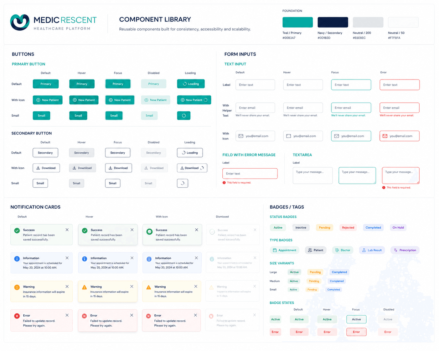
The design system was built before any platform screen was designed. Colour tokens were defined with contrast ratios checked against WCAG AA from the start. Typography scale, spacing system, and component library followed in strict atomic order - atoms to organisms - so that every screen assembled from the system inherited accessibility and consistency automatically.
Healthcare platforms carry a higher accessibility obligation than most - users may be elderly, visually impaired, or accessing the platform under stress. These aren't edge cases in health tourism. They are a significant portion of the actual user base.


05 - Users
Two audiences - one platform. Designed to never feel that way.
The platform serves two fundamentally different audiences. The design challenge was ensuring each user type experiences only the complexity that belongs to them - with clear separation between the B2C patient journey and the B2B partner portal, while sharing the same underlying design system and brand.
B2C - Patient
The Patient
Exploring health tourism for the first time - or returning after a previous experience
Search treatments by type and browse hospitals by country and price range
Get a specific price quote by securely uploading health reports
Understand which hospital gets access to their data - and when
Communicate with the hospital directly through the platform
Feel confident their sensitive data is protected under GDPR
B2B - Partner
The Partner
Hospital, tourism agency, or consultant firm managing patient referrals
Receive and respond to patient inquiries with specific pricing
Access patient health reports securely - only after patient consent
Manage referrals and relationships with tourism agencies and consultants
Track patient journey status across inquiry, quote, booking, and treatment
Maintain a compliant audit trail of all data access and consent events
Mood Mentor
A personalised check-in tool that responds to how the user is feeling in the moment - offering tailored content, exercises, or simply acknowledgment.
MUST HAVE
The Planner
A personal planning tool that helps users structure their wellness intentions without creating the pressure of a rigid habit tracker.
MUST HAVE
Progress bar
A visual progression indicator that feels encouraging rather than punishing - showing movement without making the user feel they've failed when they miss a day.
SHOULD HAVE
06 - The Hard Part
Designing the health data upload flow
The most sensitive - and most important - interaction on the platform is the health report upload flow. A patient needs to share medical documents to get a specific price quote. That is a significant trust ask, and one that standard UX patterns don't have a template for.
The design approach was to make consent explicit, visible, and revocable at every step. Users needed to see exactly which hospital would access their data, understand what it would be used for, and know they could withdraw access at any time. GDPR compliance wasn't a legal footnote - it was the interaction model.
Patient searches
Browse treatments and hospitals anonymously - no data required
NO DATA SHARED
Patient selects hospital
Chooses a specific hospital and requests a personalised quote
CONSENT PROMPTED
Hospital responds
Hospital accesses reports and provides a specific price quote
AUDIT TRAIL RECORDED

07 - Platform Design
The B2C experience - search, compare, connect
The patient-facing platform was designed around three core jobs: finding the right treatment, comparing hospitals and price ranges, and initiating a secure connection with a specific provider. The information architecture was kept deliberately simple - a patient in a stressful medical situation should never have to think about where to go next.

The B2B portal
A separate experience for hospitals and partners
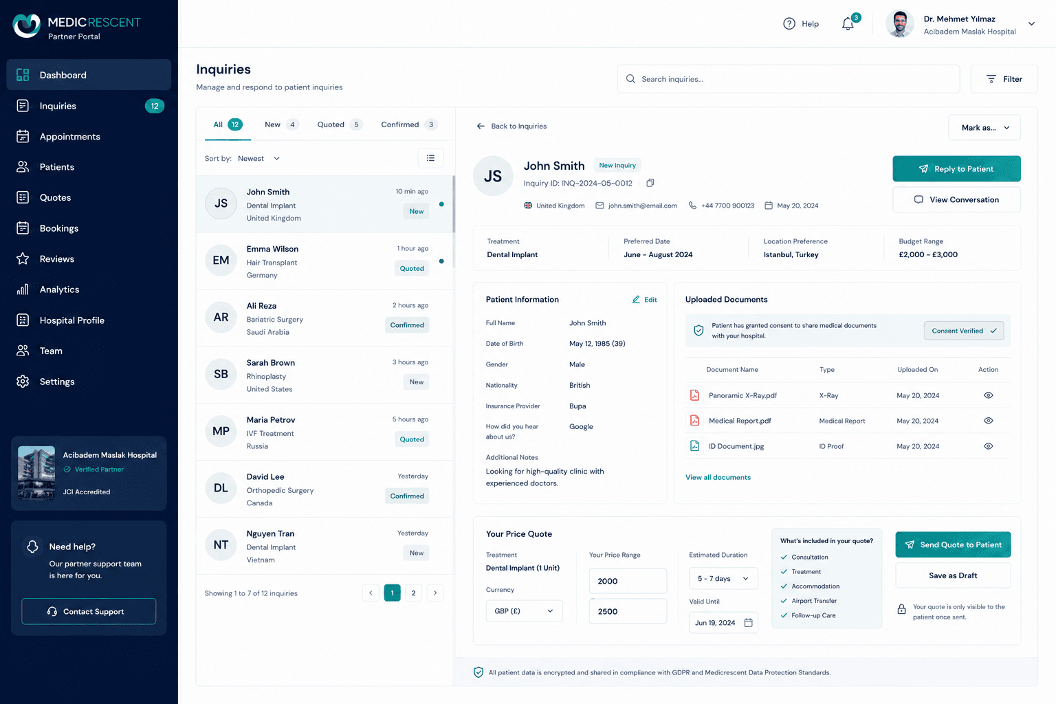
The B2B portal gives hospitals, tourism agencies, and consultant firms a dedicated workspace for managing patient inquiries, accessing consented health documents, coordinating referrals, and tracking the full patient journey. The design language is shared with the patient platform - same system, different information architecture and interaction patterns.
07 - Deliverables
What was designed - end to end
01
Brand identity
Full logo system - primary, reversed, icon-only, monochrome - with brand guidelines for color, typography, and usage rules.
02
Design tokens
Semantic color, typography, spacing, radius, and shadow tokens - all WCAG AA compliant, mapped to CSS variables for direct developer use.
03
Component library
Atomic component library in Figma - atoms to organisms, all interactive states, responsive variants, WCAG accessibility annotations throughout.
04
B2C patient platform
Full web platform screens for the patient journey - search, compare, hospital profiles, secure upload flow, and messaging. Web and mobile-responsive.
05
B2B partner portal
Dedicated partner portal for hospitals, tourism agencies, and consultant firms - inquiry management, document access, referral coordination, and status tracking.
06
GDPR-compliant data flows
Full UX design of the consent, upload, access, and revocation flows for sensitive health data - built to GDPR and German Datenschutz requirements.
When a user uploads their medical records, they're not thinking about UX. They're thinking about whether they can trust you. Every pixel of that flow either builds that trust or destroys it. There is no neutral.
09 - Outcomes
A complete product identity - ready to build on
Brand identity built for scale
A complete logo system and brand guidelines that work across digital platform, partner materials, and future marketing contexts - built to remain consistent as the company grows.
Design system that accelerates development
A fully documented component library with semantic tokens - reducing design-to-development friction and ensuring consistency across both B2C and B2B platform experiences.
GDPR-compliant sensitive data UX
A health document upload flow designed from the ground up for GDPR compliance - explicit consent, named data recipients, access audit trails, and revocation capability built into the interaction model.
WCAG AA accessible from day one
Accessibility built into the token layer - meaning every screen assembled from the system inherits compliance automatically. Critical for a health platform serving users across age ranges and digital literacy levels.
10 - Key Takeaways
What this project reinforced
01
Trust is a design material
On a platform handling medical data, trust isn't a feeling you create with nice colors - it's an outcome of specific, deliberate design decisions. Explicit consent. Named recipients. Visible audit trails. Revocation that actually works. You design for trust the same way you design for usability.
02
Two audiences need two mindsets
B2C and B2B users don't just have different needs - they have different mental models, different contexts, and different tolerances for complexity. A shared design system keeps the brand consistent. Separate information architectures keep the experiences right for each audience.
03
Compliance is a design input, not a design output
GDPR requirements shaped the information architecture, the consent flows, and the data visibility model from the very first wireframe. When compliance is designed in from the start, it makes the product better - clearer, more trustworthy, more honest about what it does with user data.
More Projects

Design System - WCAG - Figma
Ecclesia - a design system built in 53 hours.
Germany's leading insurance group had no design system. No component library. No shared UI language.
Read More

AI Platform - Dashboard UX
DFKI — Designing for
the Amazon Rainforest.
Full UX redesign of DFKI's AI-based ecological monitoring platform used by scientists.
Read More

UX/UI · Accessibility · WCAG 2.1 AA
Making Turkish Airlines
accessible for everyone.
A comprehensive WCAG 2.1 AA audit and redesign of the Turkish Airlines digital booking experience
Read More
Mobile UX - Wellness App - Research - Usability Testing
Medicrescent - designing forhealth tourism at scale.
A health tourism platform connecting patients with hospitals worldwide - and hospitals with their B2B partners. Logo, full accessible design system, and a dual-audience web platform built around one of UX's hardest problems: making users feel safe uploading sensitive medical data.
Client:
Medicrescent
Role:
UX/UI Designer - Brand
Scope:
Logo, Design System, Platform
Market:
International
01 - Context
Health tourism is a $100B+ market with a trust problem
Millions of people travel internationally every year for medical treatment - elective procedures, specialist surgeries, dental care, fertility treatments. The reasons are clear: lower costs, shorter waiting times, access to specialists unavailable locally.
The problem is the process. Finding a hospital, understanding what a procedure will actually cost, communicating across languages and systems, and knowing whether your personal health data is safe - these are all unsolved for most patients. Medicrescent was built to solve this.
A dual-audience platform: B2C for patients navigating health tourism for the first time, and B2B for the hospitals, tourism agencies, and consultant firms coordinating the journeys on the other side.
0
0
Distinct user audiences
0+
0+
Deliverables: Logo, System, Platform
Deliverables: Logo, System, Platform
AA
AA
WCAG compliance level
WCAG compliance level
GDPR
GDPR
Compliant health data flows
Compliant health data flows
02 - The Challenge
Four problems that made this project genuinely hard
Sensitive health data - and users who are scared to share it
To get a specific price quote from a hospital, patients need to upload their medical reports. That's a significant trust ask for a new platform. Every design decision in the upload flow had to actively reduce anxiety - not just look reassuring.
Two completely different user types on one platform
B2C patients and B2B partners (hospitals, tourism agencies, consultants) have different goals, different mental models, and different levels of technical sophistication. The platform needed to serve both without either experiencing the other's complexity.
International scale with multiple languages and regulations
A platform serving patients across multiple countries means multiple languages, multiple healthcare systems, different regulatory requirements, and vastly different levels of digital literacy in the user base.
GDPR and Datenschutz compliance at the core - not the edge
Health data is among the most sensitive category under GDPR. Compliance couldn't be a legal checkbox at the end - it had to be designed into the data flows, consent interactions, and information architecture from day one.
03 - Brand identity
A logo that communicates care, trust, and movement
The Medicrescent mark combines an interlocking M form with a crescent shape - referencing both the medical context and the concept of journey and growth. The teal and navy palette was chosen deliberately: teal for health, vitality, and trust; navy for authority, stability, and security. Together they signal a platform that takes both care and credibility seriously.
The wordmark is set in a clean, modern typeface - approachable without being casual, professional without being cold. The full brand system was designed to work across the platform UI, partner-facing materials, and future marketing contexts.
04 - Design System
Built accessible from the first token - not audited at the end
The design system was built before any platform screen was designed. Colour tokens were defined with contrast ratios checked against WCAG AA from the start. Typography scale, spacing system, and component library followed in strict atomic order - atoms to organisms - so that every screen assembled from the system inherited accessibility and consistency automatically.
Healthcare platforms carry a higher accessibility obligation than most - users may be elderly, visually impaired, or accessing the platform under stress. These aren't edge cases in health tourism. They are a significant portion of the actual user base.
05 - Users
Two audiences - one platform. Designed to never feel that way.
The platform serves two fundamentally different audiences. The design challenge was ensuring each user type experiences only the complexity that belongs to them - with clear separation between the B2C patient journey and the B2B partner portal, while sharing the same underlying design system and brand.
B2C - Patient
The Patient
Exploring health tourism for the first time - or returning after a previous experience
Search treatments by type and browse hospitals by country and price range
Get a specific price quote by securely uploading health reports
Understand which hospital gets access to their data - and when
Communicate with the hospital directly through the platform
Feel confident their sensitive data is protected under GDPR
B2B - Partner
The Partner
Hospital, tourism agency, or consultant firm managing patient referrals
Receive and respond to patient inquiries with specific pricing
Access patient health reports securely - only after patient consent
Manage referrals and relationships with tourism agencies and consultants
Track patient journey status across inquiry, quote, booking, and treatment
Maintain a compliant audit trail of all data access and consent events
Mood Mentor
A personalised check-in tool that responds to how the user is feeling in the moment - offering tailored content, exercises, or simply acknowledgment.
MUST HAVE
The Planner
A personal planning tool that helps users structure their wellness intentions without creating the pressure of a rigid habit tracker.
MUST HAVE
Progress bar
A visual progression indicator that feels encouraging rather than punishing - showing movement without making the user feel they've failed when they miss a day.
SHOULD HAVE
06 - The Hard Part
Designing the health data upload flow
The most sensitive - and most important - interaction on the platform is the health report upload flow. A patient needs to share medical documents to get a specific price quote. That is a significant trust ask, and one that standard UX patterns don't have a template for.
The design approach was to make consent explicit, visible, and revocable at every step. Users needed to see exactly which hospital would access their data, understand what it would be used for, and know they could withdraw access at any time. GDPR compliance wasn't a legal footnote - it was the interaction model.
Patient searches
Browse treatments and hospitals anonymously - no data required
NO DATA SHARED
Patient selects hospital
Chooses a specific hospital and requests a personalised quote
CONSENT PROMPTED
Hospital responds
Hospital accesses reports and provides a specific price quote
AUDIT TRAIL RECORDED
07 - Platform Design
The B2C experience - search, compare, connect
The patient-facing platform was designed around three core jobs: finding the right treatment, comparing hospitals and price ranges, and initiating a secure connection with a specific provider. The information architecture was kept deliberately simple - a patient in a stressful medical situation should never have to think about where to go next.
The B2B portal
A separate experience for hospitals and partners
The B2B portal gives hospitals, tourism agencies, and consultant firms a dedicated workspace for managing patient inquiries, accessing consented health documents, coordinating referrals, and tracking the full patient journey. The design language is shared with the patient platform - same system, different information architecture and interaction patterns.
07 - Deliverables
What was designed - end to end
01
Brand identity
Full logo system - primary, reversed, icon-only, monochrome - with brand guidelines for color, typography, and usage rules.
02
Design tokens
Semantic color, typography, spacing, radius, and shadow tokens - all WCAG AA compliant, mapped to CSS variables for direct developer use.
03
Component library
Atomic component library in Figma - atoms to organisms, all interactive states, responsive variants, WCAG accessibility annotations throughout.
04
B2C patient platform
Full web platform screens for the patient journey - search, compare, hospital profiles, secure upload flow, and messaging. Web and mobile-responsive.
05
B2B partner portal
Dedicated partner portal for hospitals, tourism agencies, and consultant firms - inquiry management, document access, referral coordination, and status tracking.
06
GDPR-compliant data flows
Full UX design of the consent, upload, access, and revocation flows for sensitive health data - built to GDPR and German Datenschutz requirements.
When a user uploads their medical records, they're not thinking about UX. They're thinking about whether they can trust you. Every pixel of that flow either builds that trust or destroys it. There is no neutral.
09 - Outcomes
A complete product identity - ready to build on
Brand identity built for scale
A complete logo system and brand guidelines that work across digital platform, partner materials, and future marketing contexts - built to remain consistent as the company grows.
Design system that accelerates development
A fully documented component library with semantic tokens - reducing design-to-development friction and ensuring consistency across both B2C and B2B platform experiences.
GDPR-compliant sensitive data UX
A health document upload flow designed from the ground up for GDPR compliance - explicit consent, named data recipients, access audit trails, and revocation capability built into the interaction model.
WCAG AA accessible from day one
Accessibility built into the token layer - meaning every screen assembled from the system inherits compliance automatically. Critical for a health platform serving users across age ranges and digital literacy levels.
10 - Key Takeaways
What this project reinforced
01
Trust is a design material
On a platform handling medical data, trust isn't a feeling you create with nice colors - it's an outcome of specific, deliberate design decisions. Explicit consent. Named recipients. Visible audit trails. Revocation that actually works. You design for trust the same way you design for usability.
02
Two audiences need two mindsets
B2C and B2B users don't just have different needs - they have different mental models, different contexts, and different tolerances for complexity. A shared design system keeps the brand consistent. Separate information architectures keep the experiences right for each audience.
03
Compliance is a design input, not a design output
GDPR requirements shaped the information architecture, the consent flows, and the data visibility model from the very first wireframe. When compliance is designed in from the start, it makes the product better - clearer, more trustworthy, more honest about what it does with user data.
More Projects
Design System - WCAG - Figma
Ecclesia - a design system built in 53 hours.
Germany's leading insurance group had no design system. No component library. No shared UI language.
Read More
AI Platform - Dashboard UX
DFKI — Designing for
the Amazon Rainforest.
Full UX redesign of DFKI's AI-based ecological monitoring platform used by scientists.
Read More
UX/UI · Accessibility · WCAG 2.1 AA
Making Turkish Airlines
accessible for everyone.
A comprehensive WCAG 2.1 AA audit and redesign of the Turkish Airlines digital booking experience
Read More
Mobile UX - Wellness App - Research - Usability Testing
Medicrescent - designing forhealth tourism at scale.
A health tourism platform connecting patients with hospitals worldwide - and hospitals with their B2B partners. Logo, full accessible design system, and a dual-audience web platform built around one of UX's hardest problems: making users feel safe uploading sensitive medical data.
Client:
Medicrescent
Role:
UX/UI Designer - Brand
Scope:
Logo, Design System, Platform
Market:
International
01 - Context
Health tourism is a $100B+ market with a trust problem
Millions of people travel internationally every year for medical treatment - elective procedures, specialist surgeries, dental care, fertility treatments. The reasons are clear: lower costs, shorter waiting times, access to specialists unavailable locally.
The problem is the process. Finding a hospital, understanding what a procedure will actually cost, communicating across languages and systems, and knowing whether your personal health data is safe - these are all unsolved for most patients. Medicrescent was built to solve this.
A dual-audience platform: B2C for patients navigating health tourism for the first time, and B2B for the hospitals, tourism agencies, and consultant firms coordinating the journeys on the other side.
0
0
Distinct user audiences
0+
0+
Deliverables: Logo, System, Platform
Deliverables: Logo, System, Platform
AA
AA
WCAG compliance level
WCAG compliance level
GDPR
GDPR
Compliant health data flows
Compliant health data flows
02 - The Challenge
Four problems that made this project genuinely hard
Sensitive health data - and users who are scared to share it
To get a specific price quote from a hospital, patients need to upload their medical reports. That's a significant trust ask for a new platform. Every design decision in the upload flow had to actively reduce anxiety - not just look reassuring.
Two completely different user types on one platform
B2C patients and B2B partners (hospitals, tourism agencies, consultants) have different goals, different mental models, and different levels of technical sophistication. The platform needed to serve both without either experiencing the other's complexity.
International scale with multiple languages and regulations
A platform serving patients across multiple countries means multiple languages, multiple healthcare systems, different regulatory requirements, and vastly different levels of digital literacy in the user base.
GDPR and Datenschutz compliance at the core - not the edge
Health data is among the most sensitive category under GDPR. Compliance couldn't be a legal checkbox at the end - it had to be designed into the data flows, consent interactions, and information architecture from day one.
03 - Brand identity
A logo that communicates care, trust, and movement
The Medicrescent mark combines an interlocking M form with a crescent shape - referencing both the medical context and the concept of journey and growth. The teal and navy palette was chosen deliberately: teal for health, vitality, and trust; navy for authority, stability, and security. Together they signal a platform that takes both care and credibility seriously.
The wordmark is set in a clean, modern typeface - approachable without being casual, professional without being cold. The full brand system was designed to work across the platform UI, partner-facing materials, and future marketing contexts.
04 - Design System
Built accessible from the first token - not audited at the end
The design system was built before any platform screen was designed. Colour tokens were defined with contrast ratios checked against WCAG AA from the start. Typography scale, spacing system, and component library followed in strict atomic order - atoms to organisms - so that every screen assembled from the system inherited accessibility and consistency automatically.
Healthcare platforms carry a higher accessibility obligation than most - users may be elderly, visually impaired, or accessing the platform under stress. These aren't edge cases in health tourism. They are a significant portion of the actual user base.
05 - Users
Two audiences - one platform. Designed to never feel that way.
The platform serves two fundamentally different audiences. The design challenge was ensuring each user type experiences only the complexity that belongs to them - with clear separation between the B2C patient journey and the B2B partner portal, while sharing the same underlying design system and brand.
B2C - Patient
The Patient
Exploring health tourism for the first time - or returning after a previous experience
Search treatments by type and browse hospitals by country and price range
Get a specific price quote by securely uploading health reports
Understand which hospital gets access to their data - and when
Communicate with the hospital directly through the platform
Feel confident their sensitive data is protected under GDPR
B2B - Partner
The Partner
Hospital, tourism agency, or consultant firm managing patient referrals
Receive and respond to patient inquiries with specific pricing
Access patient health reports securely - only after patient consent
Manage referrals and relationships with tourism agencies and consultants
Track patient journey status across inquiry, quote, booking, and treatment
Maintain a compliant audit trail of all data access and consent events
Mood Mentor
A personalised check-in tool that responds to how the user is feeling in the moment - offering tailored content, exercises, or simply acknowledgment.
MUST HAVE
The Planner
A personal planning tool that helps users structure their wellness intentions without creating the pressure of a rigid habit tracker.
MUST HAVE
Progress bar
A visual progression indicator that feels encouraging rather than punishing - showing movement without making the user feel they've failed when they miss a day.
SHOULD HAVE
06 - The Hard Part
Designing the health data upload flow
The most sensitive - and most important - interaction on the platform is the health report upload flow. A patient needs to share medical documents to get a specific price quote. That is a significant trust ask, and one that standard UX patterns don't have a template for.
The design approach was to make consent explicit, visible, and revocable at every step. Users needed to see exactly which hospital would access their data, understand what it would be used for, and know they could withdraw access at any time. GDPR compliance wasn't a legal footnote - it was the interaction model.
Patient searches
Browse treatments and hospitals anonymously - no data required
NO DATA SHARED
Patient selects hospital
Chooses a specific hospital and requests a personalised quote
CONSENT PROMPTED
Hospital responds
Hospital accesses reports and provides a specific price quote
AUDIT TRAIL RECORDED
07 - Platform Design
The B2C experience - search, compare, connect
The patient-facing platform was designed around three core jobs: finding the right treatment, comparing hospitals and price ranges, and initiating a secure connection with a specific provider. The information architecture was kept deliberately simple - a patient in a stressful medical situation should never have to think about where to go next.
The B2B portal
A separate experience for hospitals and partners
The B2B portal gives hospitals, tourism agencies, and consultant firms a dedicated workspace for managing patient inquiries, accessing consented health documents, coordinating referrals, and tracking the full patient journey. The design language is shared with the patient platform - same system, different information architecture and interaction patterns.
07 - Deliverables
What was designed - end to end
01
Brand identity
Full logo system - primary, reversed, icon-only, monochrome - with brand guidelines for color, typography, and usage rules.
02
Design tokens
Semantic color, typography, spacing, radius, and shadow tokens - all WCAG AA compliant, mapped to CSS variables for direct developer use.
03
Component library
Atomic component library in Figma - atoms to organisms, all interactive states, responsive variants, WCAG accessibility annotations throughout.
04
B2C patient platform
Full web platform screens for the patient journey - search, compare, hospital profiles, secure upload flow, and messaging. Web and mobile-responsive.
05
B2B partner portal
Dedicated partner portal for hospitals, tourism agencies, and consultant firms - inquiry management, document access, referral coordination, and status tracking.
06
GDPR-compliant data flows
Full UX design of the consent, upload, access, and revocation flows for sensitive health data - built to GDPR and German Datenschutz requirements.
When a user uploads their medical records, they're not thinking about UX. They're thinking about whether they can trust you. Every pixel of that flow either builds that trust or destroys it. There is no neutral.
09 - Outcomes
A complete product identity - ready to build on
Brand identity built for scale
A complete logo system and brand guidelines that work across digital platform, partner materials, and future marketing contexts - built to remain consistent as the company grows.
Design system that accelerates development
A fully documented component library with semantic tokens - reducing design-to-development friction and ensuring consistency across both B2C and B2B platform experiences.
GDPR-compliant sensitive data UX
A health document upload flow designed from the ground up for GDPR compliance - explicit consent, named data recipients, access audit trails, and revocation capability built into the interaction model.
WCAG AA accessible from day one
Accessibility built into the token layer - meaning every screen assembled from the system inherits compliance automatically. Critical for a health platform serving users across age ranges and digital literacy levels.
10 - Key Takeaways
What this project reinforced
01
Trust is a design material
On a platform handling medical data, trust isn't a feeling you create with nice colors - it's an outcome of specific, deliberate design decisions. Explicit consent. Named recipients. Visible audit trails. Revocation that actually works. You design for trust the same way you design for usability.
02
Two audiences need two mindsets
B2C and B2B users don't just have different needs - they have different mental models, different contexts, and different tolerances for complexity. A shared design system keeps the brand consistent. Separate information architectures keep the experiences right for each audience.
03
Compliance is a design input, not a design output
GDPR requirements shaped the information architecture, the consent flows, and the data visibility model from the very first wireframe. When compliance is designed in from the start, it makes the product better - clearer, more trustworthy, more honest about what it does with user data.
More Projects
Design System - WCAG - Figma
Ecclesia - a design system built in 53 hours.
Germany's leading insurance group had no design system. No component library. No shared UI language.
Read More
AI Platform - Dashboard UX
DFKI — Designing for
the Amazon Rainforest.
Full UX redesign of DFKI's AI-based ecological monitoring platform used by scientists.
Read More
UX/UI · Accessibility · WCAG 2.1 AA
Making Turkish Airlines
accessible for everyone.
A comprehensive WCAG 2.1 AA audit and redesign of the Turkish Airlines digital booking experience